
Social Sharing block
Each day we receive data that seek to quantify the Covid-19 pandemic. These daily values tell us how things have changed from yesterday, and give us the current totals, but they are difficult to understand simply because they are only a small piece of the puzzle. And like pieces of a puzzle, data only begin to make sense when they are placed in context. And the best way to place data in context is with an appropriate graph.
|
ADVERTISEMENT |
When using epidemiological models to evaluate different scenarios it is common to see graphs that portray the number of new cases, or the demand for services, each day.1 Typically, these graphs look something like the curves in figure 1.
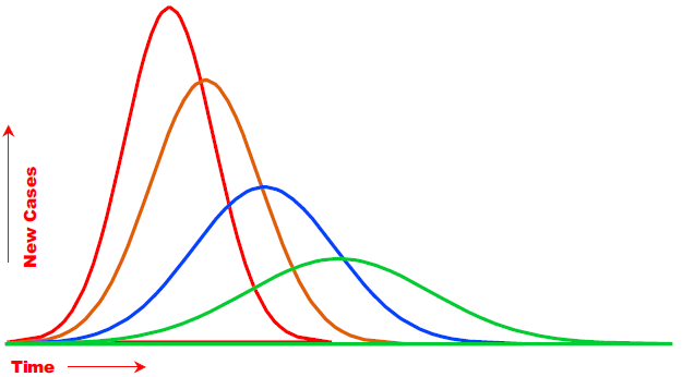
Figure 1: Epidemiological models produce curves of new cases under different scenarios in order to compare peak demands over time. (Click image for larger view.)
…
Comments
An interesting contrast to our approach
I hope it is not bad form to be the first person to comment on our article, but I wanted to call attention to a link that I just discovered today that represents an entirely different approach to the one Don and I illustrate in this article.
The web address http://covid-measures.stanford.edu/ presents interactive models that permit one to " try out" different assumptions regarding various aspects of Covid 19 in terms of certain parameters such as demand for hospital beds or the anticipated number of fatalities associated with certain containment scenarios.
I hope readers don't get the impression from our article that we reject the utility of such models.
However, they serve a very different purpose than the one we take and both should be thought of as complementing each other.
Worldometers data
I have been tracking cases and deaths using the Johns Hopkins data; after reading this excellent article I am inocorporating your approach into my tracker, so I really appreciate your discussion of exactly how you ran your analyses. I also found the Worldometers data very interesting, and I can't help but notice that they have an "active cases" field there, and a testing field. Those numbers were interesting to me and I wanted to add them to my tracker, but can't find a link to any older data.
The "active cases" field, I think, could be more useful as a general indicator than cases or new cases. Assuming that the operational definition includes those who are known to have the virus and are either under observation or quarantined, and that people considered "cured" or "recovered" have been dropped from the counts, this number could be a more representatie indicator of the current impact in a given area. I guess (becasuse they have the number on the page) that they somehow also calculate the number of people who have recovered. That would be a good number, too. Of course, we'd need to know how much accuracy and precision there are around the data.
Do any of the authors have any insight into where we might get any past data from Worldometers?
Worldometer
This was an old one
I stopped using Worldometers, because JH stopped using them when they stopped tracking a couple of months ago. Now I get the JH data from their latest source at Github. There are a few tracking sites where you can mouse over and see extra things in the tooltips. Doing that for 2300 + counties would be too much work.
The Math of COVID-19, and Factories
You might be interested in the following post, in which I summarized what the pandemic has made me learn about statistical epidemiology:
https://michelbaudin.com/2020/05/06/the-math-of-covid-19-and-restarting…
Add new comment