Featured Product
This Week in Quality Digest Live
Health Care Features
Donald J. Wheeler
Using process behavior charts in a clinical setting
Etienne Nichols
What medical device manufacturers need to know
Trupti Dhere
Technology helps doctors make more informed decisions, minimize adverse events, improve patient care
Etienne Nichols
What’s the difference?
Liza Dzhezhora
How to ensure the integration of IoMT devices in your practice

More Features

Health Care News
Creates one of the most comprehensive regulatory SaaS platforms for the industry
Resistant to high-pressure environments, and their 3/8-in. diameter size fits tight spaces
Easy, reliable leak testing with methylene blue
New medical product from Canon’s Video Sensing Division
Reduce identifying info in patient health data to enable better treatments and diagnostics
Making the new material freely available to testing laboratories and manufacturers worldwide
Google Docs collaboration, more efficient management of quality deviations
MIT course focuses on the impact of increased longevity on systems and markets
Delivers time, cost, and efficiency savings while streamlining compliance activity

More News

Donald J. Wheeler

Health Care

Are We Getting Better Yet?

How is the worldwide pandemic progressing?

Published: Tuesday, June 30, 2020 - 12:03

The daily Covid-19 pandemic values tell us how things have changed from yesterday, and give us the current totals, but they are difficult to understand simply because they are only a small piece of the puzzle. This article will present a global perspective on the pandemic and show where the United States stands in relation to the rest of the world at the end of the third week in June.

Here we will consider 27 countries that are home to 5 billion people (67% of the world's population). According to the European CDC database, which is the source for all of the data reported here, these 27 countries had more than 75 percent of the world’s confirmed Covid-19 cases and 86 percent of the Covid deaths as of June 20, 2020. So they should provide a reasonable perspective on the worldwide pandemic. Figure 1 lists these countries by region and gives the relevant Covid-19 counts and rates as of June 20, 2020.


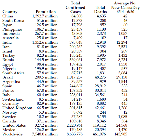
Figure 1: Countries used for global summary

Since all of these countries had their first confirmed case prior to March 7, 2020, we are looking at countries that have all had more than three months to deal with this pandemic. As may be seen in figure 1, the number of confirmed cases in these countries ranged from Australia’s 7,409 to the United States’ 2.2 million. The number of deaths ranged between Australia’s 102 to the United States’ value of 119,112. The last column in figure 1 gives the average number of new confirmed cases per day for the week ending on June 20.

To obtain values that may be reasonably compared between countries we shall standardize each country’s values by dividing by its population in millions.

Covid-19 cases

Figure 2 shows the total number of confirmed cases of Covid-19 per million population for each country as of June 20, 2020.


Figure 2: Total number of confirmed Covid-19 cases per million population

With 6,788 confirmed cases per million population, the United States is the unrivaled leader. The United States is the most infected nation in the world, and with 25 percent of the world’s Covid infections it is likely to remain so for some time to come. The United States has more infections per capita than Nigeria, India, Mexico, Iran, Turkey, or Russia. The United States even has more infections per capita than Sweden, where the official policy has been to do virtually nothing about the Covid pandemic.

Covid-19 Deaths

Figure 3 shows the total number of Covid-19 deaths per million population for each country as of June 20, 2020.


Figure 3: Total number of Covid-19 deaths per million population

Here we find that the United States’ value of 364.1 is sixth from the bottom, behind the deaths per capita of France, Sweden, Italy, Spain, and the United Kingdom. However, it is instructive to compare the United States’ death rate with other first-world countries such as Australia (4.1), South Korea (5.4), Japan (7.5), Israel (34.2), Germany (107.1), Switzerland (197.3), and Canada (225.2).

Other comparisons are equally poor. Brazil, where the pandemic is raging, only has two-thirds as many deaths per capita as the United States (230.5). Iran has one-third (114.8), and Russia has one-sixth (55.2) of the deaths per capita found in the United States.

Just as the United States accounts for more than 25 percent of the confirmed Covid cases worldwide, it also has more than 25 percent of the worldwide Covid deaths.

Pandemic growth

As a measure of how the pandemic is growing in each country, figure 1 shows the average number of confirmed new cases per day for the week ending June 20, 2020. When these averages are divided by each country’s population, we obtain the average number of confirmed new cases per day per million population. These current rates of infection growth are shown in figure 4.


Figure 4: Average number of cases per day per million population

While Brazil and Sweden lead our list in terms of new infections per day per capita, they are followed by the United States, South Africa, and Russia. The remaining 22 countries have infection rates that are less than half the United States’ rate. Thus, the United States must be considered as one of the global hot spots for this pandemic.

As listed in figure 1, during the third week of June, Sweden averaged 1,085 new cases per day, South Africa averaged 3,684 new cases per day, Russia averaged 8,234 new cases per day, the United States averaged 24,568 new cases per day, and Brazil averaged 29,158 new cases per day. Worldwide, the average number of new infections per day for this week was 143,985. Thus, these five hot-spot countries, with less than 10 percent of the world’s population, contributed 46 percent of the new cases found worldwide during the third week of June.

How the pandemic is changing over time

The values in figure 4 above provide a snapshot of how the pandemic is growing as of June 20, 2020. To understand if things are getting better or worse, we need to understand how we got to the current situation. When we look at the data over time, we find three distinct waves for this pandemic. Figures 5 and 6 give the worldwide total number of confirmed cases each week.


Figure 5: Weekly total numbers of new cases worldwide


Figure 6: Weekly total numbers of new cases worldwide

In figure 6 we can see the first wave of the pandemic, which was primarily contained within Wuhan province. Then during the last two weeks of February, the infection began to spread to South Korea, Japan, Australia, Iran, Turkey, Western Europe, and the United States. This second wave crested about the second week of April. Then after a five-week pause, the number of new cases began to climb again about the middle of May as the pandemic spread to the rest of the world. For convenience I will refer to this as the third wave of the pandemic.

To see how each country has done in the past, we will use the average number of new cases per day week by week for the weeks between January 19, 2020, and June 20, 2020. To get numbers that can be compared, we will divide these weekly averages by each country’s population to get the weekly average number of new cases per day per million people.

Figure 7 shows these weekly averages for 10 countries that were able to deal effectively with this pandemic. These countries were able to bring the infection rate down to manageable levels in a matter of weeks.

There are two groups in figure 7. The first group includes China, South Korea, Australia, and Japan. The curves for these countries can be seen along the bottom of figure 7. In each case they managed to stop the exponential growth and bring the number of infections down in a matter of a few weeks.


Figure 7: Weekly average numbers of new cases per day per million people

The second group in figure 7 consists of six countries that all experienced a very rapid increase in the number of new cases during the middle of March. In response to this rapid increase in Covid cases, Norway, Germany, France, Italy, Switzerland, and Spain all took actions that allowed them to get the infection rates back down to manageable levels within 10 weeks. By the beginning of June, these 10 countries all had averages of fewer than 10 new cases per day per million people.

Figure 8 shows four additional countries that also managed to effectively lower their infection rates by more than 70 percent from their peak levels.


Figure 8: Weekly average numbers of new cases per day per million people

The United Kingdom and Canada took a couple of weeks longer to bring their rates down than did the 10 countries in figure 7, but they did manage to lower their growth rates to about one-fourth of their peak values. Israel and Turkey also were effective in dramatically lowering their Covid growth rates, but their growth rates are currently beginning to creep back up.

So, the 14 countries shown in figures 7 and 8 all managed to intervene effectively to dramatically lower the rate of infection, and they did so within a three-month time frame. The 13 countries that follow have a different story to tell.

None of the four countries in figure 9 has been able to effectively deal with the Covid pandemic. None has been able to substantially reduce the rate of infection following their initial peaks. None of the following countries has accomplished what the preceding 14 countries have demonstrated is possible.


Figure 9: Weekly average numbers of new cases per day per million people

Iran was able to cut the infection rate in half by the end of April, but it went right back up in May.

Sweden simply plateaued throughout April and May before shooting up to what appears to be a new plateau in June.

Russia did not peak until the start of May, but since that time it has lowered its infection rate only by 15 percent.

And although the United States had an infection rate in May that was about 25 percent lower than that in April, the rate has started to go back up in June.

The ineffective responses to the Covid pandemic shown by the four countries of figure 9 simply gives them a head start on the rest on the world as we enter the third wave of the pandemic.

Figure 10 shows the curves for nine countries that have not yet reached a peak. Because these nine countries contain one-third of the earth’s population (2.46 billion), the third wave of the Covid pandemic is shaping up to be much larger and more widespread than the second wave.


Figure 10: Weekly average numbers of new cases per day per million people

Brazil and South Africa have already let the cat out of the bag. The world is now getting one million new confirmed cases of Covid-19 each week. The severity of the third wave will depend upon how effectively Mexico, Argentina, Egypt, India, the Philippines, Indonesia, Nigeria, and 180 other countries around the world deal with this pandemic.

Summary

The United States is the most infected nation in the world. With 4.3 percent of the world’s population, the United States has managed to accumulate more than 25 percent of the confirmed cases of Covid and more than 25 percent of the worldwide death toll from this pandemic.

So are we doing better? For the week ending May 30, 2020, the United States logged 145,000 new cases. For the week ending June 20, 2020, the United States logged 171,000 new cases. So, as the world is entering the third wave of this pandemic, the United States is doing its best to participate fully and completely. Although we may know what needs to be done, the United States as a whole is not dealing effectively with the opportunistic infection of Covid-19.

A pandemic does not care how technologically advanced a country is. Neither does it care how rich or poor it is. All it cares about are opportunities to infect more people, and those opportunities occur every time we are in close proximity to others without some sort of protection. Since we become infectious to others two to three days before we even know we are infected ourselves, social distancing, handwashing, and the use of face masks are still our most effective personal interventions at present.

The alternative is natural selection.

Appendix

Using data through June 25, 2020, we get the following graph of the seven-day moving averages of the daily numbers of confirmed cases of Covid-19 in the United States and in Western Europe. The United States is back up to a level last seen on April 3, 2020.

Figure 11:  Seven-day moving averages of daily numbers of new confirmed Covid-19 cases

Discuss

About The Author

Donald J. Wheeler’s picture

Donald J. Wheeler

Find out about Dr. Wheeler’s virtual seminars for 2023 at www.spcpress.com. Dr. Wheeler is a fellow of both the American Statistical Association and the American Society for Quality who has taught more than 1,000 seminars in 17 countries on six continents. He welcomes your questions; you can contact him at djwheeler@spcpress.com.


Comments

Variability in data quality by country

While it doesn't invalidate the main points of the article, we should be wary of comparing countries that produce trustworthy data, like Japan, Germany, Italy, Spain, Korea, or France, with countries that don't. The reasons national stats from a country can be unreliable include the lack of technical means to collect the data or the absence of a free press. 

Even in the US, inaccuracies creep up when the numbers have political or economic consequences. It is well known that Americans are undercounted because politicians won't allow the use of advanced statistics to detect and correct known undercounts. I don't think we know how many people actually live in China. In another country I visited long ago, an attempted census in a province had yielded a count "between 200,000 and 1,200,000." Some parents had declared more children than they had in hope of getting government subsidies, while others had declared fewer, to avoid taxation. The census takers had no idea how many of each there were.