PROMISE: Our kitties will never sit on top of content. Please turn off your ad blocker for our site.
puuuuuuurrrrrrrrrrrr
Donald J. Wheeler
Published: Monday, August 24, 2020 - 12:03 In past articles I have used graphs to provide perspective on how the Covid-19 pandemic is progressing around the world. In this article I shall update some of those graphs and use these historical data to make projections on what may be expected in the United States in the fall. Figures 1 and 2 contain the weekly total number of new confirmed cases of Covid-19 worldwide reported by the European CDC. There we can see the first wave of the epidemic as it spread in and around Hubei Province in China. Next we see the second wave as this epidemic turned into a pandemic spreading rapidly through South Korea, Japan, Australia, Iran, Turkey, Western Europe, and the United States. Then starting in mid-May we see the third wave as Covid-19 began to show up in large numbers in other countries around the globe. The world is currently experiencing 1.8 million new cases each week. Whether this is the peak for this wave only time will tell. Currently the United States is accounting for about 360,000 of these new cases each week, which is just over 20 percent of the world total. This is down from July when the United States had 27 percent of the world's new cases. As in my July 28 article, I use seven-day averages of the daily numbers of new confirmed cases of Covid-19 for groups of countries. These groups have populations between 311 million and 360 million, making their numbers reasonably comparable. The seven-day averages will be plotted against the midpoint of the period they represent. That is, the average for August 6 through August 12 will be plotted as the value for August 9. The July 28 article summarized the data up to July 22. The summaries below are based on the data up to August 12. Thus, this update shows the additional changes from July 22 to August 19. I will be referring to this three-week period for the rest of the article. In figure 3 we find the Western European and Pacific groups. The Western European group consists of Spain, Italy, France, Germany, and the United Kingdom. These five countries have a combined population of 324 million which is 98 percent of the population of the United States. Western Europe had a quickly rising number of cases in March that peaked at an average of 25,538 new cases per day on April 3. Following that peak the Western European averages steadily declined to average around 2,200 new cases per day in July. However, the effect of the third wave has brought Western Europe's average back up to about 10,000 new cases per day. The Pacific group consists of South Korea, Japan, the Philippines, and Australia. These four countries have a combined population of 311 million, which is 94 percent of the population of the United States. While these countries were some of the earliest outside China to experience the pandemic, they were able to keep their combined average daily number of new cases below 1,000 until the end of June. This group is currently averaging around 6,000 new cases per day. In figure 4 we find India and the African group. India has 1,366 million people which is 415 percent of the population of the United States. Here we will have to use a rate in order to obtain values to compare with those from the other groups. One-fourth of 1,366 million is 342 million, which is within the range of populations being considered. Therefore, the seven-day averages for India will be divided by four prior to being plotted. India's current average daily number of new cases is 62,519. When this value is divided by four we get a comparison value of 15,630 new cases per day per 342 million people. These values are roughly twice those from four weeks previous. The African group consists of Egypt, Nigeria, and South Africa. These three countries have a combined population of 360 million, which is 109 percent of the population of the United States. Over the past four weeks both Egypt and South Africa have dramatically reduced their numbers of new cases, so the average for this group has been cut to one third, dropping from a peak average of 14,115 new cases per day to its present average of 4,200 new cases per day. Figure 5 shows the United States and the South American group. The South American group consists of Brazil, Columbia, Argentina, and Peru. These four countries have a combined population of 339 million, which is 103 percent of the population of the United States. Over the past four weeks the average number of new cases for this group has increased almost 40 percent from 49,103 to 68,758. Over the same time period the United States has dropped about 27 percent from a peak of 67,374 to the current average of 48,744 new cases per day. So, once again, we see the lead change between the two regions with the greatest incidence of Covid-19. Some who commented on my column of July 28 suggested that the increased number of new cases in the United States was a consequence of increased testing: We were finding more cases of Covid because more people were getting tested. While this might provide a convenient excuse for those who do not wish to deal with inconvenient truths, it is a mistaken argument. While the number of tests given does place an upper limit on the possible number of positive test results, any assumption that these two numbers will be closely linked together requires the proportion of the population with Covid-19 to remain constant. This proportion is the "percent positive" or "positivity rate" that you may have heard used by public-health experts and the media. When we look at the proportions of positive test results we find that this proportion is changing from week to week. Using the downloadable database maintained by the Tennessee Department of Health we find the values given in the first four columns of figure 6. (The last two columns of figure 6 will be used in the next section.) Figure 6: Percentage positive tests in Tennessee and cumulative U.S. counts So, could all of these percentages have come from a population with an unchanging proportion of people with Covid-19? The three-standard-deviation error bars shown in figure 7 define the maximum uncertainty for interpreting each point as an estimate of the prevalence of Covid in Tennessee. When adjacent pairs of error bars do not substantially overlap you are looking at real differences. The proportion of people with Covid-19 was, and is, changing from week to week. Clearly, during April and early May, there was a substantial reduction in the level of Covid-19 in the state of Tennessee. The percent found with Covid dropped from 10 percent to below 4 percent. But in the latter part of May we see the percentages begin to climb as Tennessee began to open up. And now Tennessee is essentially back to where it was at the end of March. Any correlation between the number of tests given and the number of positive test results is merely an artifact arising out of the 20-fold increase in testing shown in figure 6. The appropriate way of comparing a count with its area of opportunity is to use a proportion. When the proportions are changing, as they are here, it is completely fallacious to claim that the increase in confirmed cases is merely due to increased levels of testing. The increase in cases is due to the increased levels of Covid-19, as is shown by the percent positives. As more people present themselves for health care, more tests get ordered. As more people are diagnosed with Covid, more people feel like they may have been exposed, resulting in more voluntary testing. And the outcome of these pressures will tend to increase the number of tests given. To say otherwise is to argue that "the trees make the wind blow." As students begin to return to schools and colleges across the nation we are embarking on another experiment. And when it comes to experimentation it always helps to have some benchmarks to use in evaluating the results. In this section we will use the historical data to create some benchmarks for the fall of 2020. As we saw in figure 5 the United States is currently averaging about 53,000 new cases each day. While we know that this number is changing, we can use it to make some projections based on the current levels and use the projections as benchmarks to judge the effects of our actions over the next few months. As of August 12 the count of confirmed cases in the United States was over 5.1 million. If the United States continues to add about 50,000 new cases per day we will have just over 6 million cases by the end of August. By the end of September 50,000 new cases per day will result in a total of just over 7.5 million cases. By the end of October 50,000 new cases per day will result in a total of over 9 million cases. By Black Friday, 50,000 new cases per day will result in a total of over 10 million cases. Of course, things could get better, or they could get worse. As of August 12 the Covid-19 death toll in the United States was 164,537. This is 21,000 more than it was just three weeks ago. If the United States continues to experience 1,000 deaths per day, the death toll will be over 180,000 by the end of August, over 210,000 by the end of September, and over 240,000 by the end of October. Figure 8 shows an increase in confirmed cases beginning about June 27. Figure 9 shows an increase in the number of deaths after July 25. While we all hope that the number of deaths will decrease, if we consider the number of confirmed cases as a leading indicator, then the number of deaths per day is not likely to decrease until we see a drop in the number of new cases per day. Figures 8 and 9 provide benchmarks to evaluate our fall 2020 Covid experiment. As we continue to "return to normal" in the absence of strong leadership on how to contain this pandemic we can use these benchmarks to see if we are doing better or worse as time goes by. The SARS CoV-2 virus is not going to go away. Epidemiologists tell us that it travels by aerosols which means that it can be inhaled or picked up from touching surfaces. It is very, very easy to catch while you are making other plans. You can catch it by breathing, talking, and going where others have gone. While masks provide some protection, they need to be used in conjunction with social distancing and hand washing. These three simple nonmedical interventions are the best preventive measures available at present. And they are things that we can all easily do to avoid being in tomorrow's 50,000 new cases and in next month's death toll. Quality Digest does not charge readers for its content. We believe that industry news is important for you to do your job, and Quality Digest supports businesses of all types. However, someone has to pay for this content. And that’s where advertising comes in. Most people consider ads a nuisance, but they do serve a useful function besides allowing media companies to stay afloat. They keep you aware of new products and services relevant to your industry. All ads in Quality Digest apply directly to products and services that most of our readers need. You won’t see automobile or health supplement ads. So please consider turning off your ad blocker for our site. Thanks, Dr. Wheeler is a fellow of both the American Statistical Association and the American Society for Quality who has taught more than 1,000 seminars in 17 countries on six continents. He welcomes your questions; you can contact him at djwheeler@spcpress.com. Some Benchmarks for the Fall Covid-19 Experiment
What can we expect over the next few months?
The worldwide pandemic
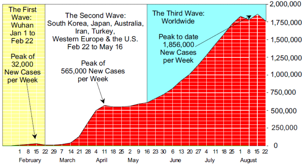
Figure 1: Weekly total numbers of new cases worldwide
Figure 2: Weekly total numbers of new cases worldwideThe numbers of confirmed cases
Figure 3: Average daily new confirmed cases of Covid-19 for Pacific and Western European groups
Figure 4: Average daily new confirmed cases of Covid-19 for India and the African group
Figure 5: Average daily new confirmed cases of Covid-19 for South America and the United StatesIncorrect attributions
Figure 7: Weekly percentages of positive tests for TennesseeSome benchmarks
Figure 8: Projected totals of confirmed cases in the United States
Figure 9: Projected death tolls for the United States
Our PROMISE: Quality Digest only displays static ads that never overlay or cover up content. They never get in your way. They are there for you to read, or not.
Quality Digest Discuss
About The Author
Donald J. Wheeler
© 2023 Quality Digest. Copyright on content held by Quality Digest or by individual authors. Contact Quality Digest for reprint information.
“Quality Digest" is a trademark owned by Quality Circle Institute, Inc.