Social Sharing block
This article is an update to “Tracking Covid-19” that Al Pfadt, Kathryn Whyte, and I wrote last week. In that article we summarized what is known about Covid-19, what has already happened, and what is to be expected based on the analysis of the data and the epidemiological models.
|
ADVERTISEMENT |
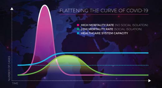
Over the past week the curve of Covid-19 infections in the United States has slightly flattened. Here are updated graphs of the actual data and new projections for what we can expect in the next few weeks.
Figure 1 shows the number of confirmed cases of Covid-19 in the United States as of 7 a.m. each day. These are the values posted by the European CDC at noon London time, and so they are slightly smaller than some other values that are reported later each day.
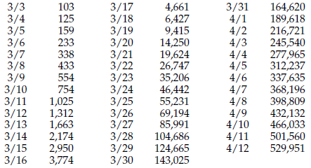
Figure 1: Number of confirmed Covid-19 cases in the United States
…
Comments
Track Covid-19 in New York
This is a great way to get a glimpse of what may occur in the near future. My only concern is that the population data are so heavily influence by New York data that it's kind of a misrepresentation. Since the bulk of the data is contributed by New York, it might be good to separate that data out and see what the rest of the country is doing at the same time. I've been tracking the data presented by Time Magazine's website. Here you can select any state in the union to see how they are doing individually.
Paul Carroll
State by state tracking
Yes, Paul, the same could be applied within states as well. I have been tracking the Tennessee numbers, and our current doubling time is about 11 days. But half of the cases in Tennessee are in the greater Nashville area, one-fourth are in Memphis, and the rest are scattered around the state. My home town of Knoxville has about 5% of the state total.
Covid - 19
The percent increase each day from the previous day gives a very clear indication of how this is slowing. Around March 5 & 6, we had about a 45% increase each day over the previous. Currently we are getting about a 5% increase. My projection estimates 4/24 as the day that we would hit 1,000,000 cases, but each day the proportion of increase is getting smaller, so even this estimate may be overly pessimistic. I have a nice chart of this data that I can not post here, but it shows that the rate of increase is slowing each day as a linear function with line formula y = -0.0101x + 444.93.
I should mention that this data is end-of-day from the Washington Post. I will run the same analysis with the data above.
Different data, different estimate y = -0.009x + 393.82 but still showing a steady decline.
Reply for DouglasB
Yes, we can see a decline in the day-to-day rates as the curve flattens out. The advantage of the semi-log plot is that it is easier to see a bend in a straight line than to see a slight difference in an exponential curve. When computing the current doubling time I do it as follows: I divide each day's value by the previous day's value to get a daily rate. I average the last three daily rates to get a smoothed current rate. When I divide the log of 2.0 by the log of the smoothed current rate the result is the doubling time. This does not assume anything about the future, but merely characterizes what is happening currently. The future data will confirm or tell of a change as it happens.
COVID-19 Tracking
Have you considered using the Z-Score statistic to track improvement by countries and states to show their relative position on the bell curve. I have used the Z-Score of %CLOSED (also 1-% ACTIVE) according to daily W.H.O. reporting. Most countries have Z-Scores less than 0 (50% CLOSED) but China remains at slightly above 2.0. Japan reached Z= -0.52 on 3/27 and retreated steadily to Z=-1.16 on 4/12, as predictive of their recent national emergency declaration. Other countries have shown linear trends with a slope of 0.01 to 0.07 points of Z-Score improvement per day. The Z=Score of CLOSED Cases is a lagging indicator by 10 to 20 days as the Recovery or Death needs time to determine. The goal is to get ahead of the ACTIVE Casess and get on the downside of the Bell Curve. If you want more information, I can send you an article that I posted on LinkedIn or you can contact me.
Reply for DONFWILSON
This approach is full of so many incorrect and inappropriate assumptions that the resulting "scores" are, and will always be, meaningless. Taiwan has had three waves of infection. Have you ever seen a three humped normal? The world is in the middle of its second wave of infection. Before we start computing all sorts of meaningless numbers we need to stop and listen to the voice of the process and interpret that voice in the context of what it represents.
COVID-19 Tracking
Thanks, Donald
I have always respected your opinion. I also appreciate your leading me to Taiwan's experience. I have been downloading from the W.H.O. database daily since 3/18/2020.
With data from 212 countries and 55 US States and territories, I haven't looked at every trend. The Z-Score for Taiwan shows Z= -0.67 on 3/18, dipping steadily to a Z =-1.21 on 3/27 and increasing to -0.35 on 4/14. Most countries show a steady linear improvement, with Z-Scores less than 0, but Taiwan's graph is a pretty clean parabola. Another country that appears different is Japan, with a steady improvement from Z= -0.70 on 3/18 to -0.52 on 3/27 and a steady decrease to -1.16 on 4/14. We first recognized the trend on 4/5 after 8 consecutive decreases since 3/28. Coincidently, Japan declared a national emergency on that day, putting sanctions back in place.
The Z-Score method using %Closed Cases is a lagging indicator by 10-20 days, but does serve as a metric for measuring improvement. It doesn't predict new cases or deaths, but it does show where actions and resources have been effective overall to reduce new cases or countries have taken actions necessary to close cases. While there are many variables that affect all measures of the process, including actions to mitigate transmission, numbers of tests taken, measurement error in reporting. new actions for cures and prevention, the Z-Score is a decent metric to help determine when to relax sanctions and identify new eruptions of the virus.
If you want more data or explanation of the method used, or graphs just let me know. I did post the thinking on LinkedIn on 4/5/2020.
Effect of Covid-19 Testing Constraint
Has anyone looked at how the number of tests administered vs. the number of people infected might be "flattening the curve?" I heard a report this morning that labs are sitting idle because many hospitals don't have equipment to take sufficient samples. If the number of tests administered as a proportion of the overall cases is going down (relatively flat or declining), this could be artificially flattening the curve.
For that matter, several factors other than actual changes in infection rate could be causing this flattening. The number of patients that can be seen in a day with the resources available, the number of tests that can be obtained or processed, and even changes in the screening criteria could each have this effect singly or in combination.
It boils down to the fundamental question “how robust is the measurement system that is being used?
Douglas
We have to consider the number of confirmed cases as a lower bound. This is the reason for the emphasis on the word "confirmed." In the article on April 6 we noted that when they had a test and tested people repatriated from China they found that 40% to 50% of those with Covid-19 had not been identified due to no symptoms or low symptoms. So, if a person has Covid-19 but shows no symptoms, they can just go around infecting people without ever feeling bad enough to ask for a test. So, yes, these numbers are incomplete. On the other hand, the nature of this pandemic does not lend itself to false flattenings. Without interventions each case will generate an average of 2.5 new cases, which is exponential growth.
If we have the ability to
If we have the ability to confirm them. That I think, is the question here. If there are only 100,000 tests conducted a day, and the pre-screening has a 70% false positive rate, we would expect to have about 30,000 new confirmed cases per day. As the total number of cases goes up, this 30,000 new-confirmed cases becomes a smaller and smaller proportion of the total. I am reminded of an anecdote (fictional I am sure) that a friend relayed to me:
A small third world country was recently praised for its very low rate of only 35 confirmed cases. When asked how many people had been tested, the reply was "38."
Don't have equipment for samples?
In response to
"I heard a report this morning that labs are sitting idle because many hospitals don't have equipment to take sufficient samples."
Due to recent travel across the US and having symptoms of shortness of breath and severe cough, my primary doctor decided to test me for COVID-19. First, I was tested for Strep throat and traditional flu with a swab of my tongue and nostrils. Then came the very uncomfortable COVID-19 test. It was a swab to the very back of each nostril, which was mailed out to a lab. It came back in a week, negative, fortunately.
So, the only "equipment" needed is a Q-Tip type swab, followed by lab analysis of the swab.
Allen
Running Out of Swabs
https://thehill.com/policy/healthcare/492486-officials-warn-that-new-york-city-could-run-out-of-coronavirus-test-swabs
Note specifically paragraph 2.
Extending Data
How exctly do you "extend data" without a model? Even if you don't assume a mathematical model, you still have to decide how to extrapolate, right? Am I missing something?
Drawing the Arrows
Stephen, the semi-log plot turns exponential curves into straight lines. When the most recent points are reasonably colinear, we can use those points to define a line. If there is no change in the rate of the exponential growth, then the projection of that line into the future will provide reasonable predictions. So, you could say the model is the process behavior in the recent past. In the case of the curved projection in Figure 4, I explained that I transitioned from the current growth rate of the deaths to the growth rate shown by the confirmed cases. (Looking back at the past, the deaths have had a growth rate that matched the growth rate of the confirmed cases about 5 to 7 days earlier.) So here I used the demonstrated relationship betwen the two related curves to create a non-linear projection. (Since then the data have fallen just under the curved projection.)
So there is no explicit model, just the implicit model of letting the recent past predict the near future. Clearly, in a dynamic situation such as an epidemic, we do not take these "predictions" as anything other than as a guide for deciding if we are getting better or worse. They define a context to use in interpreting each new value as it comes along.
Limitations of using aggregated data
I am amplifying the comments Don made in reply to questions about data from NYState.
Any time data is combined from multiple sources it becomes more difficult to draw conclusions that apply to all cases.
Even in our original article which looked at the spread of the virus in a particular community ( New Rochelle) the original spread of the virus within the closely knit Orthodox Jewish community where the first few cases were transmitted, subsequent cases were undoubtedly due to transmission from other communities.
Likewise, some of the small rural states which currently are contributing small numbers to the national total may find themselves in the unenviable position of being a hot spot.
An article in the NYTimes this week described how individuals from a company with offices all over the world served as a " Petrie dish" that spread infections each person at that meeting brought with them from other countries back to the local communities each returned to when the meeting was over. The outbreak in Tennessee that Don referred to has been traced to one person who attended that meeting.
Since national trends are the focus of much of the current discussion we decided to clarify confusion about those data first. Our methods can be applied to any level of analysis to address other concerns. Hopefully, the tools we have provided in our follow up article will help others do just that.
Semilog charts simple example
Several of our readers have had questions about a semilog chart and why it is useful for showing changes in rate.
This simple Excel spread sheet should help show the difference between a linear vs a semilog chart for showing exponential data.
Add new comment