
Social Sharing block

Some of my colleagues have recently been pushing multivariate charts. These charts combine several different process outcome values into a single number that’s placed on a chart. Unfortunately, this theoretically elegant approach breaks down in practice for reasons that will be explained here.
|
ADVERTISEMENT |
We shall use the example of Adhesive 442 to illustrate the ideas behind multivariate charts. Each batch of Adhesive 442 is characterized by two key properties, pH and viscosity. Twenty consecutive batches had the values shown in Figure 1.
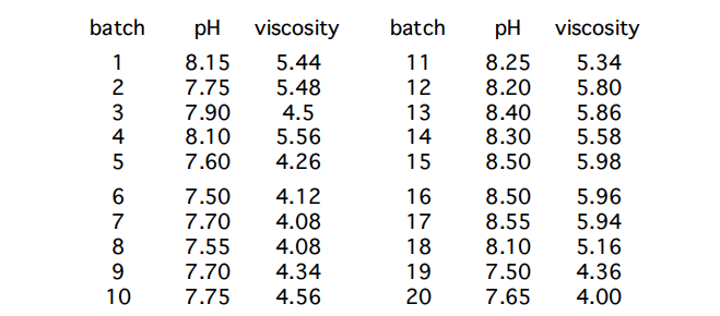
Figure 1: Adhesive 442 data
The average pH for Adhesive 442 is 7.9825. The average moving range for the pH values is 0.221. Based upon this value, the sigma(X) value for pH is 0.196. The XmR chart for the pH values is shown in Figure 2.
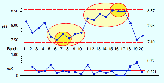
Figure 2: XmR chart for Adhesive 442 pH values
…
Comments
Multivariate is not Multi-Vari
These two terms do get confused even by statistical software. Let’s be clear that the multi-vari chart (as first advocated by Leonard Seder) is a simple uncomplicated graphical study that displays all raw data without any mathematical manipulation. It is very useful for Problem Solving and I’ve used it as a basis for determining rational subgroups. It is not the thing that Dr. Wheeler discusses.
Reply for Bev Daniels
Thank you Bev for your comment. Yes, you are right. Although somewhat subjective, Multi-Vari plots are based on the same principle as process behavior charts. They use the power of the graph to make changes visible.
Multi-vari examples?
Where would I find examples of multi-vari charts? Do you have any you can share?
Multivariate SPC has been my White Whale
I am grateful to Don for sharing this article, as I especially love the reassurance that the thing I'm not doing, that I don't really understand, is something that I don't need to be bothered with doing or understanding.
I bought Advanced Topics in SPC primarily to read his chapters on Multivariate SPC because I have been vexed by a particular question for much of my career: armed with the knowledge that two process variables should correlate with each other, can you use this information to enhance your detection of changes in process behaviour?
For example, can a situation like "This batch is within the limits for viscosity and for shear thinning index, but it is remarkably NON-shear-thinning for how high it is in viscosity" be reliably detected when such an observation would be actionable?
In one of my first real jobs out of school, I saw a very clear correlation between product properties in my R&D samples, so I naively went to the production data to look for the same on an XY scatter, only to be confronted by a large, undifferentiated blob of points. This was before I even knew about the difference between the standard deviation statistic and the estimate of sigma that must be used in process behaviour charts. This was before I knew about Don Wheeler.
After learning so much more about SPC and using it to improve processes since then, the two tricks I've found most useful in looking at correlated variables in an SPC context are what I call the "Z-Score Overlay" and the "Delta-Over-Sigma Scatter."
For the Z-Score Overlay, you make XmR charts for each of your variables, as you should. Then, you use the estimate of sigma from each XmR chart to linearly transform each of your data streams into Z-Scores. Now, they all have the same mean at zero and natural process limits at +/- 3, and you can overlay all variables on the same chart. If one of the variables seems to have an inverse correlation relative to the others, then you need to multiply its Z-scores by negative one.
Thiswise, you can observe how the correlated variables zig and zag together, and you can recognise points where they have zagged in some way that is out of character with the process history (e.g., moving substantially in opposite directions, or an instance of one moving substantially while the others move only modestly. Maybe you observe that they always track really well together, and then you see a part or batch where one variable is at +2.5 sigma while the others are near the mean; I would treat this point as a signal in spite of not breaching the limits).
For the Delta-Over-Sigma scatter, you consider a pair of variables, and you divide the point-to-point differences (i.e., the delta from point to point, the absolute value of which would be called the mR or moving range) by sigma, plotting the results on an XY scatter. A healthy correlation will result in your delta-over-sigma points piling up along one of the diagonals (the positive diagonal for a positive correlation, and vice versa), and any point-to-point differences that are uncharacteristic of this correlation will stand out by being visually distant from the relevant diagonal. You can even track the distance from this diagonal ("off-diagonality") on a process behaviour chart to detect signals of departure from the correlation, but this might be excessive, since the departure from the correlation—if it's worth saying anything about—will stand out strongly on the Z-score overlay or delta/sigma scatter.
These approaches are the answer to the following paradox: the better you run your process, the less apparent the correlations are. If you run any process well enough or long enough (even if it's not well), the XY scatter of two correlated variables will look more like a shotgun blast than a noisy regression line.
Consider a process where you are making some thermoset polymer material, and you measure its shore hardness (durometer) and its tensile modulus.
If you run your process unpredictably, then there will be high and low values for one variable that can visibly correlate with the high and low values of the other. As you reduce variation, then you see less of this correlation. Suppose you run your process so well that the only variation is measurement noise; then the correlation disappears completely.
But this is not the case in the real world. What is often the case is that your historical XY scatter looks like a shotgun blast, but you can still see evidence of the correlation on the Z-score overlay and the delta-over-sigma scatter in a way that allows any new data point to visibly adhere to or depart from the historical process behaviour. Departures from the historical correlation are evidence of a change that should be investigated. In the worst-case scenario, it is that your process has shifted into some operating regime where you are making a qualitatively different material, so its material properties do not correlate with each other in a way that is consistent with the material you intend to be making. What I have found more often is that the measurement system has changed: e.g., you have a new technician who has a heavier hand with the durometer gauge; your tensile tester is being operated in a warehouse space whose doors are now held open more than usual; the die you use to cut your tensile coupons is wearing out and introducing defects; the extensometer on your tensile tester is failing; etc.
Certainly, you don't need these supplemental multivariate techniques to detect such issues in the measurement system; using XmR charts to improve consistency of all QA/QC processes should be routine, and those approaches would certainly detect the changes that I've used as examples here. But I did not envision these alternative approaches for a well-oiled company that does continuous improvement correctly across different functions; they are for the process engineer, buried in problems, who has some sense that these correlations exist but doesn't know how to exploit them for process improvement.
Another brilliant article by Donald Wheeler
The article once again confirms the core principle I follow in my work: the best analysis is the simplest one that provides the necessary understanding of the process.
www.PBCharts.com
We built an Excel Add-In to make process Behavior Charts and named it in honor of Donald Wheeler. Here is an example of the charts of pH and Viscosity.
See it at https://peltiertech.com/ pbcharts
Add new comment