That’s fake news. Real news COSTS. Please turn off your ad blocker for our web site.
Our PROMISE: Our ads will never cover up content.
Donald J. Wheeler
Published: Monday, June 3, 2013 - 23:00 All data are historical. All analyses of data are historical. Yet all of the interesting questions about our data have to do with using the past to predict the future. In this article I shall look at the way this is commonly done and examine the assumptions behind this approach. A few years ago a correspondent sent me the data for the number of major North Atlantic hurricanes for a 65-year period. (Major hurricanes are those that make it up to category 3 or larger.) I have updated this data set to include the number of major hurricanes through 2012. The counts of these major hurricanes are shown in a histogram in figure 1. A Poisson probability distribution is commonly used to model the number of hurricanes. Since the Poisson model only has one parameter, we only need to compute the average number of hurricanes per year to fit a Poisson distribution to the histogram of figure 1. The histogram shows an average of 2.56 major hurricanes per year. A Poisson distribution having an average of 2.56 is shown in figure 2. Using any one of several different test procedures, we can check for a lack-of-fit between the model in figure 2 and the histogram in figure 1. Skipping over the details, the result of these tests is that there is “no detectable lack of fit between the histogram and a Poisson model with a mean of 2.56.” Thus, it would seem to be reasonable to use the model in figure 2 to make estimates and predictions about the frequency of major hurricanes. For example, we might decide to obtain an interval estimate for the average number of major hurricanes per year. In this case, an approximate 95-percent interval estimate for the mean number of major hurricanes per year is 2.2 to 3.0. Also, based on the model in figure 2, the probability of getting seven or more major hurricanes in any single year is 1.59 percent. This means that in any 78-year period we should expect to get about 78 × 0.0159 = 1.24 years with seven or more major hurricanes. Putting it another way, dividing 78 by 1.24, we find that a year with seven or more hurricanes should happen only about once every 63 years on the average. However, a glance at figure 1 shows that between 1935 and 2012 there have been three years with seven or eight major hurricanes. This is once every 26 years! Well, perhaps we were simply too far out in the tail. Let’s look at how many years should have six or more major hurricanes. The Poisson model in figure 2 gives the probability of getting six or more major hurricanes in any single year as 4.61 percent. This means that in any 78-year period, we should expect to find about 78 × 0.0461 = 3.60 years with six or more major hurricanes. If we divide 78 by 3.60, we find that the model suggests we should have one year with six or more major hurricanes every 22 years on the average. In contrast to this, figure 1 shows that there have been seven years between 1935 and 2012 with six or more major hurricanes. Dividing 78 by 7, we find that we have actually had one year with six or more major hurricanes every 11 years on the average. Thus, we are having extreme years at twice the predicted frequency. Sound familiar? So what is happening? Why do these data keep misbehaving? The first clue as to what is happening with these data can be found by simply plotting the data in a running record. When we do this, we immediately see that there are two different patterns of hurricane activity. In the periods before 1948 and from 1970 to 1994, there was an average of 1.49 major hurricanes per year. In the periods from 1948 to 1969 and after 1995, there was an average of 3.55 major hurricanes per year. During the periods of low activity, there could be up to four major hurricanes in a single year. During the periods of high activity, there could be up to 10 major hurricanes in a single year. These differences are reflected in the central lines and limits shown on the X chart in figure 3. To investigate this change in the weather patterns, I went to the NOAA website and found an article titled “NOAA Attributes Recent Increase in Hurricane Activity to Naturally Occurring Multi-Decadal Climate Variability” (Story 184). This article confirms the existence of the cycles shown in figure 3 and offers an explanation for this phenomenon. The histograms for these two levels of activity are shown in figure 4. So what is wrong with the probability model used in figure 2? The problem is not with the choice of the model or with the mathematics, but rather with the assumption that the data were homogeneous. Anytime we compute a summary statistic, or fit a probability model, or do just about anything else in statistics, there is an implicit assumption that the data, on some level, are homogeneous. If this assumption of homogeneity is incorrect, then all of our computations, and all of our conclusions, are questionable. No single year between 1935 and 2012 is characterized by an average of 2.56 major hurricanes per year. Our 95-percent interval estimate of 2.2 to 3.0 major hurricanes per year simply does not apply to any year or any period of years. And our predictions as to how often certain numbers of major hurricanes will occur were completely off-base. Yet this is what people are taught to do. The software makes it so easy to check for a lack of fit between a histogram and a probability model that many students have been taught elaborate systems for selecting and verifying a probability model as the first step in data analysis. We collect data regarding all sorts of disasters: in addition to hurricanes, there are databases for tornadoes, floods, earthquakes, wildfires, etc. In each case we collect the observations into a single histogram, and use these observations to fit a probability model. It should be noted that when we do this, we are fitting the broad middle portion of the probability model to our data. Of course, this broad middle portion includes all of the commonly occurring events. If we fail to find a detectable lack of fit between our model and the observations, we will decide that we have the right model. Next we will then leave the broad middle of our probability model and move out into the extreme tails to make predictions about the frequency with which the more extreme events will occur: “According to the infinitesimal areas under the extreme tail of our assumed probability model, a flood of this magnitude will occur, on the average, only once in 100 years.” Of course, the model used for such a prediction is built on the assumption that the conditions that resulted in the more common events are the same conditions that result in the more extreme events. Since this assumption that the cause system remains the same is rarely correct, the data are rarely homogeneous. When the data are not homogeneous, the fitted model will be incorrect. When the fitted model is incorrect, our predictions will be erroneous. And when our predictions are erroneous, we end up having a 100-year flood about every 10 years or so. This is why the primary question of statistical analysis is not, “What are the descriptive statistics?” Neither is it, “What probability model shall we use?” nor is it, “How can we estimate the parameters for a probability model?” The primary question of all data analysis is whether the data are reasonably homogeneous. When the data are not homogeneous, the whole statistical house of cards collapses. Hence, Shewhart’s Second Rule for the presentation of data: “Whenever an average, range, or histogram is used to summarize the data, the summary should not mislead the user into taking any action that the user would not take if the data were presented as a time series.” The primary technique for examining a collection of data for homogeneity is the process behavior chart. Any analysis of observational data that does not begin with a process behavior chart is fundamentally flawed. Quality Digest does not charge readers for its content. We believe that industry news is important for you to do your job, and Quality Digest supports businesses of all types. However, someone has to pay for this content. And that’s where advertising comes in. Most people consider ads a nuisance, but they do serve a useful function besides allowing media companies to stay afloat. They keep you aware of new products and services relevant to your industry. All ads in Quality Digest apply directly to products and services that most of our readers need. You won’t see automobile or health supplement ads. So please consider turning off your ad blocker for our site. Thanks, Dr. Wheeler is a fellow of both the American Statistical Association and the American Society for Quality who has taught more than 1,000 seminars in 17 countries on six continents. He welcomes your questions; you can contact him at djwheeler@spcpress.com. Why We Keep Having 100-Year Floods
Making predictions using historical data
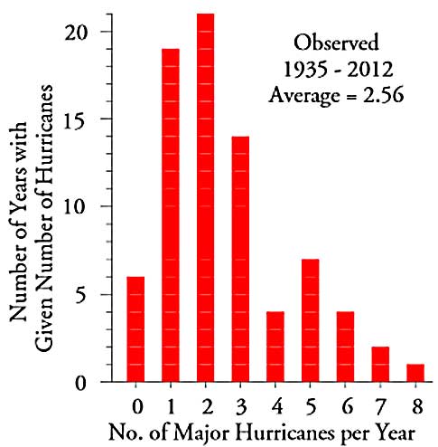
Figure 1: Histogram for the number of major North Atlantic hurricanes 1935–2012
Figure 2: The Poisson probability model with mean of 2.56
Figure 3: X chart for number of major North Atlantic hurricanes, 1935–2012. Click here for larger image.
Figure 4: Histograms for the numbers of major North Atlantic hurricanes, 1935–2012
Our PROMISE: Quality Digest only displays static ads that never overlay or cover up content. They never get in your way. They are there for you to read, or not.
Quality Digest Discuss
About The Author
Donald J. Wheeler
© 2023 Quality Digest. Copyright on content held by Quality Digest or by individual authors. Contact Quality Digest for reprint information.
“Quality Digest" is a trademark owned by Quality Circle Institute, Inc.
Comments
Histograms?
Historgrams? ha. Those are bar graphs. And you people call yourselves "quality".
Histograms
Don't Get It
It's continues to puzzle me why data analyists/quality engineers don't start with plotting the data in time order. You would think this would be the first logical step. So very easy to do and so much to be gained. It appears advances in statistical software has made it so easy to do dumb things.
Rich D.
It's what they've learned, I think
Rich, I think it's what they've learned. Statistical thinking takes a lot of effort to learn, and then some effort to do even on a regular basis. People taking most statistics courses see a time-order plot as just one of many graphical tools available, and usually only when they briefly cover some graphing options. Most of the rest of the class is devoted to histograms, tests of hypotheses, and other tools. They only learn to do enumerative studies.
Tony's on to something, as well. It doesn't help when most of the Six Sigma literature treats SPC as an afterthought, when noted SPC authors publish papers and books spuriously identifying non-existent "inherent flaws in XbarR charts" and the Primers used as references for Black Belt certification exam preparation classes state outright that you can tell if a process is in control by looking at a histogram. I just spent almost three weeks going back and forth with a "Master Black Belt" in another forum who told some young engineer not to bother with time order in a set of data that he had, just take a random sample, because "a random sample is representative, by definition."
Excellent ! What a great
Excellent ! What a great example. However I have no doubt that the masses of Six Sigma and Lean Sigma true believers and blind followers of Montgomery just won't get it.
Homogeneous Data
Great article on a issue not commonly discussed. Too often homogeneity of data is assumed but never verified. From my college stats class (many years ago) I still recall an example of a lack of homogeneity that had startling consequences. The draft lottery in 1969. The days of year were numbered and placed on ping pong balls (1 for Jan 1st... 366 for Dec 31st). The numbers were transported to the mixer in twelve shoe boxes, one for each month. The balls for Jan were pored into the mixer first, followed by Feb, Mar, etc thru Dec. The mixer was turned and a ball was removed and the number recorded. They did this until the last ball was removed. The data is on Wikipedia at: http://en.wikisource.org/wiki/User:Itai/1969_U.S._Draft_Lottery_results. Though the process was random, the results were not due to the non-homogeneity of the position of the balls in the mixer and the assumption that turning the mixer would ensure homogeneity. The results: if your birthday was in Dec, you had a 83% chance (26/31) of being drafted. If your birthday was in Jan, you had a 45% (16/31) chance.
So Important!
This is a great example of a vitally important concept that is, unfortunately, left out of most statistical training (and much of statistics education) these days. Entirely too many people are willing to jump into a data set, start taking random samples, testing for normality, and all kinds of other harmful nonsense prior to checking for homogeneity. I remember Deming discussing a similar concept, and his words apply here, I think:
"This all simple...stupidly simple...who could consider himself in possession of a liberal education and not know these things? Yes...simple...stupidly simple...but RARE! UNKNOWN!" (From the Deming Library vol VII, The Funnel Experiment).
This article should be required reading in every statistics class.
Excellent Article
An excellent, practical article. And once again, the run chart comes through. Thank you.