There are two basic ideas or principles that need to be respected when creating a chart for individual values and a moving range (an XmR chart). This column will explain and illustrate these two principles for effective XmR charts.
ADVERTISEMENT |
The first principle for an effective XmR chart is that successive values need to be logically comparable. The second is that the moving ranges need to isolate and capture the local, short-term, routine variation that is inherent in the data. When these principles are ignored, the XmR chart can miss signals that it would otherwise detect.
While the use of the time-order sequence of the data will usually be sufficient to satisfy these two principles, there are times when a careful consideration of the context for the data will require a different organization. As a case in point consider the camshaft bearing diameters shown in figure 1. The strict time-order for these data is:
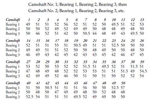
When the data are arranged in time order the average moving range is 3.10. With an average of 49.81, we obtain the limits are shown in figure 2.
XmR
Except for one moving range, all of the values in figure 2 fall within the computed limits. However, with this arrangement of these data, the moving ranges represent the differences between the three bearings. Even though the three bearings are supposed to be the same, the fact that they are produced by three separate operations means that there might be systematic differences between the three operations. Such systematic differences would have nothing to do with the routine variation of any one process. The organization of figure 2 takes a gullible point of view and assumes that the three operations are operating the same.
A skeptical approach to these same data would allow the three operations to differ. Rather than using the strict time order shown in figure 2, a more rational approach is to organize these data according to bearing number, and then to use the time order within each bearing to create moving ranges.
When these data are organized in this manner, the moving ranges will represent the natural, short-term, routine variation within each production process rather than the differences, if any, between the three processes. Now the average moving range is 1.91, giving the limits of 44.7 to 54.9 shown in figure 3. This organization and these limits allow us to see the differences between the operations producing these three bearings with greater clarity.
XmR
Thus, when there is a structure in the context for your data, it is imperative that you consider that structure when organizing the data for an XmR chart. If there are logical partitions or subsets in your data, isolate those subsets from each other so that successive values will be logically comparable and the moving ranges can characterize the routine variation rather than the differences between the subsets.
In fact, for the camshaft bearing diameters we could take the next step and compute a separate set of limits for each bearing. These XmR charts are in Figure 4. Bearing one has an average of 51.46 and an average moving range of 1.47. Bearing two has an average of 49.78 and an average moving range of 1.53. Bearing three has an average of 48.20 and an average moving range of 2.69.
XmR
Not only are these three processes operating at different averages, but each process shows evidence of unpredictable operation. Moreover, the operation producing bearing three is seen to be qualitatively different from the other two bearing operations. This ability to show qualitative as well as quantitative differences is one of the real advantages of a process behavior chart.
Both figures 3 and 4 are superior to figure 2 simply because they respect the two principles for effective XmR charts: They organize the data so that successive values are logically comparable and so that the moving ranges capture the routine variation in each of the three production operations. Once you have organized the data in a rational manner, there may be several ways to use the limits to tell the story that is contained within the data. The objective is understanding and insight rather than computing a particular value. There is an element of judgment involved in using a process behavior chart, and this element cannot be removed. It is essential to an effective analysis.
What do we gain from the moving range chart?
It has been suggested that the Moving Range Chart adds so little to the chart for individual values that you should not bother to show it—“Simply show the X chart and forget the mR chart.” The basis for this recommendation seems to be the documented fact that the combined XmR chart does not have an appreciably greater ability to detect signals than does the X chart alone.
However, this mathematical analysis overlooks the interpretative benefits to be gained by including the mR chart. In figure 3 the moving ranges confirm the impression that the process for bearing three has more variation than the other two processes. In figure 4 consider how the point above the upper range limit for bearing three identifies a change in the process between camshaft 4 and camshaft 5. This change is too large to have occurred by chance alone. Something was changed, and since the target value is 50, this change was detrimental. Thus, the moving range chart will, on occasion, provide new information in addition to reinforcing the message of the X chart.
XmR
When computing the limits for the batch weight data in figure 5, I only used the first 58 moving ranges to compute the average moving range. Why did I do this? Inspection of the mR chart shows an increase in the process variation after value 60. Since the objective is to compute limits that characterize what the process is capable of doing, the first 58 moving ranges do this better than the rest.
How did I detect this shift in variation in figure 5? At the scale used here it is hard to see, but only 22 of the 61 values between value 60 and value 120 are below the central line. While we do not use the traditional run tests with a moving range chart, shifts such as this one which are shown by a substantial number of values may still be interpreted as changes in the process variation. For example, beginning around value 120 there is a second upward shift in the process variation in figure 5. And around value 180 there appears to be a third upward shift. Since these shifts all make sense in the context of these data, it is reasonable to interpret them as being real.
Why do we not use the traditional run test rules with the moving range chart? While the usual run tests such as eight in a row on one side of the central line, two out of three beyond two-sigma, and four out of five beyond one sigma may be used with the X chart whenever the order of the points makes sense, you should not use these tests with the moving range values. This prohibition is due to the nature of the computation of the moving ranges. Since each individual value is used to create two moving ranges, the computations can create correlations and pseudo-runs within the moving range values. To see how this happens look at the first three X values that are above the upper natural process limit on the chart for bearing one in figure 6.
XmR
Each one of these values generated two large moving range values. Since this correlation structure is an artifact of the computations, it is something that we do not want to interpret as a signal. To avoid false alarms from run tests due to this artifact of the computations it is best to avoid using any of the traditional run tests with the moving range values. Moving ranges above the upper range limit will denote breaks in the original data, and as such are valid signals. To interpret shifts and long runs on the moving range chart you should use substantially more data than the traditional run tests use.
Additional reasons to use the moving range chart
The second reason that I cannot agree to the suppression of the mR chart is that there are many people, and many software packages, that actually compute three standard deviation limits rather than three-sigma limits. If you are shown a naked X chart you will have no way of knowing if the limits have been computed correctly. However, if you are shown an XmR chart, you will immediately have a higher level of confidence that the limits have been computed correctly. Moreover, by using the central line of the mR chart, you can quickly check to see if the limits are indeed correctly computed. Thus, the mR chart is the secret handshake of those who know the correct way of computing limits for an X chart. Omit it and your readers cannot be sure that you are a member of the club.
Finally, the mR chart allows you and your audience to check for the problem of chunky data. This is a problem that occurs when the data have been rounded to the point that the variation is lost in the round-off. When this happens the many moving ranges that get rounded to zero will deflate the average moving range, which will tighten the limits. At the same time that the limits are being tightened the round-off will restrict the number of values for both the original data and the moving ranges. This restriction will keep the running record from shrinking with the limits and as a result, the chart will start to show an increased number of false alarms. For a more complete treatment of the problem of chunky data see my column for December of 2011. Since the only way to check for chunky data with an X chart is to use the moving range chart, good form requires that the mR chart be shown along with the X chart.
In those instances where the mR chart adds nothing to the story told by the X chart, where it is known that the correct computations are being used, and where chunky data is not an issue, you may choose to show only the X chart in the interest of simplicity. This option of not showing the mR chart is substantially different from the general prohibition quoted at the beginning of this section.
Summary
In order to have an effective XmR chart, you need to organize the data so that successive values are logically comparable and the moving ranges isolate and capture the routine process variation. When successive values represent apples and oranges both of these principles are violated. This is why we talk about the rational organization of data on an XmR chart. Judgment has always been an essential part of using process behavior charts effectively, and it still is, even in this age of software.
While there may be little justification for showing the mR chart on the basis of mathematical theory, there are three practical reasons to do so, any one of which is sufficient to justify the inclusion of the mR chart with your X chart. Displaying the mR chart along with your X chart is simply full disclosure, and as such it is the recommended practice.
Finally, do not use the traditional run tests with the mR chart.
Comments
COV Analysis
The rule of thumb I learned about where to create multiple charts vs single chart was to do a components of variance study. Any source of variability > 20% needs to be charted (I can't find any source -I've been using it for 20 years!). In this case, taking your data we get about 30% of the variability due to the differences in bearings and 70% in camshafts. So, the conclusions about plotting on separate graphs is supported by the rule of thumb. The graphs presented are good visual tools for a study, but on the floor would have to be 3 different plots. The downside is that we lose the immediacy of trying to fix the problem and probably allow the problem to go on. Good topic.
Add new comment