{domain:"www.qualitydigest.com",server:"169.47.211.87"} Skip to main content

User account menu
Main navigation
  • Topics
    • Customer Care
    • FDA Compliance
    • Healthcare
    • Innovation
    • Lean
    • Management
    • Metrology
    • Operations
    • Risk Management
    • Six Sigma
    • Standards
    • Statistics
    • Supply Chain
    • Sustainability
    • Training
  • Videos/Webinars
    • All videos
    • Product Demos
    • Webinars
  • Advertise
    • Advertise
    • Submit B2B Press Release
    • Write for us
  • Metrology Hub
  • Training
  • Subscribe
  • Log in
Mobile Menu
  • Home
  • Topics
    • 3D Metrology-CMSC
    • Customer Care
    • FDA Compliance
    • Healthcare
    • Innovation
    • Lean
    • Management
    • Metrology
    • Operations
    • Risk Management
    • Six Sigma
    • Standards
    • Statistics
    • Supply Chain
    • Sustainability
    • Training
  • Login / Subscribe
  • More...
    • All Features
    • All News
    • All Videos
    • Contact
    • Training

What Makes the XmR Chart Work?

How does it separate the signals from the noise?

Donald J. Wheeler
Thu, 11/29/2012 - 13:39
  • Comment
  • RSS

Social Sharing block

  • Print
  • Add new comment
Body

There are two basic ideas or principles that need to be respected when creating a chart for individual values and a moving range (an XmR chart). This column will explain and illustrate these two principles for effective XmR charts.

ADVERTISEMENT

The first principle for an effective XmR chart is that successive values need to be logically comparable. The second is that the moving ranges need to isolate and capture the local, short-term, routine variation that is inherent in the data. When these principles are ignored, the XmR chart can miss signals that it would otherwise detect.

While the use of the time-order sequence of the data will usually be sufficient to satisfy these two principles, there are times when a careful consideration of the context for the data will require a different organization. As a case in point consider the camshaft bearing diameters shown in figure 1. The strict time-order for these data is:
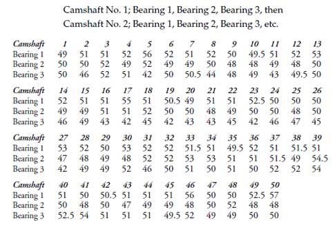

Figure 1: The camshaft bearing diameters

 …

Want to continue?
Log in or create a FREE account.
Enter your username or email address
Enter the password that accompanies your username.
By logging in you agree to receive communication from Quality Digest. Privacy Policy.
Create a FREE account
Forgot My Password

Comments

Submitted by kkbari on Fri, 12/07/2012 - 10:02

COV Analysis

The rule of thumb I learned about where to create multiple charts vs single chart was to do a components of variance study.  Any source of variability > 20% needs to be charted (I can't find any source -I've been using it for 20 years!).  In this case, taking your data we get about 30% of the variability due to the differences in bearings and 70% in camshafts.  So, the conclusions about plotting on separate graphs is supported by the rule of thumb.  The graphs presented are good visual tools for a study, but on the floor would have to be 3 different plots.  The downside is that we lose the immediacy of trying to fix the problem and probably allow the problem to go on.  Good topic.

  • Reply

Add new comment

Image CAPTCHA
Enter the characters shown in the image.
Please login to comment.
      

© 2025 Quality Digest. Copyright on content held by Quality Digest or by individual authors. Contact Quality Digest for reprint information.
“Quality Digest" is a trademark owned by Quality Circle Institute Inc.

footer
  • Home
  • Print QD: 1995-2008
  • Print QD: 2008-2009
  • Videos
  • Privacy Policy
  • Write for us
footer second menu
  • Subscribe to Quality Digest
  • About Us
  • Contact Us