{domain:"www.qualitydigest.com",server:"169.47.211.87"} Skip to main content

User account menu
Main navigation
  • Topics
    • Customer Care
    • FDA Compliance
    • Healthcare
    • Innovation
    • Lean
    • Management
    • Metrology
    • Operations
    • Risk Management
    • Six Sigma
    • Standards
    • Statistics
    • Supply Chain
    • Sustainability
    • Training
  • Videos/Webinars
    • All videos
    • Product Demos
    • Webinars
  • Advertise
    • Advertise
    • Submit B2B Press Release
    • Write for us
  • Metrology Hub
  • Training
  • Subscribe
  • Log in
Mobile Menu
  • Home
  • Topics
    • 3D Metrology-CMSC
    • Customer Care
    • FDA Compliance
    • Healthcare
    • Innovation
    • Lean
    • Management
    • Metrology
    • Operations
    • Risk Management
    • Six Sigma
    • Standards
    • Statistics
    • Supply Chain
    • Sustainability
    • Training
  • Login / Subscribe
  • More...
    • All Features
    • All News
    • All Videos
    • Contact
    • Training

Proper Use of a U-Chart

The simple power of plotting data in their naturally occurring time order wins the day

Davis Balestracci
Wed, 03/21/2018 - 12:03
  • Comment
  • RSS

Social Sharing block

  • Print
  • Add new comment
Body

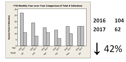
Because of a growing movement in the health insurance industry toward not reimbursing hospitals for any expenses caused by a system-acquired infection, one health system made efforts to improve its infection rate starting in the last quarter of 2016. In June 2017, a year-over-year graph was presented to show progress to date.

ADVERTISEMENT

Despite the impressive progress, there was obviously more work to do to eradicate these “should never happen events”:

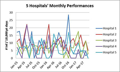
The system consisted of five hospitals, and one analyst discovered monthly data for each all the way back to January 2015. He created the following graph (that I have dubbed a “copulating earthworm graph”), which for some strange reason executives (and many analysts) seem to love:

 …

Want to continue?
Log in or create a FREE account.
Enter your username or email address
Enter the password that accompanies your username.
By logging in you agree to receive communication from Quality Digest. Privacy Policy.
Create a FREE account
Forgot My Password

Comments

Submitted by Dr Burns (not verified) on Thu, 03/22/2018 - 20:20

XmR as a replacement

"Thus, if you do not have advanced degrees in statistics, or if you simply have a hard time
determining if your counts can be characterized by a Binomial or a Poisson distribution, you can
still verify your choice of specialty chart for your count-based data by comparing the theoretical
limits with the empirical limits of an XmR"  - Dr Wheeler

chart.

  • Reply

Add new comment

Image CAPTCHA
Enter the characters shown in the image.
Please login to comment.
      

© 2025 Quality Digest. Copyright on content held by Quality Digest or by individual authors. Contact Quality Digest for reprint information.
“Quality Digest" is a trademark owned by Quality Circle Institute Inc.

footer
  • Home
  • Print QD: 1995-2008
  • Print QD: 2008-2009
  • Videos
  • Privacy Policy
  • Write for us
footer second menu
  • Subscribe to Quality Digest
  • About Us
  • Contact Us