Body
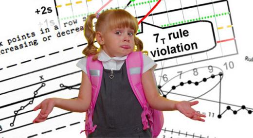
There are many control chart rules to detect special causes (i.e., out-of-control conditions). Although most of these rules are clear, the one that seems to befuddle most people is the rule about trends. Is it six points (including the first point), six points (excluding the first point), or seven points including the first point? Confusing, isn’t it? The goal of this article is to identify the usable answer to this question. But first, it might be interesting to take a look at the various rules proposed over the years.
|
ADVERTISEMENT |
Western Electric
The original Western Electric rules1 did not include a trend rule. These four rules compare a series of points in the data set to zones created by the 1, 2, and 3 sigma lines.
…
Want to continue?
Log in or create a FREE account.
By logging in you agree to receive communication from Quality Digest.
Privacy Policy.
Comments
Rule 4 or Rule 5
In the example for Figure 4 and 5 you cite the Trend rule (5) as the reason to review the limits of the process and adjust them. Isn't the real indicator a long-term shift below the calculated mean line of the process? Rule 4 is the one that indicates a major process shift in this case.
Also in all the examples that you cite as references you seem to have over looked the ISO series on control charting (ISO 7870-1-9). This series provides excellent guidance on the usage and development of control charts for many applications.
Trends Signal Process Shifts Too
First, I doubt that a 21-page, $120 ISO standard will shed any startlingly new clarity on control charts that is not contained in the references cited.
Second, I will argue that a trend signifies a process shift just as much as a run of 8 points below the center line. If patient falls started increasing, any hospital CEO worth his or her salt wouldn't wait for a run of 8 points above the centerline to take corrective action.
The goal of any control chart is to tell a story—one of concern (instability), stability or one of improvement. This example shows the improvement in a way that can be easily grasped by anyone.
It is possible that if the
It is possible that if the 21-page, $120 ISO standard was used the UCL and LCL wouldn’t have changed between Figures 4 and 5. No out of control point for 2019/06/30 in Figure 5. Also how can the process be stabilized after only 6 or 7 points? Don't you need to have more data to show the process is now in control at the ’new’ limits?
Trends signal process shifts
Every reference cited says the same thing as the ISO standard. That's great when you are working on a manufacturing line and sampling data every hour. You get results in a day or less. I can understand that point of view.
In service industries, some indicators, such as Falls per 1000 Patient Days are tracked weekly or monthly. Service industries can't wait eight months to take corrective action when an indicator goes wrong, nor should they wait eight months to declare improvement.
While you are arguing the letter of the law developed for manufacturing over the last century, I believe that we can use the intent of the law for services. Since most people work in service industries, we need rules that work for them as well.
The limits still changed
The limits still changed bewtween Fig 4 and 5 and an out of control point suddenly was ok.
Why not follow a standard so that all service industries are using the same terms and defintions? You wouldn't have this issue about fence posts vs. fence sections.
Still I guess a trend of 5 points in a downward direction is a start in testing for assignable cause. Your example took 6 months to see if the the new process change worked. Would another way of measuring improvement have been faster? What if the new process failed?
Work with the data you have
Yes, it would have been nice to know the results faster. In this case I was just working with the data available.
A g Chart of time between patient falls (instead of falls per 1000 patient days) might have demonstrated the change faster, but that data was not available.
Again, I'm not overly concerned with whether people use the trend rule or not. If they do, I'd like them to apply it correctly.
Counting points - the fencepost problem
Fun with integer math. Do we count the fenceposts, or do we count the fence sections built on those posts? A 1-D fence needs one more fencepost than fence sections.
So is the trend rule that we need 6 fenceposts or 6 fence segments?
"six consecutive points increasing or decreasing" implies that we need 6 fence segments since it's the fence segments (line segments connecting points) that can have increasing or decreasing slopes. But common usage is to use 6 fenceposts (points).
Fence Posts
Nelson counted posts, not segments.
KEEP IT SIMPLE
Dr Wheeler explains why you only need [Western Electric] Rule #1 here:https://www.qualitydigest.com/inside/statistics-column/when-should-we-u…
KEEP IT SIMPLE
Dr Wheeler explains why you should only use Rule #1https://www.qualitydigest.com/inside/statistics-column/when-should-we-u…
Montgomery makes a mess of Process Behavior Charts. They are NOT probability charts.
https://www.linkedin.com/pulse/control-charts-keep-simple-dr-tony-burns/
It's not about what rules to use
This article is about what is the correct way to interpret the trend rule, not about which rules you choose to use. That's up to you and your customer.
The Western Electric Zone
The Western Electric Zone Tests includes 8 successive points on the same side of the central line. In the example there are 7. But these are man-made rules that the underlying process does not care about. Maybe your conclusion about a real change would have been reasonable after only 4 successive points!
Most important rule is to understand the data in its context. In the example given, the conclusion would likely have been the same with or without the extra trend rule. It then becomes unclear why the extra rule would do anything else than add complexity and increase the number of false signals.
What about consecutive equal points in the midst of a trend?
Thank you for this post! I appreciate how you highlighted that different industries may need to use different standards. One question I've been struggling with is how to handle consecutive equal values that occur within a trend. This can be seen in the first circled trend of your Figure 2. In that example, observations 5 and 6 both have a value of 15, but the lack of change did not interrupt the trend. How do you think it affected implementation of the six consecutive points rule? Should the count pause while the values stay the same and then resume if the points keep going up after the period of no change? In Figure 2, that would mean that at least two more points were required before a trend could be identified.
Trend Rules in Control Charts
So what is the high level question being asked here? Isn't it something like "how likely is the observed behavior of X consecutive data points given the assumption that they are randomly pulled from some probability distribution that is representative of a stable process for this parameter?"
If the above is the case, then shouldn't something like a properly configured runs test give a likelihood of the observed sequence of X data points? We would set what level we'd like the ARL(0) to be, say 0.0028.
I feel like maybe I'm missing something here.
To me, the first thing to do is to see if the data appears to be random. If not then look for the non-randomness?
Thanks,
Dan
Add new comment