PROMISE: Our kitties will never sit on top of content. Please turn off your ad blocker for our site.
puuuuuuurrrrrrrrrrrr
Davis Balestracci
Published: Monday, May 15, 2017 - 11:03 Don’t tell me you’re not tempted to look when you spot a magazine cover saying, “How does your state rank in [trendy topic du jour]?” Many of these alleged analyses rank groups on several factors, then compare the groups’ sum totals of their respective ranks to make conclusions. For example, in 2006, I was at a presentation by someone considered a world leader in quality (WLQ) who has been singing W. Edwards Deming’s praises since the late 1980s. He presented the following data as a bar graph, from lowest score to highest. 
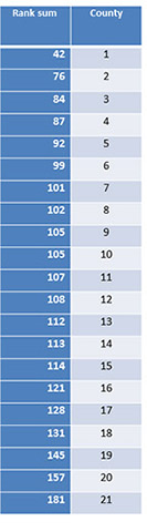
It is the sum of rankings for 10 aspects of 21 counties in a small country’s healthcare system (considered to be on the cutting edge of quality). Lower sums are better: minimum = 10, maximum = 210, average = 10 x 11 = 110. My antennae went up. A bar graph? With absolutely no context of variation for interpretation? And a literal interpretation of the rankings? What’s wrong with this picture? I wanted to use one of my favorite techniques, analysis of means (ANOM), to take a systems view of things. When looking at improvement opportunities, the mindset must change from comparisons of individual performances to comparison of individual performances relative to their inherent “system.” I wrote to him for the data, and he graciously complied. There’s a statistical technique known as the Friedman test, where it is legitimate to perform an analysis of variance (ANOVA) using the combined individual sets of rankings (not shown) as the responses. I won’t bore you with the details, but the p-value of this analysis was < 0.001, so there’s little doubt that there is indeed a difference among counties. Now... which ones? (If you’re interested in the statistics involved, click here.] From the ANOVA, one can calculate what is called the “least significant difference” (LSD) between any two summed scores due to common cause, which in this case was 51. Because of the potential of 220 potential pairwise comparisons, one can also calculate a more conservative difference to take this into account, which results in a difference as high as 91 being possible common cause. Given the rankings and results of the two calculations above, suppose there was a subsequent meeting to discuss the rankings, possibly revise them, and then decide on how to take action. Oh, and those two calculated differences aren’t worth very much. Consider these counties as a “system” and use ANOM. The results are shown below (overall, p = 0.05 and p = 0.01; the reference lines are drawn in). Note that the points aren’t connected, and the horizontal axis order has no time element. I chose to display them from the smallest score to the largest. W. Edwards Deming hated probability limits and would just use his mentor Walter Shewhart’s recommended limits of “three” standard deviations (as in the red bead experiment comparing workers). In this case, it’s 110 +/– 55 (55 to 165), neither a whole lot of difference in limits from the ANOM nor change in the conclusions. The statistical interpretation: In The New Economics (MIT Press, second edition 2000), Deming shows a similar chart and comments about the performance equivalent of counties two to 20: These cannot be ranked. I once analyzed a similar state ranking. There were two states truly above average, two below average, and 46 states were indistinguishable. Discussions on data like these involve a lot of talk about quartiles, top or bottom 10 percent, and above- and below-average performances. Sound familiar? (Healthcare folks: Press-Ganey reports?) These special cause strategies are fruitless. But perhaps clusters resulting from a common cause strategy of color coding by geography might be useful? When I shared this analysis with the WLQ, I was shocked at his response. Our verbatim email correspondence follows. World leader in quality: “A subtle issue you did not tackle is the political-managerial issue of communicating such insights to [the two special cause counties] and the counties that thought they were ‘different,’ but, statistically, aren’t. I wonder what framework one could use to approach that psychological challenge.” Davis: “As I say to my audiences, ‘Hey, I’m just the statistician, man!’ “I’m going to be very hard on you here, but I think the issue is how people and leaders like you are going to facilitate these difficult conversations... which will be profoundly different... and productive! This is the leadership that quality gurus keep alluding to... and seems to be in very short supply. “My job is to keep you all out of the ‘data swamp’; however, I would be a very willing participant. I have a saying, ‘I’m the statistician; I know nothing. You’re the [leaders]; you know too much. That makes us a great team!’ “And I would love to pilot some of these types of analyses with you or other leaders. We need to figure out what this process should be. This is potentially very exciting and could quantum-leap the quality improvement movement. “My point is that this ‘language’ needs to be a fundamental piece of any improvement process... and led by leaders who understand it and are now promoted into positions of leadership only if they understand it. If this could become culturally inculcated, then the ongoing daily defensiveness reacting to data stops... PERIOD! “The discussion will then focus, as it should, on process. “I am seeing far too much concern about ‘hurting people’s feelings.’ This would change that as well as result in having conversations leading to appropriate action. “That’s what I’ve been saying the last few years: We need new conversations... and this could be a key catalyst.” WLQ: “Nope. I don’t buy it. Yes, I am a leader and need to carry the message. But I know you too well to let you off the hook. I’d love to see you try to lead these conversations and experiment with approaches. You’re a leader, too.” Davis: “Give me an opportunity, and I will do my best to lead that conversation (and feel that we could begin by co-facilitating it). Have you fathomed the potential of this?” That last email has never been answered. Here it is, 10 years later, and several follow-up gentle email reminders have been ignored. I’m still waiting for that promised exciting opportunity, but I’ve given up any hope. And I’ve had no more luck persuading any other leader to give it a try. At his insistence, I sent the analysis with explanation to the original executive group that collected and summarized the data. No reply. I’ve done several grand rounds for various groups of doctors. When I explain ANOM and “plot the dots,” just about every audience has said, “This makes sense! If data were presented this way, we would take care of it ourselves.” Doctors and hospitals especially are currently being victimized left and right with inappropriate analyses and rankings by statistical “hacks” (Deming’s term). Many of these have major influence on reimbursement. One common criterion is to penalize anyone falling into the bottom quartile of performance! Given a set of numbers, aren’t 25 percent of them naturally in the bottom quartile? I’ve even seen criteria using even one standard deviation (usually calculated incorrectly) to find those “outliers.” In the data above, the resulting range (~92 to 128) would add three additional counties each to the already declared “above” and “below” average counties. Is it any wonder why physicians are so angry? How much variation would be reduced if ANOM could be standardized as an analysis? A side benefit: Rather than focusing just on rank, the exposure of variation in performance could result in nondefensive conversations to reduce inappropriate and unintended variation. (By the way, WLQ is a physician.) Many of this example’s statistical principles are what Deming demonstrated in his seminars (and, yes, the red bead experiment is an ANOM). After 30+ years of trying to teach similar things, I’m still amazed at the abject cowardice (yes, cowardice!) and resistant bluster I see in (alleged) leaders abdicating their responsibility to comprehend the transforming, liberating power of a simple, basic understanding of variation. Deming had zero tolerance for such ignorance (or is it arrogance?). Is that too much to ask of someone making a six- or seven-figure salary whose actions affect the five-figure salary folks? Amusing note: My own state of Maine had a panicked headline in the newspaper a couple of weeks ago: “Maine’s ranking drops from 13th to 17th” in something or other, and the explanations and excuses started flying. I wonder on whom the blame finally fell? In how many meetings does this nonsense go on with their accompanying, staggering “unknown or unknowable” costs? Quite frankly, many people who think they “get” Deming’s message don’t. To deeply understand the message and its power has taken me more than 30 years... and I don’t do red bead experiment demonstrations (but WLQ still does). Quality Digest does not charge readers for its content. We believe that industry news is important for you to do your job, and Quality Digest supports businesses of all types. However, someone has to pay for this content. And that’s where advertising comes in. Most people consider ads a nuisance, but they do serve a useful function besides allowing media companies to stay afloat. They keep you aware of new products and services relevant to your industry. All ads in Quality Digest apply directly to products and services that most of our readers need. You won’t see automobile or health supplement ads. So please consider turning off your ad blocker for our site. Thanks, Davis Balestracci is a past chair of ASQ’s statistics division. He has synthesized W. Edwards Deming’s philosophy as Deming intended—as an approach to leadership—in the second edition of Data Sanity (Medical Group Management Association, 2015), with a foreword by Donald Berwick, M.D. Shipped free or as an ebook, Data Sanity offers a new way of thinking using a common organizational language based in process and understanding variation (data sanity), applied to everyday data and management. It also integrates Balestracci’s 20 years of studying organizational psychology into an “improvement as built in” approach as opposed to most current “quality as bolt-on” programs. Balestracci would love to wake up your conferences with his dynamic style and entertaining insights into the places where process, statistics, organizational culture, and quality meet.Understanding Variation
Can we please stop the obsession with rankings and percentiles?
The process-oriented approach
• There is one outstanding county (No. 1)
• One county is indeed “below” average in performance (No. 21)
• The other 19 counties are, based on these data, are indistinguishable Did he ‘get it?’
A serious consequence for healthcare
A basic Deming principle still fiercely resisted
Our PROMISE: Quality Digest only displays static ads that never overlay or cover up content. They never get in your way. They are there for you to read, or not.
Quality Digest Discuss
About The Author
Davis Balestracci
© 2023 Quality Digest. Copyright on content held by Quality Digest or by individual authors. Contact Quality Digest for reprint information.
“Quality Digest" is a trademark owned by Quality Circle Institute, Inc.
Comments
Excelent
Saludos desde México
Meaning
Numbers don't mean much without an understanding of what they mean. Exactly what is being "ranked" here?
What was being ranked?
Your guess is as good as mine -- the speaker never said. But, I'm sure they were VERY important things :-)
And that's another point I could make -- how do they actually define the things they rank? It's all so "vague" -- and most analyses I've done like this exhibit the inevitable resulting wide variatiion.
But people do love those rankings!
Sad "state of affairs"
Your article on Understanding Variation included the following sentance: "I once analyzed a similar state ranking. There were two states truly above average, two below average, and 48 states were indistinguishable."
Unless you are including some of the US Territories, having two states above average and two below average, wouldn't there be "46" states being indestinguishable.
I never comment on statistical evaluations, but I guess there's a first tme for everything. Since I was born in 1948, I can recall a time when 48 states would be indistinguishable....
Hey -- I'm a statistician...
...I deal in variation. Plus or minus two isn't so bad.
Thanks for noticing my brain flatulence -- it should be 46.