I live with a German national, who often tells me that we Americans spend way too much of our lives at work. He also frequently comments that we work much less efficiently than Germans do, during the increased time we’re at work.
ADVERTISEMENT |
Which reminds me—I need to pay my water bill online....
OK, I’m back. Quick, wasn’t it? So convenient. Now, where was I? Oh, work habits.
After checking the hourly weather forecast, I created this bar chart in Minitab, using international labor data from the Organisation for Economic Co-operation and Development (OECD).
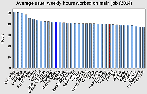
These data seem to indicate that Americans generally work longer weekly hours than many western Europeans, including Germans. But we’re not the extreme. We work fewer weekly hours, on average, than workers in many other countries, including Colombia, Turkey, and Costa Rica.1
What about the actual number of hours worked over the entire year?2 You can use a time series plot to show trends for each country.
Yikes! The complete data set with all the OECD countries really gums up the works.
Graphic overload? Subset the worksheet!
If you’ve been busy working (and/or reading LeBron James tweets), you might not know that Minitab now has a much quicker, easier way to subset data in version 17.3. This new interface feature is a godsend when you want to quickly graph only selected portions of a very large data set, without having to manually delete values in the worksheet or set up unwieldy formulas in the Calculator to define the values.
With the worksheet active, choose Data > Subset Data. Now just check the values for the data that you want in the new worksheet.
Then use the new worksheet to re-create the graph.
In this subset of nine countries, Germany (green diamonds) is the lowest series at the bottom, with the fewest annual average hours per worker. So there seems to be credence to what I’ve been hearing. The United States (green squares) is once again somewhere in the middle, almost identical with Japan. Mexico (yellow triangles) is the highest series on the graph, with the most annual average hours per worker.
The plot shows some interesting trends. During the early 2000s, Mexico and Chile were nearly the same. But the average annual hours of workers in Chile has decreased steadily during the last 10 years, while Mexico has remained almost the same. Also, many countries (particularly Ireland, Japan, and Germany) show a pronounced dip in average annual hours starting at about 2007–2008, which corresponds with the global recession.
Does increased work hours translate into increased production output? To explore this, I graphed GDP per capita for each country in relation to the average annual hours worked.3
Surprise! Generally, the fewer the hours worked, the greater the gross domestic product per capita. Now, here’s a thought. If your boss doesn’t know much about statistics and the relationship between correlation and causation, show this scatterplot to her. Then ask that your workload be reduced to boost company productivity.
While you’re waiting for your boss’s response, take a look at where Germany and the United States fall on the plot:
Finally—some good news for seemingly overworked Americans. Compared to other countries, our GDP per capita is much higher than expected based on the number of hours that we work. It would be nice to say that’s because we're so incredibly efficient and productive.
But, alas, GDP per capita is a tricky metric, heavily influenced by things like oil production, foreign investment, financial services, and so on, and not a direct indicator of worker efficiency. And even if some causal relation did exist between the two variables, it could be that a higher GDP per capita leads to reduced work hours, not the other way around.
So, obviously, a lot of follow-up research and statistical analysis is needed to flush out preliminary results from these exploratory graphical analyses. But I’ve already spent hours and hours and hours working on this post. So I don’t have time to investigate this further.
Can you find other data online that support or contradict these results? (While you're there, check out these hilarious animal reactions to mirrors on YouTube....)
Notes
1. These averages reflect only full-time (≥30 hours a week) and dependent employees (i.e., those working for a company, government, or institution)—not the self-employed. Also, they only track hours worked on a main job. The OECD did not have complete 2014 data on usual weekly hours worked for all the countries in its organization, including Japan, Korea, Russia, Canada, and Brazil.
2. Some of these data were collected by the OECD from different sources. Therefore specific, direct comparison for a given year between two countries may be misleading. The OECD recommends evaluating overall results and trends in the data.
3. The data for Luxembourg was excluded from the graph because it was an outlier with high leverage that was not representative of OECD countries.
If GDP per capita were actually a direct indicator of worker efficiency (which it isn’t), then the Luxembourgers would have top bragging rights for the global Nose-to-the-Grindstone Award. They have the world’s highest GDP per capita, despite being on the lower end of average annual work hours.
Add new comment