Featured Product
This Week in Quality Digest Live
Statistics Features
Scott A. Hindle
Part 4 of our series on SPC in the digital era
Donald J. Wheeler
What are the symptoms?
Douglas C. Fair
Part 3 of our series on SPC in a digital era
Scott A. Hindle
Part 2 of our series on SPC in a digital era
Donald J. Wheeler
Part 2: By trying to do better, we can make things worse

More Features

Statistics News
How to use Minitab statistical functions to improve business processes
New capability delivers deeper productivity insights to help manufacturers meet labor challenges
Day and a half workshop to learn, retain, and transfer GD&T knowledge across an organization
Elsmar Cove is a leading forum for quality and standards compliance
InfinityQS’ quality solutions have helped cold food and beverage manufacturers around the world optimize quality and safety
User friendly graphical user interface makes the R-based statistical engine easily accessible to anyone
Collect measurements, visual defect information, simple Go/No-Go situations from any online device
Good quality is adding an average of 11 percent to organizations’ revenue growth
Ability to subscribe with single-user minimum, floating license, and no long-term commitment

More News

David Currie

Statistics

Metrics: The Good, the Bad, and the Ugly

Part two: the bad

Published: Monday, November 12, 2018 - 12:02

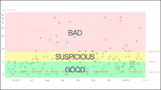
This is the second article in a three-part series to help readers distinguish good metrics from bad. In part one we discussed good metrics. Here, we will look at a bad metric and consider how to change it into a useful, good metric. A bad metric is one that fails in one or more of the attributes of a good metric and is often not usable for the purpose it was intended.

Attributes of a good metric

A good metric:
• Supports the goals and objectives of the quality system
• Contains data with sufficient detail to allow analysis of specific defects
• Contains data that have been carefully collected, and checked for accuracy and completeness
• Contains data that are combined in a way that clearly represents the process
• Uses a data-collection process that is clearly understood
• Demonstrates a clear relationship between the process and the data being used
• Has a metric-review interval that matches the response time for corrections
• Results in process improvement and overall cost savings

I have seen many bad metrics that logic suggests should be good. The No. 1 cause of a bad metric is that there is not a clear relationship between the process and the data being used. As an example, let’s look at a common metric used in many organizations, the “scrap report.” 

The scrap report is typically an accumulation of costed scrap dollars that comes from accounting. In some facilities the quality group has a regular meeting to review scrap information and the corresponding actions that have been taken to improve the results. The reviewer’s expectation is that specific actions should result in a reduction of scrap at the next review interval. If an organization produces limited product that runs a single production line continuously, a review interval of a week or month might be appropriate, because the scrap report would reflect changes in the single-production process very closely.

The problem is that most manufacturing organizations produce multiple products, using many processes to produce each item. How many, you ask? Let’s look at a specific example. During my last employment, we manufactured tool boxes, large tool boxes. There were 159 distinct models produced. Each model had an average of 18 different purchased parts and 32 different manufactured parts. Each manufactured part could entail up to three distinct manufacturing processes and three individual handling steps. Additionally, each end item had been through a minimum of five welding processes, nine cleaning process, a powder coat process and cure, along with six assembly processes. All told, each model produced was the composite of 232 different processes (assuming the purchased parts could be considered a single process). Now we didn’t build all 159 individual models each month. Most months we built only 50.

So that means in a month’s time, we had an average of 50 × 232 = 11,600 processes, out of the available 36,888, processes contributing to the monthly scrap number. This means that in order to make a 1-percent improvement in scrap cost, the quality department would need to be able to predict 116 processes that would be run during the next month and completely eliminate all scrap in those 116 processes. Impossible! Most quality organizations only have sufficient manpower to work up to six processes in a single month.

With all of that going on, true improvements in scrap reduction are like shovelfuls of sand on a beach. You just are not going to see it in a weekly, monthly, or even annual review.

So how do we convert this situation to a truly successful metric?

First, use the scrap report to identify up to six (or whatever is workable with available resources) specific areas for improvement. Track the scrap for these items from the previous 12 months. These should be the top six high-scrap dollar processes during the last year. Document the potential savings per year. This is important because the effort to investigate the scrap causes, identify corrective actions, and implement them should not exceed this dollar amount; otherwise, the effort is wasted. Then, each month track the cost of scrap for the processes under investigation and the dollars spent on improvement. As each month progresses, determine if additional projects can be added to the total projects being worked. Keep a running 12-month total of scrap dollars on each project item. Now you have a metric that demonstrates a clear relationship between the process and the data being used. Along the way, you may even find data collection errors, or items scrapped because there was no better way to remove them from the accounting system. Some improvements may involve more accurate data collection and reporting.

Do you have a metric that logically should improve but just doesn’t? Perhaps it is a bad metric, or even worse. Be sure to read the final article in this series, which descibes a downright ugly metric, one with no hope for conversion.

Discuss

About The Author

David Currie’s picture

David Currie

David Currie is a quality professional with a broad background of experience in the nuclear (ANSI N45.2), commercial (ISO 9001), automotive (QS-9000), aerospace (AS 9100), and defense (MIL-Q-9858) quality systems.