Most data in business and industry belong to the category known as observational data. These data are the voice of your processes because they are the result of ordinary operations rather than an experiment.
|
ADVERTISEMENT |
Because the purpose of analysis is insight, the question is how to analyze observational data to gain insight into your processes. Here, we’ll illustrate three approaches to answering this question. Everyone who uses observational data needs to understand the differences between these approaches.
Description
The first approach is description. This uses the descriptive statistics and histograms taught in introductory classes in statistics. For our example, we’ll use the 200 observations listed in Figure 1.

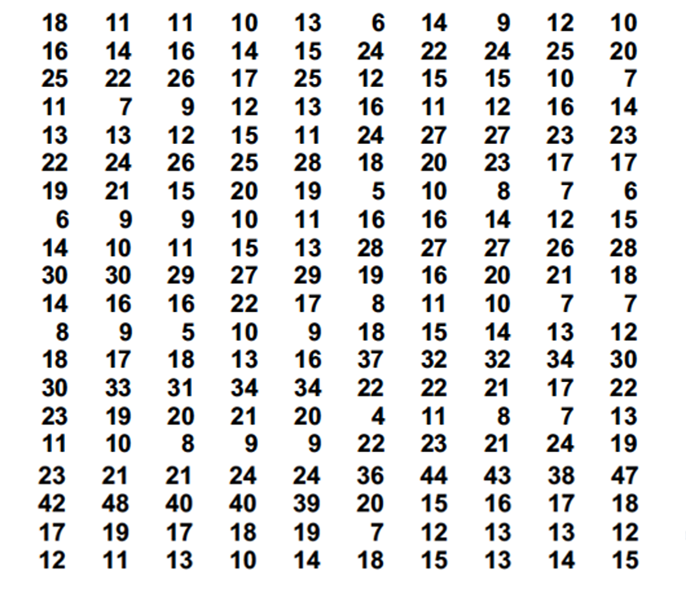
Figure 1: 200 original observations X
The basic descriptive technique is to collect all the data into a histogram and compute the basic properties of the data set as a whole. The minimum value is 4, the median is 16, and the maximum value is 48. The average for the histogram in Figure 2 is 18.24, and the standard deviation statistic is 8.77.

Figure 2: Histogram of original observations X
The standard deviation characterizes how the data cluster around the average. This clustering is explained by the empirical rule, which tells us to expect 60% to 75% of the data within one standard deviation of the average. For these data, this interval is 9.47 to 27.01, and we find 147 (73.5%) of these observations in this interval.
The empirical rule also tells us to expect 90% to 98% within two standard deviations of the average. This interval is 0.70 to 35.78, where we find 189 observations (94.5%).
Finally, the empirical rule tells us to expect 99% to 100% within three standard deviations of the average. This interval is –8.07 to 44.55, where we find 198 observations (99%). So even though this histogram is skewed, it fits in with the rather broad expectations for a typical, unimodal histogram.
If the 200 values represent all of the product produced during this production run, then our description is complete. The 200 values are fully summarized by the descriptive statistics. But if the 200 values represent only a portion of the product stream, we may want to extend our description to cover the product not measured.
To extrapolate from the 200 observed values to a description of the 20,000 parts produced during this production run, we use interval estimates (also known as confidence intervals).
A 95% interval estimate for the average of all the product produced during this production run would be 17.01 to 19.46.
With specifications of 0 to 30, we find 9.0% nonconforming in the 200 parts measured. Based on finding 18 nonconforming out of 200, our 95% interval estimate for the fraction nonconforming among the 20,000 parts of this production run is 5.7% to 13.9%.
The performance index, Pp, computed from these 200 data is 59%. For the 20,000 parts as a whole, our 90% interval estimate for the performance index is 54% to 64%. The centered performance index, Ppk, for these 200 data is 47%. For the run as a whole, our 90% interval estimate for Ppk is 42% to 51%.
So, after describing these data, what do you tell the managers? Just that they will need to continue as in the past: In the words of Joe Druecker, they get to “Run... sort... pray!”
A critique of description
The descriptive approach is built on the assumption that the data are homogeneous. It is this homogeneity that makes the descriptive statistics meaningful. When the data are a mixture of apples and oranges, the average doesn’t summarize either group. Likewise, a histogram is intended to show how a set of homogeneous data varies. If a histogram is a collection of data representing unlike things, it tells us nothing about any one group of things.
Moreover, the extrapolation from the data to the product not measured is built on the assumption of homogeneity for both the data and the concurrent product. This is the basis for using interval estimates. If the assumptions of homogeneity are not correct, the descriptive approach becomes deceptive and misleading. It may describe some aspects of the past, but it’s unlikely to represent the future.
Modeling
Some data analysts seek to generalize observational data by finding a probability model that fits the histogram. Since our histogram is skewed, we’ll want to use a skewed probability model to characterize the process. And a family of skewed distributions preferred by many statisticians is the family of lognormal distributions. If these data might be reasonably modeled by a lognormal distribution, we can use the descriptive statistics from the histogram to estimate the two parameters for the lognormal model.
The scale parameter, alpha, may be estimated by the median of the original data. Here the median is 16, and so we estimate alpha = 16.
The shape parameter, beta, may be estimated according to the formula:

So we divide the average for the histogram by the median for the histogram, find the natural logarithm, multiply by 2, and take the square root to find an estimate of beta. For our data, this operation gives an estimate of beta of 0.511. So here we might use a lognormal (16, 0.5) model. This model is plotted on top of the histogram in Figure 3.

Figure 3: Original observations X with lognormal (16, 0.5) model
The advantage of having a lognormal model for our data is that we can compute probabilities using a standard normal distribution. Specifically, the probability that the lognormal variable X is less than some value X = x is the same as the probability that a standard normal variable, Z, is less than the value Z = z where:

So that

For example, using the upper watershed specification limit of 30.5, we might estimate that this process is likely to produce 9.85% nonconforming:

In the same way, we could compute a customized upper “control” limit for this process that would cover 99.7% of these observed values:

So we might predict that virtually all of the future values should fall between zero and 63.3 unless something changes in this process.
Thus, our model allows us to compute more precise values than we can compute based on the histogram alone. So now that we have a model for our process, what do we tell the managers? With 9% nonconforming, they will need to continue to run... sort... pray!
A critique of modeling
When we wrap up our observations inside a probability model, we no longer have to work directly with the raw data. As a result, the estimates based on the model will seem more precise and more robust than those obtained from the raw data. However, nothing in the process of fitting a model to the data does anything to reduce the uncertainties of the extrapolation from the data to the product not measured. Whether we report 9% or 9.85% nonconforming, the uncertainty is still 5.7% to 13.9%. The appearance of greater precision for the model-based estimates is an illusion created by writing extra decimal places.
Moreover, the upper bound on routine variation of 63.3 is an extrapolation beyond the data. Consequently, it’s a function of the model used rather than being a characteristic of the data themselves. Change the model, and you will change the estimated upper bound.
When we use a model to describe the process, we’re making two extrapolations. First, we’re assuming the observations represent the product that was not measured, and then we’re assuming that the model represents the product not yet produced. These extrapolations assume that the data are homogeneous internally, that they are homogeneous with the data stream, and that the process itself is homogeneous (i.e., unchanging) over time.
So the modeling approach seeks to generalize the observed data using a mathematical model. But this generalization is built on assumptions that are never explicitly stated nor examined for validity. While complexity may seem more profound than simplicity, it may more easily go astray and get the wrong answer.
Characterization
Observational data occur in time, and so they’ll almost always have a time-order sequence. Both the description approach and the modeling approach ignore this time order.
When we take the time-order sequence into account, we can characterize the process behavior. The data of Figure 1 are written in time order in rows. If we use this time order to organize these data into 40 subgroups of size five and create an average and range chart, we get Figure 4.

Figure 4: Average and range chart for original data
Clearly, this process was subject to oscillations, and the oscillations seem to have been getting more extreme. The short-term variation represented by the limits is dramatically less than the overall variation seen in the running record of averages. At this point, it doesn’t matter what the descriptive statistics happen to be. It doesn’t matter what the shape of the histogram may be. And it doesn’t matter what probability model we might use. The only question that matters here is, “What is causing the process to oscillate?”
The lack of homogeneity makes computations and models irrelevant. Effects have causes, and action is required to discover those causes. Unless and until the assignable cause of the process oscillation is discovered and controlled, this process will not operate anywhere near its full potential.
But how do we do this? Aristotle told us that the time to discover the causes that affect a system is to look at those points where the system changes. And a process behavior chart facilitates this search by highlighting process changes.
Moreover, a process behavior chart will also allow us to approximate what our process might look like when operated at full potential. We begin by estimating the process standard deviation using the short-term variation shown on the range chart. The average range of 5.40 results in an estimated process standard deviation of 2.32 units (rather than the 8.77 units found earlier). If we get the process average near the target value of 15, the empirical rule tells us that we could expect virtually all of the product to fall between 8 and 22.
So, after characterizing these data, what do you tell the boss? Find what’s causing the oscillation, and we can run this process so that it will produce 100% conforming product. No sorting needed. No prayers required. Just make it and ship it.
Figure 5 shows what this manufacturer was able to accomplish by identifying and controlling the previously unknown cause of the process oscillations.

Figure 5: Predictable operation vs. the original data
Summary
All data are historical. All analyses of data are historical. Yet management requires prediction. Prediction requires extrapolation. Extrapolation requires homogeneity. And the most useful information regarding homogeneity is contained in the time-order sequence of the data.
The descriptive approach ignores the time-order sequence and simply seeks to summarize the past. It can do no other. The modeling approach ignores the time-order sequence and provides a complex way to describe the past. It can do no other.
If the data happen to be homogeneous, the past may describe the future, and the descriptive and modeling approaches may work. However, in my 56 years of experience, I have found observational data to be homogeneous only about 1 time in 10.
The only approach that examines the data for the homogeneity needed for the extrapolations to be reasonable is the process behavior chart approach. When the chart shows points outside the limits, the requisite homogeneity is missing, and prediction is just wishful thinking. Actions are required to get the process to operate predictably and, by highlighting the points where the process changes, the process behavior chart gives you clues as to what actions to take. The inevitable results of finding and controlling assignable causes of exceptional variation are increased quality, increased productivity, and improved competitive position.
The alternative is: Run... sort... pray!
Donald J. Wheeler’s complete “Understanding SPC” seminar may be streamed for free; for details, see spcpress.com.

Add new comment