PROMISE: Our kitties will never sit on top of content. Please turn off your ad blocker for our site.
puuuuuuurrrrrrrrrrrr
Donald J. Wheeler
Published: Tuesday, January 6, 2015 - 15:24 Whenever the original data pile up against a barrier or a boundary value, the histogram tends to be skewed and non-normal in shape. In 1967 Irving W. Burr computed the appropriate bias correction factors for non-normal probability models. These bias correction factors allow us to evaluate the effects of non-normality upon the computation of the limits for process behavior charts. To understand exactly what these effects are, read on. Before we can discuss the computation of limits for non-normal probability models, we will need to have a way to quantify the uncertainty in the computed limits. The curve that does this is given in figure 1. This curve involves two quantities that require some explanation: The first of these is the degrees of freedom for the limits, and second is the coefficient of variation for the limits. Figure 1 shows that as the degrees of freedom increase, the coefficient of variation will decrease. However, the relationship is very nonlinear, with the first few degrees of freedom accounting for the greatest reduction in the coefficient of variation. As the names suggest, the degrees of freedom is tied to the amount of data used, while the coefficient of variation is a measure of the uncertainty in the computed limits. The exact natures of these two quantities will be discussed below, but the shape of the curve in figure 1 tells us that the first 10 degrees of freedom are critical, and that when we have 30 to 40 degrees of freedom the coefficient of variation will have fairly well stabilized. For an Average and Range Chart with limits based on k subgroups of size n, the Average Range could be said to be based on a total of nk data. However, because of various properties of subgroup ranges, a slightly different characterization of the amount of data used in the computation is preferred. This characterization is called the effective degrees of freedom, and for the average of k subgroup ranges, where each range is based on n data, this quantity is given by: where d2 and d3 are the bias correction factors for subgroups of size n. While the expression above is relatively simple, it is common to use some even simpler approximations in practice: The degrees of freedom for the limits will be the same as the degrees of freedom for the Average Range used to compute those limits. So, for example, the limits for an Average and Range Chart based on 25 subgroups of size 2 would be said to have about 22 degrees of freedom. For an XmR chart there is a different formula for degrees of freedom. When using (k–1) two-point moving ranges to compute an Average Moving Range the degrees of freedom will be: For routine use a simple approximation for this quantity is: Thus, the limits for an XmR chart with a baseline of k = 50 data would be said to have about 30 degrees of freedom. When working with variables having a fixed zero point it is common to divide the standard deviation by the mean and to call the result the coefficient of variation. For the Average Range, based on k subgroups of size n: The coefficient of variation is not affected by linear transformations. This means that the coefficients of variation for the three-sigma limits will be the same as the coefficient of variation for the Average Range used to compute those limits. The coefficient of variation above depends solely upon the bias correction factors d2 and d3 and the number of subgroups used, k. Since these bias correction factors depend upon the subgroup size, n, this coefficient of variation can be seen to depend solely upon the amount of data used, n and k. The subgroup size, n, will fix the values of d2 and d3, so that, as the number of subgroups, k, increases, these coefficients of variation will decrease in proportion to the square root of k. This result supports the intuitive notion that limits which are based on a greater amount of data should be more trustworthy than limits based on a lesser amount of data. Comparing the formulas for the coefficient of variation and the effective degrees of freedom, it seems that there should be some relationship between these two quantities. There is, and it is the curve plotted in figure 1: When we compute limits we naturally want to know how much uncertainty exists in those values. While degrees of freedom are the traditional way of characterizing measures of dispersion, it is the coefficient of variation that actually quantifies the uncertainty in the limits. Therefore, the most straightforward way to characterize uncertainty is to convert degrees of freedom into coefficients of variation using the curve in figure 1 or the equation given above. The relationship shown in figure 1 holds for every estimator of the standard deviation parameter, σ. Because of this, we can compare the efficiency of different estimators by comparing their degrees of freedom. Clearly, the first few degrees of freedom will have the greatest impact upon improving the quality of your limits. In every case, to cut the coefficient of variation in half, you will have to increase the degrees of freedom four-fold. This means that 32 degrees of freedom will only be twice as good as 8 degrees of freedom. Likewise, 128 degrees of freedom will be twice as good as 32 degrees of freedom. Figure 1 makes two lessons plain: Degrees of freedom are a highly nonlinear way of characterizing uncertainty, and diminishing returns set in early. The curve in figure 1 has a 45° tangent somewhere in the neighborhood of 10 degrees of freedom. Thus, the elbow point can be taken to be 10 degrees of freedom. So, how many degrees of freedom do you need? How many do you have? Walter Shewhart suggested that, based on his experience, useful limits could be found using as few as six degrees of freedom. Clearly this is minimal. Also, it should be clear that there is little need to continue to update limits once they have been computed using 30 or 40 degrees of freedom. By using the relationship between degrees of freedom and coefficients of variation summarized by the bullet points above, you can understand when you have soft limits, when your limits are getting firm, and when your limits are solid. Remember, the objective is not to compute the right number, or even the best estimate of the right value, but to take the right action, and you can often take the right action even when the limits themselves are fairly soft. During World War II, in the interest of simplicity, the formulas for computing the limits for charts for location were written using scaling factors such as E2 and A2. These scaling factors minimized the number of computations required, which was important when everyone was doing them by hand. These two scaling factors depend upon the subgroup size and the bias correction factor, d2. The evaluation of the bias correction factors requires the numerical evaluation of a rather messy triple integral. While this is feasible when n = 2, it quickly becomes overwhelmingly tedious for larger subgroup sizes. In 1925 H. C. Tippett avoided this problem by using a simulation study to estimate the values for d2 and a second bias correction factor d3. In 1933 A. T. McKay and E. S. Pearson managed to publish the exact bias correction values for the case when n = 3. By 1942 E. S. Pearson and H. O. Hartley had published the exact bias correction factors for n = 2 to 20. Finally, in 1960 H. L. Harter published the exact bias correction factors out to 10 decimal places for n = 2 to 100. Of course all of these computations were carried out under the worst-case scenario: They used a normal distribution for the original data. Thus, it is a fair and correct statement to say that the normal distribution was used to compute the bias correction factors commonly found in textbooks today. The question here is how much of a restriction does this place upon the charts for location? In 1967 Irving W. Burr decided to compute the exact bias correction values using each of 27 different probability models. These models were all members of the family of Burr distributions, and as such they effectively cover the whole region of mound-shaped probability models. Figure 2 shows six of the models Burr used. Figure 3 gives Burr's exact values of d2 for each of his 27 non-normal distributions. The first row gives the usual bias correction factors found using the normal distribution. As you go down each column you will see the bias correction factors that are appropriate for each of the 27 non-normal distributions. The non-normal values for d2 tend to be slightly smaller than the normal theory values. This is as expected simply because the normal distribution has maximum entropy. Other distributions will result in slightly smaller subgroup ranges. Irving Burr's original idea was that we could use the values in figure 3 to sharpen up the limits by computing the skewness and kurtosis statistics for our data and then choosing appropriate bias correction factors from his table. Unfortunately, in practice, the uncertainty in both the skewness and kurtosis statistics is so great that we can never be sure that our estimates for these shape parameters are even remotely correct. As I showed in "Problems With Skewness and Kurtosis, Part Two," Aug. 2, 2011, any estimate of skewness will have 2.45 times more uncertainty than your estimates of location and dispersion, and any estimate of kurtosis will have 4.90 times more uncertainty than your estimates of location and dispersion. This unavoidable uncertainty in the statistics for skewness and kurtosis is due to their dependence upon the extreme values in the data set. Regardless of how many data you have, you will always know more about location and dispersion than you will ever know about skewness and kurtosis. Until you have thousands of data collected from a predictable process, any use of the skewness and kurtosis statistics is an exercise in fitting noise. This inherent and unavoidable problem undermines Burr's approach. So, even though Burr's idea does not quite work out as intended in practice, we can use the values in figure 3 to assess the effects of non-normality upon the computation of the limits. Up to this point we have treated the bias correction factors as constants. However, since the problem Burr was considering was how to determine the values of these constants, we shall instead look at the bias correction factors as unknown variables that must be approximated. With this change in perspective, the question becomes one of assessing the impact of not knowing the exact value for these fundamental constants. We begin by observing that the d2 bias correction factor always occurs in the denominator of the formulas for the scaling factors above. Thus, we begin by inverting the values for d2 from figure 3. These new values are shown in figure 4. To characterize how the values in figure 4 vary, we compute the coefficient of variation for each column. These coefficients of variation will summarize how our not knowing the exact values for d2 will affect the computation of the limits for charts for location (that is, limits for X charts or for average charts). The formulas for E2 and A2 show that limits for individual values and limits for subgroup averages will suffer some uncertainty due to not knowing the exact value for d2. The last row of figure 4 shows this uncertainty will vary from 2.3 percent to 1.6 percent across a wide variety of distributions for the original data. By combining these uncertainties with the uncertainty inherent in using the Average Range, we can see what happens in practice. Figure 5 shows the incremental uncertainty in limits for charts for location that is introduced by not knowing the exact value for d2. The bottom curve is the same as that in figure 1. The upper curve (yes, there are two curves in each of the two panels) shows the impact of not knowing the exact value for d2 for the worst case scenario of n = 2. To illustrate the computations involved in figure 5, consider what happens if you have an XmR chart based on k = 331 data. The Average Moving Range would have 200 degrees of freedom, and this would correspond to a coefficient of variation of 5.0 percent. The effective subgroup size for the ranges would be n = 2. Thus, if we consider the value of d2 to be a random variable with a coefficient of variation of 2.33 percent as shown in figure 4, we can combine the uncertainty due to d2 with the uncertainty of the Average Moving Range. Ignoring the effects of correlation, this would result in an approximate coefficient of variation of at most: Thus, any uncertainty we might have about the exact value of d2 will have a minimal impact upon our overall uncertainty. Here it causes the coefficient of variation for these limits to go from 5 percent to 5.5 percent, which is shown by the two values in figure 5 for 200 degrees of freedom. For the case of an Average and Range Chart with limits based on 25 subgroups of size 2, the limits for the averages will have 22 degrees of freedom. The uncertainty due to the Average Range is therefore 15.1 percent. Include the uncertainty due to not knowing d2 exactly, and we have a coefficient of variation of at most: So here the inherent uncertainty due to the Average Range statistic is 15.1 percent, and when we include the uncertainty in d2 this goes up to 15.3 percent. Figure 5 shows that in practice our not knowing the exact value for d2 does not have an appreciable impact upon the limits for charts for location. For all intents and purposes the normal theory values are sufficiently close to the exact values to work with all types of data. Fine-tuning the computations as Burr envisioned will only reduce the uncertainty in the limits for location charts by a trivial amount. Another way of looking at the uncertainty introduced by not knowing the exact value for d2 is to consider how many degrees of freedom would be needed before the uncertainty due to the Average Range is the same size as the uncertainty due to d2. For n = 2 this is 921 degrees of freedom. This corresponds to a baseline of 1,485 points on an XmR chart, or 1,023 subgroups of size 2 for an Average and Range Chart. Until your baseline becomes this large, the uncertainty in the Average Range will dominate the uncertainty due to not knowing the exact value for d2. Figure 6 contains the degrees of freedom for which the two sources of uncertainty reach parity for subgroup sizes greater than 2. Since baselines with 1,000 to 2,000 degrees of freedom are rare (and are rarely rational when they do occur), we do not need to be concerned about fine-tuning the limits for the charts for location due to any potential lack of normality for the original data. Remember, the objective is to take the right action. The computations are merely a means to characterize process behavior. The objective is not to compute the right number, or even to find the best estimate of the right value. You only need numbers that are good enough to allow you to separate the potential signals from the probable noise so you can take the right action. The limits on a process behavior chart are a statistical axe—they work by brute force. Just as there is no point in putting too fine of an edge on an axe, we also do not need to compute the limits with high precision. The generic three-sigma limits of a process behavior chart are sufficient to separate dominant cause-and-effect relationships from the run-of-the-mill routine variation. This is why you can take the right action even when the limits are based on a few degrees of freedom. So while Irving Burr built a more complex mousetrap, the difficulties of using his approach in practice make it less useful than the traditional approach. Instead of fine-tuning the bias correction factors to make small adjustments to the limits on a process behavior chart, it is simpler, easier, and better to use the traditional scaling factors. This will not only save you from becoming lost in the details of the computations, but also allow you to get on with the job of discovering the assignable causes that are preventing your process from operating up to its full potential. In "Are You Sure We Don't Need Normally Distributed Data?" I showed that three sigma limits will filter out virtually all of the routine variation, regardless of the shape of the histogram for the original data. In "Don't We Need to Remove the Outliers?" I illustrated the robustness of the computations. And in "Myths About Process Behavior Charts," I described the origin of the myth regarding normally distributed data and also showed how Shewhart’s approach to the analysis of data is profoundly different from the statistical approach. Here I have shown how the traditional bias correction factors do not impose a requirement that the data be normally distributed. The best analysis is the simplest analysis that allows you to discover what you need to know. And in this regard, the simple process behavior chart with its three-sigma limits computed using the traditional scaling factors is the undisputed champion. In part two we will look at what happens to limits for range charts. Quality Digest does not charge readers for its content. We believe that industry news is important for you to do your job, and Quality Digest supports businesses of all types. However, someone has to pay for this content. And that’s where advertising comes in. Most people consider ads a nuisance, but they do serve a useful function besides allowing media companies to stay afloat. They keep you aware of new products and services relevant to your industry. All ads in Quality Digest apply directly to products and services that most of our readers need. You won’t see automobile or health supplement ads. So please consider turning off your ad blocker for our site. Thanks, Dr. Wheeler is a fellow of both the American Statistical Association and the American Society for Quality who has taught more than 1,000 seminars in 17 countries on six continents. He welcomes your questions; you can contact him at djwheeler@spcpress.com. Process Behavior Charts for Non-Normal Data, Part 1
A guide for charts for location
Background
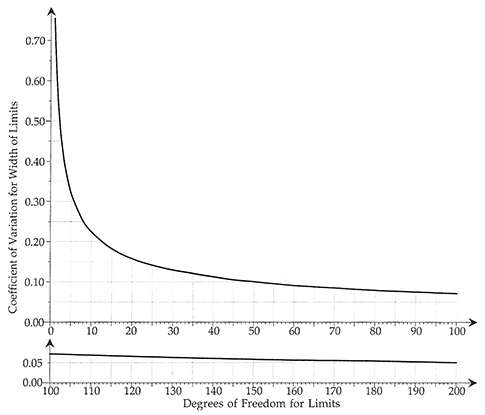
Figure 1: Uncertainty and degrees of freedom for process behavior chart limits. Click here for larger image.Degrees of freedom
Coefficients of variation
How many data?
• When you have fewer than 10 degrees of freedom, your limits will be very soft, and each additional degree of freedom will give you valuable information.
• Between 10 degrees of freedom and 30 degrees of freedom, your limits will coalesce, gel, and firm up.
• Beyond 30 degrees of freedom, your limits will have, for all practical purposes, solidified.Some history behind the computation of limits
Figure 2: Six of the 27 non-normal distributions Burr used
Figure 3: Burr's values of d2 for 27 non-normal distributions
Click here for tab data.Burr's approach
Limits for charts for location
Figure 4: Uncertainties in scaling factors. Click here for tab data.
Figure 5: How variation in d2 affects limits for location charts. Click here for larger image.
Figure 6: Baseline degrees of freedom needed for parity between uncertaintiesSo what do we do in practice?
Our PROMISE: Quality Digest only displays static ads that never overlay or cover up content. They never get in your way. They are there for you to read, or not.
Quality Digest Discuss
About The Author
Donald J. Wheeler
© 2023 Quality Digest. Copyright on content held by Quality Digest or by individual authors. Contact Quality Digest for reprint information.
“Quality Digest" is a trademark owned by Quality Circle Institute, Inc.
Comments
Reply for Levinson
As I explained in "Why We Keep Having 100-year Floods, (QD June, 2013) trying to fit a model to a histogram is meaningless unless we know the data in the histogram are homogeneous and that they all came from the same process. This is the question that is only addressed by a process behavior chart. Trying to use your fancy software to fit a model to garbage data will simply result in garbage dressed up in mathematics.
Let the user beware. Your software has no common sense.
If the process is out of control, we can't set control limits
If the date are garbage (e.g. from an out of control process or, as shown by the 100 year hurricane example, what are essentially two different processes), NO model will give us a valid control chart or capability index. E.g. a manufacturing process that behaved like Figure 3 in the hurricane article would clearly be an example of a process that has changed, e.g. to a change in materials rather than season. We could not set valid control limits for that process either.
This is why, in addition to performing goodness of fit tests, we must also make a control chart of the data to make sure nothing of this nature is happening. Figure 3 of the hurricane article shows clearly that we have a bimodal (at least) "process," each segment of which follows its own Poisson distribution.
If the data are homogenous, though, the actual underlying distribution must be clearly superior to any normal assumption or approximation.
Myth Four
In "Myths About Process Behavior Charts," QDD September 8, 2011, I refer to the argument you have just presented as Myth Four. This article deals directly with the arguments you are presenting here, so anyone who wishes to dig deeper should find this article interesting.
Requirement for state of control
Per the AIAG SPC manual (2nd ed, page 59)
There are two phases in statistical process control studies.
1. The first is identifying and eliminating the special causes of variation in the process. The objective is to stabilize the process. A stable, predictible process is said to be in statistical control.
2. The second phase is concerned with predicting future measurements thus verifying ongoing process stability. During this phase, data analysis and reaction to special causes is done in real time. Once stable, the process can be analyzed to determine if it is capable of producing what the customer desires.
============
This suggests that the process must indeed be in control before we can set meaningful control limits. This is not to say that we cannot plot the process data to look for behavior patterns, e.g. as shown in Figure 6 of http://www.qualitydigest.com/inside/quality-insider-article/myths-about-.... It is easy to see just by looking at this that there is a problem with this situation.The AIAG reference, in fact, says the control statistic(s) should be plotted as they are collected.
It adds, by the way, that control limits should be recalculated after removal of data from subgroups with known assignable causes--that is, not merely outliers, but outliers for which special causes have been identified. Closed loop corrective action should, of course, be taken to exclude those assignable causes in the future.
Why not try to identify the actual distribution?
The Burr approach does seem complicated, and a simpler and more accurate approach is to use the actual underlying distribution, if it can be identified. Noting that Minitab and StatGraphics can fit these other distributions--an option that wasn't available in Burr's day--there is no practical obstacle to doing this.
The first step is to identify the likely distribution. For example, if a certain characteristic is known to follow the Weibull distribution or extreme value distribution (the latter for failure at the weakest point), try that distribution first. My experience with actual data is that impurities such as trace metal concentrations follow the gamma distribution. This is not surprising because contaminants, impurities, and so on are undesirable random arrivals. We know random arrivals follow the Poisson distribution, and the gamma distribution is the continuous-scale counterpart. My article ""Watch Out for Nonnormal Distributions of Impurities," Chemical Engineering Progress, May 1997, pp. 70-76" discusses this further, and applies the gamma distribution to actual trace metal data.
Then fit the process data to the distribution in question, and perform goodness of fit tests (quantile quantile plot, Anderson-Darling statistic, chi square test) to make sure we cannot reject the null hypothesis that we have selected the right distribution. Note also that these tests will almost certainly reject the normal distribution.
Then use the fitted distribution to find the 0.00135 and 0.99865 quantiles for the control limits although, in the case of something like a gamma distribution in which we want zero of whatever we are measuring (such as contaminants), we can dispense with the LCL.
The Central Limit Theorem may let us use a normal distribution (traditional Shewhart limits) with a big enough sample, but we MUST use the actual distribution to calculate the process performance index. This is because individual measurements, as opposed to sample averages, are in or out of specification. The Automotive Industry Action Group sanctions this approach, along with another that is apparently almost as accurate. Reliance on the normal distribution, e.g. PPU = (USL-mean)/(3 sigma), can create a situation in which our purportedly Six Sigma process is delivering 100 or even 1000 defects per million opportunities.
All of this can be done in minutes in StatGraphics or Minitab. These programs will fit the data, and then perform the goodness of fit tests (Minitab does not apparently do the chi square test, which quantifies how well the actual histogram matches that of the fitted distribution). They will also use the actual distribution to give the process performance index. StatGraphics will create a control chart with the correct limits for the distribution in question.
If somebody has non-proprietary data they are willing to share, e.g. impurities, pollutant concentrations, or anything else that could easily follow a gamma distribution (or other data for which the underlying distribution is known), they would make a good case study.
KISS principle
I often wonder if folk like Levinson have shares in Minitab. No matter how much wonderful and detailed explanation Don gives, they just don't seem to get it.
People who use control charts
There seems to be two types of folks who use process behavior charts. Those actively working on improving a manufacturing process or adminstrative system and those who don't. For those folks who use them as part of their every day work, we know how useful they are. We don't bother with all the statistical assumptions because we don't have to. They work well and help us improve our products and systems. That's ALL we care about. We're not mathamaticians nor statistians. We are users of the charts.
I often wonder if the people who write articles on SPC ever really use them in practice.
Rich D.
More on this from Quality America
http://qualityamerica.com/Knowledgecenter/statisticalinference/non_norma...
"Software can help you perform PCA with non-normal data. Such software will base yield predictions and capability index calculations on either models or the best fit curve, instead of assuming normality. One software package can even adjust the control limits and the center line of the control chart so that control charts for non-normal data are statistically equivalent to Shewhart control charts for normal data (Pyzdek, 1991)." StatGraphics can do this, and my book on SPC for Real World Applications also discusses the technique in detail.
This abstract for a paper also raises the issue: http://papers.sae.org/1999-01-0009/
"The application of SPC to an industrial process whose variables cannot be described by a normal distribution can be a major source of error and frustration. An assumption of normal distribution for some filter performance characteristics can be unrealistic and these characteristics cannot be adequately described by a normal distribution."
Trend charts vs. SPC charts
There is nothing wrong whatsoever with using a trend chart that does not rely on statisitcal assumptions, e.g. like Figure 8 in Don Wheeler's article at http://www.qualitydigest.com/inside/quality-insider-article/myths-about-.... This trend chart shows clearly that something is wrong about the process regarless of its statistical distribution.
As for using SPC in practice, that is exactly why I took the time to write numerous articles on SPC for non-normal distributions. I found that what I learned in the textbooks (plus/minus 3 sigma control limits) did not work in the factory.
Furthermore, it is not optional, but mandatory, to use the actual underlying distribution when calculating process performance indices (with their implied promises about the nonconforming fraction). E.g. Figure 1 of Wheeler's article for modulus of rupture for spruce, and slide 21 of http://www.slideshare.net/SFPAslide1/sfpa-new-design-value-presentation-... shows a similar distribution for pine. The distribution is sufficiently bell curve shaped that you might get away with 3 sigma limits for SPC purposes (assuming SPC were applicable to this situation), but you sure wouldn't want to use a bell curve to estimate the lower 1st or 5th percentile of the modulus of rupture.
You can also run into autocorrelated processes, e.g. quality or process characteristics in continuous flow (chemical) processes. As an example, the temperature or pressure at a particular point is going to be very similar to the previous one. Traditional SPC does not work for these either.
The only thing you risk by using the wrong distribution for SPC is a (usually) higher false alarm risk, i.e. the workforce is chasing far more than 0.00135 false alarms per sample at each control limit. If you assume a bell curve when estimating the Ppk for something that follows a gamma distribution, though, your nonconforming fraction estimate can be off by orders of magnitude.
Caveat for the gamma distribution and impurities
When we deal with impurities that are measured in parts per million (or even less), we run up against the issue of the lower detection limit. If, for example, the LDL is 0.1 ppm, "zero" can mean anything from 0 to 0.1 ppm. This requires the use of methods similar to those for censored reliability tests, in which not all items have failed by the end of the test, but in this case censoring is at the bottom rather than the top of the distribution. Off the shelf methods are available for doing this.
Comments
What is this? A filibuster? 106 lines of commentary out of a total of 124 lines come from one source!
To repeat the quote from Elton Trueblood that I have at the begining of Understanding Statistical Process Control,
"There are people who are afraid of clarity because they fear that it may not seem profound."
oh boy
I enjoy statistical math, I really do. I could get lost in my computer for hours and days with it...but I don't get paid for it. I get paid to prevent and solve quality problems in a for profit company. So I need practical approaches to industrial problems. So there are three issues that I see in this clash of beliefs regarding SPC. First is the difference in theoretical precision and practical value. The second is related but slightly different; the difference between theoretical models and practical reality as it effects the use of common statistical calculations. The third is a very simple communication issue.
I will start with the third as it is easiest: The difference between setting control limits and using them to gain insight. This article – and indeed many articles by Dr. Wheeler - deal with using control limits to gain insight into the stability of a process and/or clues as to why the process appears unstable. In these instances Dr. Wheeler is correct; calculating control limits for insight into time series data is invaluable. Dr. Levinson is partially correct that we should not set control limits for an unstable process. There are exceptions to this of course. One is that very few processes are ever stable for any substantial amount of time – which is one reason why we need control limits: to detect excursions as early as possible and take appropriate action to reverse the event and prevent recurrence thereby improving the stability of the process. A second reason is that not all processes that appear to be ‘unstable’ through traditional subgrouping (sequential pieces) are unstable – or incapable. They may simply be non-homogenous.
This leads us to the second issue. This non-homogeneity is quite common and can be quite benign in today’s manufacturing processes. Non-homogenous, yet capable processes are exactly why the concept of rational subgrouping was developed. Yet in the theoretical statistical models for most of the common statistical tests of significance, there is an assumption that non-homogeneity is wrong and must be corrected. The statistical models give mathematically correct, yet practically wrong answers in the presence of non-homogeneity. Non-homogeneity also ‘looks’ like an assignable cause – one can clearly see the changes related to cavity to cavity or lot-to-lot differences so they should be considered as ‘out of control’ and due to assignable causes right? But if we think about it, we could apply the same logic to piece to piece differences that exist in a homogenous process: we can clearly see it so it must be assignable and easy to fix right? Piece to piece variation that is clearly visible is common cause variation – one must understand the true causal mechanism of the variation in order to ‘fix’ or improve it, otherwise we are tampering. The same logic must apply to other components of variation. Without understanding true cause we are only tampering. Non-homogeneity is not a sign of instability. It is simply a sign that other factors are larger than the piece to piece variation components. George Box wisely said “all models are wrong; some are useful”.
And now for the first issue. Dr. Levinson appears to be placing value on statistical precision. Dr. Wheeler is placing value on practical use. If one values statistical precision, Dr. Levinson is correct. If one is looking for an actionable answer to a real world problem Dr. Wheeler is correct. While there is value in statistical precision, in the industrial world, we only need enough statistical precision to gain insight and make the right decisions. If more precision doesn’t add value to this process, it is only of academic interest. We must remember that a very precise estimate is still an estimate. It may very well be precisely wrong. Ask yourself: from an everyday, real world perspective, does a very statistically precise estimate of a .03% chance of mis-diagnosing an assignable cause provide you with truly better ability to detect and improve excursions than a 5% chance of mis-diagnosis? And perhaps more importantly, is that improvement worth all of the extra time? To quote another famous statistician, John Tukey said that “an approximate answer to the right question is worth far more than a precise answer to the wrong question”.
Practicality and precision
Robert Heinlein wrote in Starship Troopers that, if you weigh a soldier down with a lot of stuff he has to watch, somebody a lot more simply equipped, e.g. with a stone ax, will sneak up and bash his head in while he is trying to read a vernier. This certainly applies to complex statistical methods (e.g. fitting a gamma distribution to data) if you don't have a computer. This is why we have, for decades, used normal approximations to the binomial and Poisson distributions for attribute control charts even though these approximations work very poorly unless we expect 4-6 nonconformances or defects per sample.
The traditional 3-sigma limits will admittedly work more or less even for non-normal distributions but, if they give you the wrong answer 1 percent of the time rather than 0.135 percent of the time (the process is out of control, when it is actually in control), the production workers will find themselves chasing false alarms and possibly making adjustments (tampering) when no adjustments are needed. Things get a lot worse if you calculate a process performance index under the normal distribution assumption when the process is non-normal, becuase the estimate of the nonconforming fraction can then be off by orders of magnitude.
"Non-homogeneity also ‘looks’ like an assignable cause – one can clearly see the changes related to cavity to cavity or lot-to-lot differences so they should be considered as ‘out of control’ and due to assignable causes right?" raises two additonal issues. Systematic differences between mold cavities are not an out of control situation, tney are a multivariate situation for which well-established control methods (T squared chart) are known. That is, while each cavity does not produce exactly the same mean, their performance is correlated.
Between-batch variation also is a known issue, and control limits can be calculated that reflect both it and the (often smaller) within-batch variation. This, in fact, is often responsible for the difference between Cpk (short term variation, as calculated from subgroup statistics) and Ppk (calculated based on long-term variation). When Cpk > Ppk, the subgroups clearly do not reflect all the variation that is present.