PROMISE: Our kitties will never sit on top of content. Please turn off your ad blocker for our site.
puuuuuuurrrrrrrrrrrr
Davis Balestracci
Published: Wednesday, June 11, 2014 - 14:52 Do you still insist on asking, “Which chart do I use for which situation?”
I’ve seen many flowcharts in books to help you answer this question. They’re all some variation of this: 
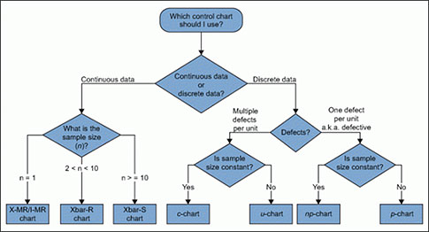
I find them far too confusing for the average user and have never taught this in my work. Besides, you get no credit for choosing the technically correct chart or computing the right numbers—only for taking the right action. For any initial chart for process assessment, the data should be in its naturally occurring time sequence, preferably as a run chart. Next, the control chart of choice with which to start is virtually almost always the I-chart (individuals chart), which uses the moving range (MR) between consecutive points to determine its common-cause limits. The I-chart is the “Swiss Army knife” of control charts. As I have discovered time and time again, it usually approximates the “correct” chart under most conditions, and its use is easier to explain. I can hear the chorus: “So, what are the conditions when it isn’t correct?” Bottom line: Before you ask me, “Which chart should I use for which situation?” or challenge me with a “what if” doomsday scenario (I’m truly amazed at the creative hypothetical situations thrown at me during my teaching), let me request that you use a sequence which by now should seem awfully familiar: If you have the patience to answer these, and follow them through with a data set to reach an appropriate action, you will probably have answered the question yourself—and solved a major problem in the process—while saving yourself a major side trip into the swamp of calculation minutiae. Note: In some of the figures mentioned above, it is advertised as an I-MR chart combination. Don’t worry too much about the MR chart for the moment. Your main concern with that chart is its easily calculated upper limit, which gives you the maximum value by which two consecutive data points can differ randomly. And then there remains (still) the problem of getting the limits right. In my searches, I was amazed at how many said to calculate the standard deviation (as we were taught in basic statistics) and multiply it by three to get the limits around the average. What part of “never” don’t people understand? So let’s consider the various other charts. C-charts are easily approximated by the I-chart, especially if the average of the data is at least five. Remember, the process’s stability is actually the key question and determines whether you subsequently use a common- or special-cause strategy. Small numbers (and rare events) can get very tricky and usually require guidance by a statistical expert to get the right number. Although, in the troublesome case of rare events, plotting the time between occurrences of them can be useful... as an I-chart. Regardless, the run chart and I-chart will generally lead you to the right initial action. When p-charts (percentages) and u-charts (rates) are plotted over time, pretty much everyone gets confused by the stair-step limits caused by the varying denominator sizes. This confusion only escalates by well-meaning attempts to explain them. Occasionally, the chart might come in handy for finding an individual outlier. More important, these become problematic, especially p-charts, when data are aggregated monthly or quarterly or even annually. The resulting large denominators (as in hundreds or thousands) artificially create many out-of-control signals (above or below the limits). At the opposite extreme, p-charts also get tricky if you have very small denominators, which is true for the I-chart as well. Sometimes, one needs to aggregate subgroups to smooth things out a bit. Donald Wheeler is of the opinion that the assumption of true independence of occurrence of events necessary for proper use of a p-chart is rarely encountered in reality. He feels it is correct to use only the I-chart. My experience has pretty much borne this out. (Wheeler’s books are very practical and well-written with good examples. You can peruse them here.) All that said, I have found p-charts and u-charts to be helpful in stratification (a common cause strategy). One uses them to compare, statistically, individual rates that, ideally, each have been obtained by: In these cases, the horizontal axis is not time; for example, it could be a comparison of individual doctors or locations. Many of you have no doubt encountered these via the fancy euphemism “funnel plots,” where the results are sorted horizontally by lowest to highest denominator size, creating a funnel-like shape of common cause. For healthcare readers, I’ll tell you right now: You virtually never use these. They were designed for manufacturing processes where thousands of parts are made per day, and it’s no big deal to grab, say, four to five parts, produced consecutively, every hour (which takes seconds). People—even at manufacturing facilities—seem to find these confusing and hard to use because the limits are based on the behavior of averages, not the individual parts. And the plague of putting specification limits on these charts (which is wrong, wrong, wrong... what part of “never”...?) continues, which causes a specification focus, not a process focus. In healthcare clinical applications, you don’t have patients coming through in numbers similar to an assembly line. I literally can’t remember the last time I’ve used these charts in my healthcare work—and that’s over the course of 20 years. They might lend themselves to high-volume administrative processes, but, once again, people will still find them confusing. So, I never formally teach them and would do so only if needed in the context of solving an issue. As far as the np-chart goes, it’s a marginal pedagogical classroom exercise, and that’s about it. I virtually never use one because having equal sample sizes in the denominator is a rare luxury indeed. Or, the machinations to create equal denominators and then explain the resulting chart to one’s puzzled audience far outweighs any benefits. First, find out what you’re “perfectly designed” to get and, second, see whether common and/or special cause strategies are needed to further solve the problem. Also, this gives you a baseline with which to assess the current state as well as your subsequent intervention efforts. Many projects fail because they lack a baseline. So you see, there is never an escape from plotting your process data over time. And if you insist on picking the right chart, be my guest. Here is an inventory I encountered on one website (without a flowchart to help you). This list includes neither the multivariate ones I encountered on a search, nor the one I found based on the Mann-Whitney statistic. DATA TYPE CHARTS MONITORS APPLICATIONS Variable X-bar and S Process average and standard deviation High volume, single characteristic Variable X-bar and R Process average and range High volume, single characteristic Variable X and MR Process average and moving range Sensitivity not required Variable Deviation from Nominal Process average and range (or standard deviation) Short production runs (multiple parts) Variable Standardized X-bar and R Process average and range Short production runs (multiple parts) Variable X-bar, Rb, d Process average, range between and difference between extreme locations Multiple locations within subgroup Variable X-bar, Rb, Rw Process average, range (or standard deviation) within and range between subgroup Multiple locations within subgroup Variable CUSUM Cumulative deviations from mean Charts for individuals when X and MR are not sensitive enough Variable EWMA Weighted moving average Charts for individuals when X and MR are not sensitive enough -- -- -- -- Attribute np Number of Defectives Pass/Fail Data Attribute p Proportion Defective Pass/Fail Data Attribute Standardized p Standardized Proportion Defective Pass/Fail Data Attribute c Number of Defects Multiple types of defects on unit Attribute u Number of Defects per unit Multiple types of defects on unit Attribute Standardized u Standardized Number of Defects per unit Multiple types of defects on unit Correct chart or correct action? Until next time.... Quality Digest does not charge readers for its content. We believe that industry news is important for you to do your job, and Quality Digest supports businesses of all types. However, someone has to pay for this content. And that’s where advertising comes in. Most people consider ads a nuisance, but they do serve a useful function besides allowing media companies to stay afloat. They keep you aware of new products and services relevant to your industry. All ads in Quality Digest apply directly to products and services that most of our readers need. You won’t see automobile or health supplement ads. So please consider turning off your ad blocker for our site. Thanks, Davis Balestracci is a past chair of ASQ’s statistics division. He has synthesized W. Edwards Deming’s philosophy as Deming intended—as an approach to leadership—in the second edition of Data Sanity (Medical Group Management Association, 2015), with a foreword by Donald Berwick, M.D. Shipped free or as an ebook, Data Sanity offers a new way of thinking using a common organizational language based in process and understanding variation (data sanity), applied to everyday data and management. It also integrates Balestracci’s 20 years of studying organizational psychology into an “improvement as built in” approach as opposed to most current “quality as bolt-on” programs. Balestracci would love to wake up your conferences with his dynamic style and entertaining insights into the places where process, statistics, organizational culture, and quality meet.Right Chart or Right Action?
No extra credit for choosing the technically correct chart
Your ‘Swiss Army knife’
1. Could you please show me the data (or describe an actual situation) that are making you ask me this question?
2. Please tell me why this situation is important.
3. Please show me a run chart of this indicator plotted over time.
4. What ultimate actions would you like to take with these data?C-charts (for counts)
P-charts and u-charts
1. Plotting a run chart
2. Following up with a control chart
3. Determining the most recent stable history
4. And then and only then aggregating the data obtained from 3) into summed numerators and denominators for statistical comparison.
5. Then use a p-chart analysis of means to expose special causes for subsequent focus.X-bar/R charts and X-bar/S charts
Np-chart
Always start with process data gathered over time, and plot a run chart
Sample size 2 or larger
Sample size between 2 and 6
Sampling is costly
Long cycle time
(Note: Normality of data must be considered.)
All parts have similar standard deviation
Standardized X-bar and S
Process average and standard deviation
Part standard deviations differ
Location averages are statistically different
X-bar, Rb, S
Variation within and between subgroups different
Location averages are not statistically different
Constant Sample Size
n > 3/p
Constant or Variable Sample Size
n > 3/p
Variable Sample Size
n > 3/p
Can be used for short production runs
Constant sample size
n such that c > 7
Constant or variable sample size
n such that c > 7
Variable sample size
n such that c > 7
Can be used for short production runs
Our PROMISE: Quality Digest only displays static ads that never overlay or cover up content. They never get in your way. They are there for you to read, or not.
Quality Digest Discuss
About The Author
Davis Balestracci
© 2023 Quality Digest. Copyright on content held by Quality Digest or by individual authors. Contact Quality Digest for reprint information.
“Quality Digest" is a trademark owned by Quality Circle Institute, Inc.
Comments
Software or Brainware?
Most SPC software asks you to figure out which control chart to use before you select data.
This means that you have to mentally walk through a forest of decision trees to get a chart. You have to use your noggin--your brainware. For the expert this is easy; for the novice or occasional user this can be difficult.
The QI Macros for Excel asks you to select the data first. That way the Control Chart Wizard can analyze your data, run through the decision trees for you and choose the right chart.
So, do you want to keep using your brainware and worrying that you've made the right choice?
Or would you rather let your software help you get the right answer?
Verifying Assumptions for Attribute charts
The notion that a typical user of control charts is able to verify the theoretical assumptions that Wheeler writes about in his books on charts for counts is just not realistic. With the XmR chart, you can skip all that since the limits are empirical. This allows you to get to work on the process right away.
Rich
I-MR Chart
Teaching charts
Ditto - I teach from a pre-done class and I make about a 1 minute comment about the rest that if the IMR chart doesn't work, there are other options. I agree with Davis' comment about generalization and would extrapolate to just about any industry outside of manufacturing, the sample size is 1.