I was teaching a class and asked participants to create a control chart of an indicator that was important to them. A lab supervisor presented me with a chart on the number of procedures her department performed and told me that it wasn’t very useful.
ADVERTISEMENT |
She wanted to use the chart for staffing purposes, but the wide limits were discouraging to the point of being ridiculous:
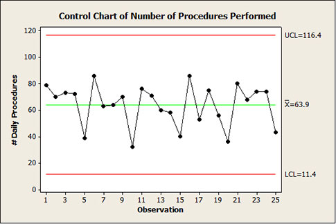
I know that a lot of you have access to software with the classic Western Electric special cause tests programmed in. In this case, none of them were triggered. On the surface, the chart is exhibiting common cause. For what it’s worth (and as you will see, it isn’t worth much), the data also “pass” a Normality test with a p-value of 0.092. Lots of statistics. And the subsequent action is...?
It’s situations like this when, if we’re not careful, we can lose credibility as quality professionals. People just shake their heads at the wide limits while we try to explain that their process is perfectly designed to have this variation, and they’re going to have to tell management they need a new process. They roll their eyes and say, “Thanks...” while muttering under their breath “...for nothing!”
I have often spoken of common cause strategies as being woefully underutilized instead of the usual knee-jerk “simple... obvious... and wrong” special cause strategies. To review, there are three: process stratification, process dissection, and designed experimentation. They should be approached in that order, but the typical response to common cause is to jump right to experimentation—based on the very common misconception that, faced with common cause, a process redesign is the only option.
Not necessarily! Common cause just means that data points can neither be looked at individually nor compared to one to another.
One can’t ask it enough: “How were these data collected?”
A lot of Six Sigma training emphasizes the need for more frequent data collection on the processes being studied. I agree. But this can cause additional problems in interpretation if one is not careful.
When I asked the lab supervisor how these 25 numbers were obtained, she told me that they were five weeks of daily procedure counts, and that the lab was closed on weekends. So, it was five weeks of Monday through Friday data. Might that insight help? (It often does.)
Why not start with the simple stratification staring you in the face? Separate the data by day of the week.
This can easily be done by coding each data point by “day of the week” to see whether there is a pattern either to all the high values and/or all the low values. Does the chart below, in its simplicity, give some significant insight for proceeding without the added confusion of “statistics?”
Another tool that I feel is over-taught is the histogram. However, in cases like this, I have found that it can prove to be quite useful—as a stratified histogram comparing the values by the days of the week (although the simple coding above has done as good a job):
As both graphics show, there was a hidden special cause by day of the week in these data: Mondays tend to be high, Fridays tend to be low, and Tuesdays through Thursdays are in the middle and pretty much indistinguishable from each other.
These special causes have rendered the initial control chart invalid—the moving ranges between consecutive points do not all necessarily reflect random variation. The non-random, fixed-difference special causes in the moving ranges from Mondays to Tuesdays, Thursdays to Fridays, and then Fridays to Mondays inappropriately inflate the limits.
Actually, sampling issues such as this are usually the cause when the Western Electric “15 consecutive points within one standard error of the center line” test is triggered. In this case, the special cause is most likely due to the sampling process. Because the moving ranges are so inflated, the limits are unnecessarily wide. This can be seen to some extent in the first graph: No points are close to the limits.
The “15 consecutive points” test remains a possibility for an I-chart when special causes are unknowingly “mixed” to calculate the variation—as in the first graph plotting all days of the week.
This could also be a lurking issue if you sample several times in one day—e.g., hourly, by shift, etc.
As Deming always insisted: “What can you predict from these data?”
How does telling her to staff to anticipate 11 to 116 procedures every day compare to telling her to staff as follows (notice the tightened ranges compared with the initial chart):
Monday: 50 to 103 procedures; Tuesday through Thursday: 40 to 80 procedures; Friday: 23 to 63 procedures?
There is a rule of thumb for staffing that says one should anticipate the “80-percent point of service,” which happens to be approximately halfway between the average and upper limit. For the lab superintendent, this would result in staffing for 90 procedures for Monday, 70 for Tuesday through Thursday, and 53 for Friday.
By understanding the underlying sources of variation—by asking how the data were collected—we are able to make better predictions... with less variation!
As my respected colleague Donald Wheeler has said many times, “The purpose of charts is not to have them, but to use them!”
Any good statistical analysis will always motivate the next question. The best advice I can give for any quality improvement effort is to be relentless in understanding the variation in a situation by asking, “What would I ultimately like to predict?”
Add new comment