Social Sharing block
The word “kurtosis” sounds like a painful, festering disease of the gums. But the term actually describes the shape of a data distribution.
|
ADVERTISEMENT |
Frequently, you’ll see kurtosis defined as how sharply “peaked” the data are. The three main types of kurtosis are shown below.
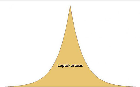
Lepto means “thin” or “slender” in Greek. In leptokurtosis, the kurtosis value is high.
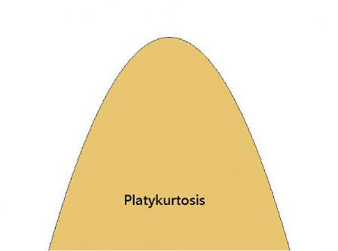
Platy means “broad” or “flat”—as in duck-billed platypus. In platykurtosis, the kurtosis value is low.
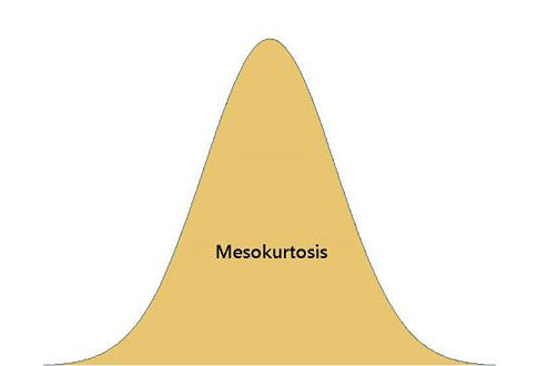
Meso means “middle” or “between.” The normal distribution is mesokurtic.
Mesokurtosis can be defined with a value of 0 (called its "excess" kurtosis value). Using that benchmark, leptokurtic distributions have positive kurtosis values and platykurtic distributions have negative kurtosis values.
…
Comments
Not a problem
I suggest that Patrick needs to read Don Wheeler's wonderful little book "Normality and the Process Behaviour Chart". He shows on page 89 that standard 3 sigma Shewhart Charts have no problems with Kurtosis less than 4 ... something similar to Patrick's Leptokurtosis illustration.
Sometimes yes, sometimes no
The consequences depend on the statistical analysis, the application, the severity of the lepto/play- kurtosis, the sample size…. among other things.
But your point is well-taken! Although I haven’t read the book you cite by Dr. Wheeler, I’m familiar with his views on the assumption of normality in the context of process control charts—which can be readily found in many of his posts on this site.
In hindsight I can see how my post might be construed as yet another attempt to support the ongoing witchhunt for nonnormality. That I might have, unwittingly, fueled the flames of what Dr. Wheeler calls rampant “leptokurtophobia”. That was certainly not my intention!!
So let me try to make some important distinctions here. Yes, variable control charts are generally robust to departures from normality. One of Dr. Wheeler’s main points about skewness and leptokurtosis in the context of control charts is that the 3-sigma limits of the charts “filter out” routine variation so that beyond those limits, one is not likely to see significant effect from skewed or leptokurtic data. That viewpoint is also backed by extensive simulation studies by research statisticians at Minitab, who have examined the effects of kurtosis and skewness on variables control charts. (Although if you read the white paper carefully (see Appendix A) you’ll see that leptokurtosis does actually impact the false alarm rate more than skewness does—particularly with small subgroup sizes. Still, for subgroups of n= 2 or more, the false alarm rate stays below 2%, compared to 0.39% for a normal distribution)
However, it would be incorrect to conclude that because variables control charts are generally robust to leptokurtosis, it is “not a problem.” It certainly can be.
A normal capability analysis, for example, is much more vulnerable to departures from normality. If the process is not capable and the specification limits fall inside the process spread, the “fat tails” of leptokurtosis could result in a significant underestimation of nonconforming parts (PPM). How critical is that? It depends on the application, obviously, and what the consequences of an underestimation would mean in real time.”
ANOVA is generally robust to nonnormality *if* the group sizes are about equal. If they vary, it’s a different ball game. In that case, platykurtosis can cause serious problems.
Also, as your comment implies, the severity of leptokurtosis is important as well. You suggest a kurtosis measure greater than 4 might be problematic, even in Dr. Wheeler’ view. The first illustration in my post is based on a laplace distribution with a kurtosis value of 5.6 (assuming the kurtosis measure that defines a normal distribution with a kurtosis of 3). The second “liposuction” illustration of leptokurtosis is based on a t distribution with a kurtosis value of 8.6—well above 4 in both cases!. (Of course such benchmarks are only of value in a very rough sense anyway and shouldn’t be taken too literally. Like most statistical estimates, they're influenced by sample size, variance, etc. Nevertheless some applications do have a recommended "safe" range of kurtosis values..)
Sorry this is so long! But sometimes a long-winded response is the only clear response.
Thank you for reading and commenting and giving me a chance to clarify some of these issues!
Add new comment