Our PROMISE: Our ads will never cover up content.
Our children thank you.
Davis Balestracci
Published: Monday, March 25, 2019 - 11:03 In most healthcare settings, workers attend weekly, monthly, or quarterly meetings where performances are reported, analyzed, and compared to goals in an effort to identify trends. Reports often consist of month-to-month comparisons with “thumbs up” and “thumbs down” icons in the margins, as well as the alleged trend of the past three months or the current month, previous month, and 12 months ago. 
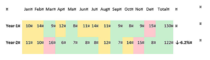
The data below are typical of the types of performance data that leadership might discuss at a quarterly review, in this case, a year-end review. Suppose these are healthcare data on a key safety index indicator—for instance, some combination of complaints, patient falls, medication errors, pressure sores, and infections. The goal is to have fewer than 10 events monthly (less than 120 annually). In line with the craze of “traffic light” performance reporting, colors are assigned as follows: The 6.2-percent year-over-year drop in the performance measure failed to meet the 2018 corporate goal of at least a 10-percent drop. Two commonly used displays for these types of data are shown below. The first is a year-over-year line graph, and the second shows bar graphs for each of the past 12 months, with a fitted trend line. The upward trend during most of the last 12 months created additional concern. Typical reactions to these displays might include: Although well-intentioned, these kinds of statements derail improvement efforts and waste precious company resources. If leadership subsequently announces a “tough stretch goal” of reducing such incidents by 25 percent for the next year, the improvement efforts could go further off track, especially if fear is prevalent. For example… your first 2019 quarterly review is tomorrow, and you just got March’s result of 14. The results for January and February were eight and 10, respectively (quarterly total of 32, thumbs down!), hardly a 25-percent reduction from 2018, but at least it’s down “slightly” from the 37 of 2018’s first quarter. Bigger problem: That won’t be enough to distract from the 8, 10, 14 trend, which is sure going to put you in the hot seat! Looks like a long night: Prepare your analysis and recommendations PowerPoint presentation. (I’m willing to bet there would be as many different presentations as there are people reading this.) The statements above reflect intuitive reactions to variation. When people see a number or perceive a pattern that exhibits an unacceptable gap (i.e., variation) from what they feel it should be, actions are suggested to close that gap. Whether these people understand statistics, they have just used statistics—for decision making in the face of variation. No meaningful conclusions can be drawn from these commonly used data displays because of the human variation in how people perceive and react to variation, which compromises the quality of such data analysis. General agreement on each reaction and its suggested solution will likely never be reached because decisions are based on personal opinions (see “Vital Deming Lessons Still Not Learned”). Truth be told, I generated these data randomly from a single process. In other words, absolutely nothing changed during the 24 observations. Goals such as “10 percent or greater reduction” in such situations can’t be met, given how the work processes—and improvement efforts—are currently designed and being performed. These data were generated through a process simulation that’s equivalent to shaking up two coins in one’s hands, letting them land on a flat surface, observing whether two heads result, and repeating this process 39 more times. An individual result is the final tally of the total number of “double heads” in the 40 flips. One might calculate the odds of getting two heads as 1/2 × 1/2 = 1/4—that is, about 10 double heads in every 40 flips. This conclusion is true, but one also needs to consider the meaning of “about.” What is the estimated expected range for any one set of flips? Human variation surfaces yet again: Each person will have a different opinion. A group discussion might then try to decide what range would be “acceptable,” which introduces another source of human variation—people making numerically arbitrary decisions rather than letting the processes and data speak for themselves. As will be shown using statistics, the actual range for this coin flip process is 1 to 20. How about reducing the human-variation factor by applying some simple statistical theory? Here is a time-ordered plot of the same two years’ data, displayed as 24 months of output from a process with the addition of the 24 months’ data median as a reference line: in other words, a run chart. A sequence of six successive increases or six successive decreases indicates special cause (when applying the rule with fewer than 20 data points, six can be lowered to five). An exact repeat of an immediate preceding value neither adds to nor breaks the sequence. Applied to the data in our example (median is ignored for this analysis), the trend rule would indicate the following: Based on the trend rule, the 24 months of data neither include any series of six consecutive decreases that would indicate improvement nor six consecutive increases that hint at the alleged upward trend seen by some people in the bar graph/trend line display above. Although the standard of six consecutive increases or decreases might seem excessive, this conservative approach is statistically necessary when reacting to a table of numbers with no common cause reference. In actual practice, this occurs surprisingly rarely. The important benefit of this rule is curtailing the temptation to perceive trends in tabular data reporting. The common convention of using three points—whether all going up or all going down—does not necessarily indicate a trend. A run is a sequence of points either all above or all below the median, and a run is broken when a data point crosses the median. A special cause is indicated when one observes a run of eight consecutive data points either all above the median or all below the median. Points that are exactly on the median are simply not counted; they neither add to nor break the run. The run chart above shows runs of 1*, 1, 1, 1, 3, 3, 3*, 4, 1, 1, 2, 1 (an * indicates points on the median). Had there been a benefit from any efforts to improve the indicator’s performance (i.e., achieve a decrease) over the two-year span, the data might show one or both of the following: Neither is present. This finding, coupled with the lack of a downward trend, is an indication that process performance has not improved over the two years. (See “An Elegantly Simple but Counterintuitive Approach to Analysis,” especially the “Three routine questions” section; and “Use the Charts for New Conversations.”) The main point of this column is to encourage you to develop the habits of plotting “dreaded meeting data” over time and stopping the ubiquitous, incorrect use of the term “trend.” But let’s take these data to their logical conclusion. A run chart with no special causes is easily converted into a control chart (aka process behavior chart). The process of obtaining this chart answers two questions: How much process variation must one currently tolerate? and How much of a difference between two consecutive months is “too much?” Based on the stability of the run chart, the additional control chart analysis allows one to conclude: About that quarterly review tomorrow... Quality Digest does not charge readers for its content. We believe that industry news is important for you to do your job, and Quality Digest supports businesses of all types. However, someone has to pay for this content. And that’s where advertising comes in. Most people consider ads a nuisance, but they do serve a useful function besides allowing media companies to stay afloat. They keep you aware of new products and services relevant to your industry. All ads in Quality Digest apply directly to products and services that most of our readers need. You won’t see automobile or health supplement ads. So please consider turning off your ad blocker for our site. Thanks, Davis Balestracci is a past chair of ASQ’s statistics division. He has synthesized W. Edwards Deming’s philosophy as Deming intended—as an approach to leadership—in the second edition of Data Sanity (Medical Group Management Association, 2015), with a foreword by Donald Berwick, M.D. Shipped free or as an ebook, Data Sanity offers a new way of thinking using a common organizational language based in process and understanding variation (data sanity), applied to everyday data and management. It also integrates Balestracci’s 20 years of studying organizational psychology into an “improvement as built in” approach as opposed to most current “quality as bolt-on” programs. Balestracci would love to wake up your conferences with his dynamic style and entertaining insights into the places where process, statistics, organizational culture, and quality meet.Quarterly Review Coming Up on That Aggressive 2019 Goal
Will it be thumbs up or thumbs down?
• Less than 10 = green
• 10–14 = yellow
• 15 or higher = redYear-end review performance data
Two common displays of year-end review performance data
• “Month-to-month increases or drops in performance of five or greater need to be investigated—that’s just too much!”
• “Let’s find out what happened to cause the most dramatic drop of 10 from March to April in year two and implement it.”
• “It looks like the good ideas resulting from the root cause analyses we did on October’s and November’s incidents broke the trend in December.”‘First you plot the data, then you plot the data, then you plot the data.’ —Ellis Ott
Run chart rule No. 1: Defining what a ‘trend’ is and what it isn’t
• Observations 7 to 10 (July through October of year one) do not suggest a downward trend needing investigation, given that only three consecutive decreases occurred.
• Observations 16 to 20 (April through August of year two) are not an upward trend, given that only three consecutive increases occurred (the July value, 8, is the same as the June value, so it neither adds to nor breaks the sequence).Run chart rule No. 2: Did a process shift occur?
• A run of eight consecutive points all above the median early in the data
• A run of eight consecutive points all below the median late in the dataProcess summary using run and control chart analyses
• The process is stable and hasn’t changed in two years. All of the data points lie between the limits of 1 to 20.
• The common cause range encompasses the entire original red (15 or higher), yellow (10–14), and green (less than 10) spectrum. The color performance of any one month is essentially a lottery drawing.
• If all they do is continue to do what they are currently doing—i.e., reacting to individual incidents and monthly, quarterly, and annual results—the process could not consistently meet the 2018 monthly goal of keeping performance below 10. Approximately half of the individual months’ performances will be greater than 10.
• However, defined statistically (by the average), the process was meeting this goal. Each data point was, in essence, 10—the current estimate of the process average.
• The maximum difference between two consecutive points due to common cause (the upper limit of the moving range chart, which is not shown) is 12.
—The difference of 10 between March and April in year two is not a special cause because it is less than this.
—The “unacceptable increase of 7” from September to October in year two, which could result in individual root cause analyses of the 29 October-November incidents, was not necessarily a special cause.
—The same goes for declaring that any alleged success of these analyses caused a decrease of 7 from November to December in year two.
• This ongoing, incorrect special cause strategy will result in an annual total number of events most likely in the range of 98 to 142, but even an occasional number as low as 87 or as high as 153 would not be unusual.
—In some circumstances, common cause variation could deceive one into thinking that the process had met a “tough” reduction goal!
Given the analysis above, how would you now interpret 2019’s first three months’ performances of 8, 10, and 14? Could your organization accept such a truth? The answer says a lot about your culture and the success or failure of its improvement efforts, regardless of the approach.
Our PROMISE: Quality Digest only displays static ads that never overlay or cover up content. They never get in your way. They are there for you to read, or not.
Quality Digest Discuss
About The Author
Davis Balestracci
© 2023 Quality Digest. Copyright on content held by Quality Digest or by individual authors. Contact Quality Digest for reprint information.
“Quality Digest" is a trademark owned by Quality Circle Institute, Inc.
Comments
A better way?
Hi, Davis,
Your article centres on a “better way” – plot the data in time order, run charts, control charts … – in the use and review of data while providing a basis for action from the data.
In how many places do you see this “better way” successfully in operation?
Where yes, what do you think is/are the key ingredient/s to make it happen?
Where not, what do you think is a main obstacle?
My two cents
I don't know what Davis's answers will be, but I would imagine they would run close to mine:
1. In not nearly enough places, especially outside of manufacturing operations
2. Key ingredients to make it happen: Constancy of purpose, leaders who understand variation (and, hopefully, the rest of the System of Profound Knowledge), and want to KNOW what their processes will do, instead of guessing...
3. Obstacles: The system for educating and training managers (that does not, for the most part, teach them these things). Clinging to MBO, carrot-and-stick, firefighting paradigms for management.