{domain:"www.qualitydigest.com",server:"169.47.211.87"} Skip to main content

User account menu
Main navigation
  • Topics
    • Customer Care
    • FDA Compliance
    • Healthcare
    • Innovation
    • Lean
    • Management
    • Metrology
    • Operations
    • Risk Management
    • Six Sigma
    • Standards
    • Statistics
    • Supply Chain
    • Sustainability
    • Training
  • Videos/Webinars
    • All videos
    • Product Demos
    • Webinars
  • Advertise
    • Advertise
    • Submit B2B Press Release
    • Write for us
  • Metrology Hub
  • Training
  • Subscribe
  • Log in
Mobile Menu
  • Home
  • Topics
    • 3D Metrology-CMSC
    • Customer Care
    • FDA Compliance
    • Healthcare
    • Innovation
    • Lean
    • Management
    • Metrology
    • Operations
    • Risk Management
    • Six Sigma
    • Standards
    • Statistics
    • Supply Chain
    • Sustainability
    • Training
  • Login / Subscribe
  • More...
    • All Features
    • All News
    • All Videos
    • Contact
    • Training

What Analysts Can Learn From Storytelling With Data

A tale of effective communication

Paul Laughlin
Wed, 06/10/2020 - 12:03
  • Comment
  • RSS

Social Sharing block

  • Print
  • Add new comment
Body

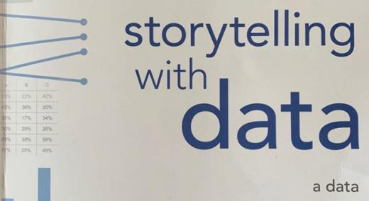
One of the most practical data visualization books for my clients is Storytelling With Data (Wiley, 2015). So, this is a longer-than-usual book review of this modern classic.

ADVERTISEMENT

I say that because it is not just accessible for those with no background in data visualization. The book also focuses on the kind of charts most analysts produce. You won’t find admonitions to keep updated with the latest packages for R or Python. You won’t be overwhelmed by award-winning data-viz art.

But before I rush in with too much enthusiasm, let me tell you a little about the author. Cole Nussbaumer Knaflic started her data viz career at Google. There she honed her craft and transformed the company’s People Operations with incisive charts. She has since gone on to found Storytelling with Data, her own training and consulting business.

 …

Want to continue?
Log in or create a FREE account.
Enter your username or email address
Enter the password that accompanies your username.
By logging in you agree to receive communication from Quality Digest. Privacy Policy.
Create a FREE account
Forgot My Password

Comments

Submitted by knowwareman on Wed, 06/10/2020 - 10:15

Line and Bar Charts Won't Tell Quality Improvement Stories

Line and bar charts with trendlines usually fail to illustrate improvement because they do not have a goodness of fit metric above 50%. Line and bar charts are the "Dumb and Dumber" of charts. To tell Six Sigma improvement projects you will need smart charts--charts that went to college and took statistics.

Quality Improvement Stories can be told easily:

  1. Control chart of current performance (also used in Control phase of DMAIC)
  2. One or more Pareto charts of types of defects (or histogram of deviation)
  3. Ishikawa/Fishbone Diagram to determine root causes
  4. Countermeasures
  5. Action Plan

Control charts will be required to sustain (i.e., control) the performance after improvement. Otherwise, the improvement decays over time.

Download my free Lean Six Sigma Action Plan to understand quality improvement and problem solving with charts and data.

  • Reply

Add new comment

Image CAPTCHA
Enter the characters shown in the image.
Please login to comment.
      

© 2025 Quality Digest. Copyright on content held by Quality Digest or by individual authors. Contact Quality Digest for reprint information.
“Quality Digest" is a trademark owned by Quality Circle Institute Inc.

footer
  • Home
  • Print QD: 1995-2008
  • Print QD: 2008-2009
  • Videos
  • Privacy Policy
  • Write for us
footer second menu
  • Subscribe to Quality Digest
  • About Us
  • Contact Us