{domain:"www.qualitydigest.com",server:"169.47.211.87"} Skip to main content

User account menu
Main navigation
  • Topics
    • Customer Care
    • FDA Compliance
    • Healthcare
    • Innovation
    • Lean
    • Management
    • Metrology
    • Operations
    • Risk Management
    • Six Sigma
    • Standards
    • Statistics
    • Supply Chain
    • Sustainability
    • Training
  • Videos/Webinars
    • All videos
    • Product Demos
    • Webinars
  • Advertise
    • Advertise
    • Submit B2B Press Release
    • Write for us
  • Metrology Hub
  • Training
  • Subscribe
  • Log in
Mobile Menu
  • Home
  • Topics
    • 3D Metrology-CMSC
    • Customer Care
    • FDA Compliance
    • Healthcare
    • Innovation
    • Lean
    • Management
    • Metrology
    • Operations
    • Risk Management
    • Six Sigma
    • Standards
    • Statistics
    • Supply Chain
    • Sustainability
    • Training
  • Login / Subscribe
  • More...
    • All Features
    • All News
    • All Videos
    • Contact
    • Training

The Predictive Power of Control Charts

Useful information is within reach

Steve Daum
Tue, 05/12/2015 - 10:18
  • Comment
  • RSS

Social Sharing block

  • Print
  • Add new comment
Body

The ability to make predictions has always been rewarded. Statistician Donald J. Wheeler says that “prediction is the essence of business.” With growing bodies of data and good analytical models, our predictions are getting better.

ADVERTISEMENT

The statistical models and algorithms behind prediction can be intimidating. Topics such as regression and neural networks can make the methods of prediction seem out of reach. However, a control chart—a simple statistical process control tool—can put the power of useful prediction within your grasp.

Consider the following data series:

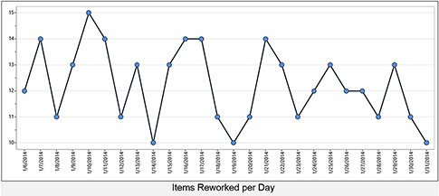
Click here for larger image.

When presented in this form, what kind of predictions can you make about the response variable? You might note the scale of the chart and make this prediction:
Most of the data will be between 10 and 15.

 …

Want to continue?
Log in or create a FREE account.
Enter your username or email address
Enter the password that accompanies your username.
By logging in you agree to receive communication from Quality Digest. Privacy Policy.
Create a FREE account
Forgot My Password

Comments

Submitted by Steve Moore on Fri, 05/15/2015 - 08:38

More Analysis Needed

Thanks for your article explaining the use of Process Behavior Charts.  However, the analysis needs to go a few steps farther.  In your final chart, the parameters of UCL, LCL, and Mean are meaningless in this context.  The first three data points and the last 17 points appear to come from the same process, while the data for 3/18 - 3/23 suggest a definite upset in the system.  I suggest you replot the chart with centerlines and control limits for each of these populations, easily done with most software.  Then, what lesson(s) can be learned from studying the points of 3/18 - 3/23?  What happened?  The true underlying process may be centered at 11.0 - 11.5.  Obviously, the desired number of reworked items per day is zero, but the process "knows" NOTHING of your wants and desires (i.e., specs)!  Next, one could work on the process and determine if the process goes "out of control" to the low side as a result.  

  • Reply

Add new comment

Image CAPTCHA
Enter the characters shown in the image.
Please login to comment.
      

© 2025 Quality Digest. Copyright on content held by Quality Digest or by individual authors. Contact Quality Digest for reprint information.
“Quality Digest" is a trademark owned by Quality Circle Institute Inc.

footer
  • Home
  • Print QD: 1995-2008
  • Print QD: 2008-2009
  • Videos
  • Privacy Policy
  • Write for us
footer second menu
  • Subscribe to Quality Digest
  • About Us
  • Contact Us