{domain:"www.qualitydigest.com",server:"169.47.211.87"} Skip to main content

User account menu
Main navigation
  • Topics
    • Customer Care
    • FDA Compliance
    • Healthcare
    • Innovation
    • Lean
    • Management
    • Metrology
    • Operations
    • Risk Management
    • Six Sigma
    • Standards
    • Statistics
    • Supply Chain
    • Sustainability
    • Training
  • Videos/Webinars
    • All videos
    • Product Demos
    • Webinars
  • Advertise
    • Advertise
    • Submit B2B Press Release
    • Write for us
  • Metrology Hub
  • Training
  • Subscribe
  • Log in
Mobile Menu
  • Home
  • Topics
    • 3D Metrology-CMSC
    • Customer Care
    • FDA Compliance
    • Healthcare
    • Innovation
    • Lean
    • Management
    • Metrology
    • Operations
    • Risk Management
    • Six Sigma
    • Standards
    • Statistics
    • Supply Chain
    • Sustainability
    • Training
  • Login / Subscribe
  • More...
    • All Features
    • All News
    • All Videos
    • Contact
    • Training

First, Look at the Data

What can we learn from the historical record?

Donald J. Wheeler
Thu, 01/29/2009 - 14:03
  • Comment
  • RSS

Social Sharing block

  • Print
Body

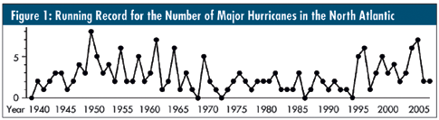
I recently received a data set consisting of the number of major hurricanes in the North Atlantic from 1940 to 2007. (Major hurricanes are those that reach Category 3 status or higher at some point during their existence.)

The first step in analyzing any data set is to look at the data. This means plotting the data in some meaningful format. With data that form a time series, the simplest and best format will be the running record where the data are plotted in time order. The running record for the number of major hurricanes is shown in figure 1.

The first question of data analysis must always be whether the data are homogeneous. If the data are, then we can use them with the various computations commonly taught in statistics classes. However, if the data aren’t homogeneous, then the question becomes, “Why or when did the changes occur?”

 …

Want to continue?
Log in or create a FREE account.
Enter your username or email address
Enter the password that accompanies your username.
By logging in you agree to receive communication from Quality Digest. Privacy Policy.
Create a FREE account
Forgot My Password

Comments

Submitted by ivan777 on Sun, 02/22/2009 - 21:22

First, Look at the Data

Don,
You forgot to mention that data need to be normally distributed before a statistically valid "control chart" can be plotted. Therefore, and IMHO, one needs to check the data for normality first then decide if a control chart or a run chart is the adequate graphical presentation of the data. reagrds,
Ivan Araktingi

  • Reply

Add new comment

Image CAPTCHA
Enter the characters shown in the image.
Please login to comment.
      

© 2025 Quality Digest. Copyright on content held by Quality Digest or by individual authors. Contact Quality Digest for reprint information.
“Quality Digest" is a trademark owned by Quality Circle Institute Inc.

footer
  • Home
  • Print QD: 1995-2008
  • Print QD: 2008-2009
  • Videos
  • Privacy Policy
  • Write for us
footer second menu
  • Subscribe to Quality Digest
  • About Us
  • Contact Us