In May 2019, James Beagle and I published an article that contained tables for the analysis of mean moving ranges or ANOMmR (pronounced a-nom-m-r). By request of those using this technique, I have expanded these tables. This article contains these expanded tables and repeats the illustrative example from the earlier paper.
ADVERTISEMENT |
Say you have m measurement devices and you wish to know if these devices have equivalent amounts of measurement error. Also assume that each of these devices is used to repeatedly measure a standard item k times. When repeated measurements of a standard are placed on an XmR chart the resulting chart is known as a consistency chart.
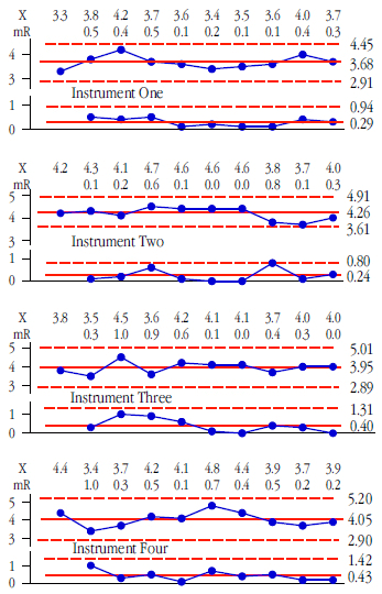
Figure 1:
With a consistency chart the moving ranges provide a measure of measurement error, and the average moving range may be used to estimate measurement error for each device. In the example used here we shall have m = 8 consistency charts, each based on k = 10 measurements of a standard.
Figure 2:
When one of these consistency charts has one or more points outside the limits you have strong evidence of inconsistency in that measurement device, and any attempt to characterize the measurement error for that device is nothing more than smoke and mirrors having no contact with reality.
For those devices with charts that display consistency we may compare the average moving ranges to see if the devices have detectably different amounts of measurement error. Consistency must be demonstrated, it cannot be assumed, and a consistency chart is the simplest way to do this.
Figure 1 shows the data and consistency charts for instrument Nos. 1, 2, 3, and 4. Figure 2 shows the data and consistency charts for instrument Nos. 5, 6, 7, and 8. Each of these eight instruments was used to measure the same standard 10 times. None of these charts show any evidence of inconsistency. But the question of whether these eight instruments are equivalent remains unanswered.
Checking for equivalency of measurement error
The moving ranges in figures 1 and 2 represent measurement error. The average moving ranges for these eight instruments are, respectively, 0.289, 0.244, 0.400, 0.433, 0.322, 0.411, 0.444, and 0.833. To test if these average moving ranges are equivalent we shall use the analysis of mean moving ranges, ANOMmR (pronounced a-nom-m-r).
The ANOMmR chart compares m average moving ranges where each average moving range is based upon (k–1) two-point moving ranges. That is, each average moving range comes from an XmR chart that has a baseline of k original data.
The central line of an ANOMmR chart is the grand average of the m average moving ranges. For the eight XmR charts in figures 1 and 2 the grand average moving range is 0.4222.
The upper and lower detection limits of an ANOMmR chart are found by multiplying the grand average moving range by scaling factors. These ANOMmR scaling factors will depend upon your choice for the risk of a false alarm (the alpha level), the number of average moving ranges being compared (denoted here by m), and the number of original X values in each of the XmR charts (denoted here by k). Tables of these scaling factors are given at the end of this article.
For this example we are comparing the average moving ranges from m = 8 different XmR charts, each of which is based upon k = 10 original values. We choose to use an alpha-level of 5 percent because this is the traditional, default alpha level for a one-time analysis. From the tables we find our scaling factor for the upper ANOMmR detection limit is UL = 1.869, and the scaling factor for the lower ANOMmR detection limit is LL = 0.376. With our grand average moving range value of 0.4222 we find:
Figure 3:
Figure 3 shows that instrument No. 8 has a detectably different amount of measurement error. (This was not immediately apparent in figure 2 simply because, like charts produced by most software, all of these charts were scaled so that the graph fit into a fixed size format, rather than using a fixed scale for all the graphs. Thus, the chart for instrument No. 8 with limits 4.4 units apart [1.8 to 6.2] is shown the same size as the chart for instrument No. 2 with limits only 1.5 units apart [3.6 to 4.9]).
Now that we know instrument No. 8 has a different amount of measurement error we must characterize it separately from the others. Instrument No. 8 has an average of 4.01 units, and an average moving range of 0.8333 units. Dividing the average moving range by d2 = 1.128 gives an estimate of SD(E) of 0.74 units, and multiplying this by 0.675 results in a probable error of 0.50 units. So while instrument No. 8 records values to a tenth of a unit, the values are only good to about one-half unit. Half the time they will err by one-half unit or more, and half the time they will err by one-half unit or less.
In contrast to what we see with instrument No. 8, the remaining seven instruments appear to have equivalent average moving ranges. So, we can combine these seven values to obtain a new grand average moving range of 0.3635 units. This translates into a common estimate of measurement error for the remaining seven instruments of SD(E) = 0.3222 units, and a common probable error of 0.22 units. Thus, instruments No. 1 through No. 7 give values with a precision that will err by less than one-quarter unit at least half the time.
So, by using ANOMmR we can separate these eight instruments into seven that have equivalent amounts of measurement error and one that has roughly twice as much measurement error.
Checking these instruments for bias effects relative to each other and relative to some master measurement method was discussed in reference [2].
About the tables for ANOMmR
The original tables covered up to m = 20 comparisons. The expanded tables are 50-percent larger and now include columns for m = 25, 30, 40, 50, 60, and 80 comparisons. This quadruples the coverage of these tables. For values of m and k not included in the tables you may either use the next smaller values of m or k given in the tables or else you may interpolate within the tables to obtain scaling factors good to two decimal places.
The scaling factors in these tables were found by simulation beginning with 40 million standard normal random values. These observations were repeatedly organized into groups of k values for k ranging from 5 to 50, and in each case the [k–1] moving ranges were obtained and averaged.
Next, for each value of k, these average moving ranges were grouped into groups of m values and the grand average moving range for each group was found. Two ratios were then computed:
Blocks of 10,000 pairs of ratios were then used to create a histogram for each of these ratios and these histograms were then used to estimate three percentiles for each ratio. For values of m ranging from 3 to 80, these histograms were used to estimate the upper 0.5%, 2.5%, and 5.0% points for the Upper Ratios, and the lower 0.5%, 2.5%, and 5% points for the Lower Ratios. (For m = 2 symmetry allowed the use of the upper 1%, 5%, and 10% points for the Upper Ratio.)
Figure 4:
Additional blocks of 10,000 pairs of ratios were then found using new groups of m average moving ranges and used to estimate the six percentiles. Next, for each combination of m and k, the estimates of the six percentiles were averaged together to obtain the values in the tables.
By using up to four times as many blocks in preparing these extended tables the standard error of the estimates in the tables were effectively cut in half. In the original tables about 80% of the values were good to more than two decimal places, while the remainder were good to two decimal places. In the new tables all of the values are good to more than two decimal places, and most are good to three decimal places. While some of the values in the third decimal place may be slightly uncertain, the error introduced by rounding these values off to two decimal places will in every case be greater than the error introduced by using three decimal places.
I did not expand the tables to include larger values of k because an average moving range based on (k–1) = 49 values will possess 30 degrees of freedom. This makes the use of consistency charts with more than k = 50 points a proposition with a diminishing return.
For further reading
1. “When Are Instruments Equivalent? Part One,” Donald J. Wheeler and James Beagle III, Quality Digest, April 2, 2019.
2. “When Are Instruments Equivalent? Part Two,” Donald J. Wheeler and James Beagle III, Quality Digest, May 6, 2019.
3. “When Are Instruments Equivalent? Part Three,” James Beagle III and Donald J. Wheeler, Quality Digest, June 10, 2019.
4. “Analysis of Means Techniques,” Donald J. Wheeler, Quality Digest, July 8, 2019.
Add new comment