Walter Shewhart, father of statistical process control and creator of the control chart, put a premium on the time order sequence of data. Since many statistics and graphs are unaffected by this, you might wonder what the fuss is about. Read on to see why.
ADVERTISEMENT |
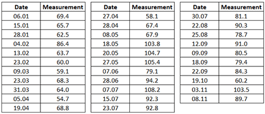
Figure 1 shows a series of measurements over 11 months. Each measurement value is from one production batch, with the date of each production given. The date is formatted as day first, and month second, meaning that “06.01”—the first measurement of 69.4—is from January 6.
|
The analysis of the data started with a simple process behavior chart, or control chart for individual values, as shown in figure 2. The green line is the average of the data in figure 1. The red lines are process limits, computed from the data in figure 1. How to compute the process limits is described in Process Capability: What It Is and How It Helps, Part 2.
|
With this chart displaying process behavior consistent with that of a stable process—an effectively unchanging process over time—the question of process capability was there to answer.
With a lower specification limit of 40, the software returned a disappointing Cpk value of 0.7. Figure 3’s histogram seeks to put this somewhat bleak outcome into an understandable picture. The need to take action on this process to improve the situation looks real.
|
Figure 3 shows that this process doesn’t currently cut it. While none of the obtained measurement values were below the lower specification limit, the analysis tells us it is just a matter of time. Trouble—a word that well describes out-of-specification product—is brewing.
But, is trouble brewing? Look back again at figure 2’s x-axis. The first measurement in the series is from “03.11,” which is November 3, but this is the second-to-last value in Figure 1. The x-axis ascends in order of day of the month, going from 03 to 04 to 05 before ending at 31, which is March 31. The value from 31st March is not the final measurement in the record.
A quick change in the software resolved the problem.1 A new process behavior chart, this time based on the actual time sequence order, is shown in figure 4.
|
Figure 4 no longer paints the picture of a process displaying stable behavior over the 11 months of operation. There is a run of 10 points below the central line up to May 8. From May 18 the process operates at a higher average. Figure 4 gives the green light to dig deeper. A new chart, created using two sets of process limits to reflect the knowledge gained from figure 4, is seen in figure 5.
Figure 5 substantiates that a change occurred on, or just before, May 18. Up to May 8, the process displayed stable behavior around an average of 65.4; thereafter, stable behavior is displayed around an average of 90.0.
Process capability is primarily about prediction. Yet, the data up to May 8 account for something that belongs to the past. This version of the process ceased to exist after May 8. What is—meaning the current process—is represented by the data from May 18 onward.
A new process capability analysis was carried out using the data from May 18 onward. The current process’s Cpk came out as 1.48. A new histogram picture was done to reflect the predicted performance of the current process, as shown in figure 6.
|
Rather than trouble brewing, figure 6 indicates a process in good health. If this process continues to behave in a stable manner, producing out of specification looks as likely as rain in the desert.
What, then, is the distinction between the two analyses of the data? It is like night and day:
• Wrong sequence: Unhealthy process
• Correct sequence: Healthy process
The wrong sequence resulted in a misleading outcome, painting a picture that wrongly condemns a currently healthy process. The hallucination is that the process needs attention. How much waste might this have caused due to unnecessary meetings and the planning and execution of actions?
The correct sequence, based on time order, showed that the process had changed and pinpointed when it changed. The data representing the current process could be identified, and these data led to the conclusion that the process was in a healthy state. The basis for action is to sustain this process’s current capability, meaning to continue at the level of performance of the last six months.
We started with Walter Shewhart. His landmark 1931 book, Economic Control of Quality of Manufactured Product (Martino Fine Books, 2015 reprint), had three postulates, the third being “Assignable causes of variation may be found and eliminated.” An assignable cause is what causes instability in a process. It is what causes a change in the process, as in figure 4.
On page 25, Shewhart wrote: “This state of control [a stable process], appears to be, in general, a kind of limit to which we may expect to go economically in finding and removing causes of variability without changing a major portion of the manufacturing process as, for example, would be involved in the substitution of new materials or designs.”
A stable process is free of assignable cause variation. For Shewhart, the time sequence order of the data was needed to make his control chart method work, and the control chart was needed to detect the presence of assignable cause variation.
A potentially unknown example is from Shewhart’s 1941 conference paper, “Contribution of statistics to the science of engineering.” Using thickness data on relay springs, Shewhart showed that a control chart based on a randomization of the data hid the presence of the assignable causes, whereas the control chart based on the time sequence of production exposed them. Shewhart subgrouped the data and presented them on an average chart. The data are presented below on a process behavior chart for individual values.
Figure 7 shows the thickness data in randomized order.2 (Shewhart’s paper doesn’t reveal the random order he used, so I randomized the data myself.) Even with all eight detection rule tests in the software turned on, the only signal is the single point just above the upper process limit. When a single point of 144 values is a fraction above the upper process limit, the process will be characterized as no more than slightly unstable.
|
Figure 8, using the time order sequence of the data, tells the true story of this process. Only detection rule one is applied, and this is sufficient to characterize the process as unstable. Seven points of 144 (4.9% of the points), and the fact some of the seven points are a lot more than a fraction beyond the upper process limit, leave no doubt: The evidence of instability is strong. This process is not operating with minimum variation in output. No matter what the performance is vs. specifications, this process has the potential to do better.
|
So, why the fuss about the time order sequence of data? As we’ve seen:
• First, the sequence order of the data can make all the difference to the outcome of an analysis.
• Second, the time order sequence is key to expose assignable causes.
We now know at least two reasons why Shewhart placed a premium on time order sequence. One, to avoid the unnecessary waste of being misled3; and second, to use data to help get the most out of a production process.
Notes:
1. The values in the x-axis column were initially text formatted. By default the software used the text values in ascending order, hence 03.11 first, 04.02 second, 05.04 third, and so on. Once the column was reformatted to date, the correct time-order sequence was used to generate the process behavior chart.
2. The lower process limit is at –10 in figure 6. Since a thickness measurement cannot be negative, the lower process limit could be positioned at zero to respect this boundary condition. The interpretation of the chart is not affected by this point.
3. In Shewhart’s 1939 book, Statistical Method from the Viewpoint of Quality Control (Dover Publications, 2013 reprint), he covered this with his rule one: “Original data should be presented in a way that will preserve the evidence in the original data for all the predictions assumed to be useful.”
Comments
Shewart and Control Limits
Consider using the same scale on all of the charts(both run and histograms). If you do, it is noticeable that the control limits change when the data sequence changes.
It may also be revealing to place both spec limits and control limits on both run charts and histograms.
Purists may say that spec limits have no place on a control chart but the first observation that could then be made is whether the process control limits (the voice of the process) are inside or outside the spec limits ( the requirements of the customer). One condition would be cause for relaxation, the other for vigilance.
Another observation is that the control limits calculated for the initial data set indicate that the second data set is way out of control. An observation that may not be so obvious with control limits based on the combined data set. The presence of unmoving spec limits as a reference on the same chart may also bring this observation to the forefront.
Control limits and specs
Fully agree that the position, or width, of the control limits is also dependent on the order sequence used. I once had a real example where data were presented in ascending order – the control limits where then extremely narrow (and useless too). Interestingly, as you’ll know but many do not, no matter how we order the data the generic standard deviation statistic never changes.
Spec limits on control charts for individual values? It all depends on the ability of the user to interpret the chart appropriately: I’d guess that in a lot of cases inclusion of the specs leads to an interpretation of the chart that doesn't do justice to the voice of the process because the specs dominate the interpretation. I don’t think it is purist at all, but rather a realisation of the misinterpretation that is likely. If the specs dominate the interpretation, make a time series with the specs on it.
I think we are in full agreement that the specs play a key role in deciding how urgent action is.
Thanks for the comments.
I agree with Scott
I tried training our very smart, creative engineers that it was OK to put spec limits on Individuals (process behavior) charts, but NOT on Xbar charts. Nope, a sizeable portion of the engineers forgot that part of the discussion because, well, most of our engineers are astoundingly good in their discipline but not so much in statistical quality. I had to run around putting fires out when enginers thought control charts were bogus because clearly there were out-of-spec observations, but the Xbar chart was telling them everything was in spec. Worse, managers who saw Xbar charts showing "everything in spec" were sometimes walking away from presentations thinking things were hunky-dory when they weren't.
I've found since that it's much easier to say that specs belong on a completely different plot unless I'm dealing with engineers and managers who have used SPC for a while and get what it's doing. It's a Just Say No kind of message, simple and easy to convey in big red letters on a slide. Just sayin'.
Add new comment