Let’s get this out of the way right up front: You have the best product in your sector of the industry. You know it, your people know it—heck, even your competitors know it in the bottom of their competitive hearts. But do the thousands upon thousands of potential customers across the world know it? If not, how do you communicate that value to them in a flash?
Welcome to the power of a well-thought-out and elegantly executed media marketing strategy. If there’s one maxim you need to keep in mind constantly, it’s the words we all mutter to ourselves whenever we land somewhere online: “Why do I care about this?” You have fewer than five seconds to show your prospects why they should care.
Notice we said “show” and not “tell.” Showing them starts with a great landing page, which must be visual, enticing, and most of all, simple. If looks like it’s too much work, too complicated, then prospects will bounce.
What makes a great landing page? A few simple elements:
|
Do |
Don’t |
|
Be simple |
Be complicated |
|
Use few words |
Be wordy |
|
Choose a single, large, eye-catching image |
Avoid images or pick small, disconnected ones |
|
Employ complementary colors and fonts |
Scramble disassociated colors and fonts |
|
Mention pricing in your call to action |
Hide your pricing or discounts |
Yes, that’s right! Say right up front what your pricing is, as well as any specials or discounts you’re offering in specific campaigns. “Contact us for a quote” communicates a lack of confidence in your value to the user. You’ll get some who will take the time, but think of all the others who will bounce away when your offer isn’t transparent. Say what you charge, clearly. A range, even a big one, is perfectly acceptable. If you get fewer prospects engaging with you, so be it… the ones who do choose to take the next step are infinitely better qualified.
Fewer words are better than more; some are more powerful than others.
|
Good |
Bad |
|
Value |
Nice |
|
Certify |
Want |
|
Measure |
Estimate |
|
Improve |
Try |
|
Promote |
Love |
In terms of positioning the content on the landing page, note that most PCs today have a resolution of 1,600 × 800 pixels or higher. That 800-pixel vertical depth is critical… this is the portion of the page that’s “above the fold.” You may have heard that phrase before. It harkens back to the days of newspapers, when the most valuable real estate on the front page was the portion just above the crease when the paper was displayed on a newsstand or in a vending machine. This space is where you can immediately communicate value at a glance to a potential customer and make your case for the sale.

Similarly to a newspaper trying to convince a reader to make an immediate decision to buy it based on what is above the fold, a well-designed landing page should give users everything they need to know right away, without scrolling. Display pertinent information like price, features, benefits, and other key differentiators in that spot at the top of your page. Include any forms you want them to complete or resources you want them to have. Employ some of the powerful wording mentioned above along with that eye-catching image.
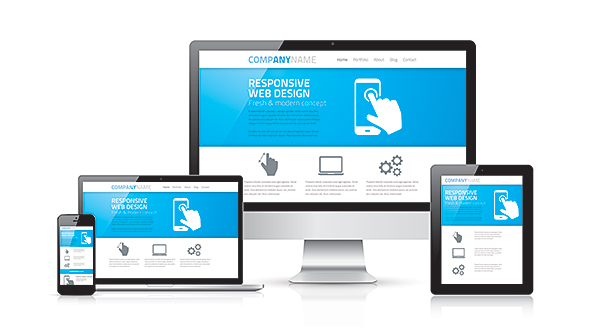
People are now regularly using their phones to review content, so keep your mobile site requirements in mind, too. The same thinking applies: Show readers, immediately, why they care about your offer and how they can take additional steps to work with you. Mobile design is demanding; you have even fewer words and just one column to make your case. Show people, right away, why they should care about you. Use a few active words, one strong image, and a way that they can engage with you further.

Next time, we’ll look more closely at the importance of powerful and deeply attractive calls to action—that small handful of words which guide your user toward taking further steps to learn more about you, your organization, and your unique, perfect solution to their specific problem.
Add new comment