Cost for QD employees to rent an apartment in Chico, CA. $1,200/month. Please turn off your ad blocker in Quality Digest
Our landlords thank you.
Take a look at the control chart in figure 1. There are no observations outside the common-cause limits, but there are five special-cause flags:
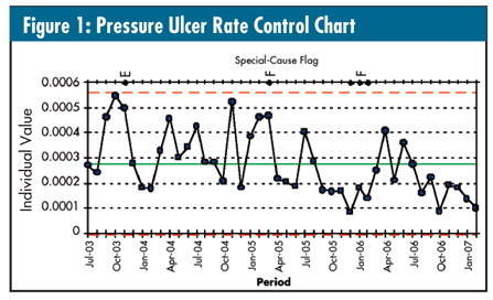
• Observation 5: Two out of three consecutive points greater than two standard deviations away from the mean
• Observations 21 and 30-32: Four out of five consecutive points greater than one standard deviation away from the mean
So, what do you do? Treat them as five individual special causes? Say, “Well, if you look at it realistically, there really seems to be three ‘clumps’ of special cause?” Because the last seven observations all fall below the mean, some readers might want to call them special causes as well. Maybe nothing should be done because no individual points are outside of the limits.
What have been your experiences?
As I’ve tried to emphasize time and again in this column, always do a run chart of your data first (as seen in figure 2).
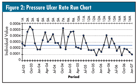
There are no trends and no runs of eight in a row either above or below the median--although there are two runs of seven in a row (No. 9-15 and No. 38-44).
Let’s use the “total number of runs” tests described in last month’s column. (Note the axis above the run chart: It’s counting the runs and indexes every time the data cross the median.) The data contain 16 runs, and there are 44 data points. According to the table in last month’s column, you would expect 17 to 28 runs. We got 16… below what’s expected. So, what exactly does this mean?
All it means is that, through the history of these data, there’s been more than one process “needle” (i.e., center). This is where any initial focus should be--not, as I so often hear, “Are there any observations outside the control limits? What do those special-cause tests mean?” I asked the person who gave me these data whether there was an intervention at observation No. 38 or observation No. 27. She looked at me as if I were a magician and declared it was observation No. 27. That is the special cause.
This “needle shift” caused some points in the initial control chart’s history to appear high and some points in the post-intervention history to appear low, causing the special-cause flags when the data were naively plotted as a control chart using the mean of all 44 observations.
Figure 3 shows the resulting control chart where the only adjustment made was for the known intervention.
Do you now see what I mean by “needle shift?” I can see some board members commenting on the “disturbing trend” of observations No. 33-37, but they are common cause in the improved process.
Let’s stop treating each special cause test as a special cause and do some thinking. As my distinguished predecessor, Don Wheeler, said many times in this column, “The purpose is not to have charts but to use charts.” Let’s stop being so statistically dogmatic.