PROMISE: Our kitties will never sit on top of content. Please turn off your ad blocker for our site.
puuuuuuurrrrrrrrrrrr
Davis Balestracci
Published: Tuesday, March 21, 2017 - 12:03 According to Mark Graham Brown, from his book Keeping Score (Productivity Press, 2006), 50 percent of the time leaders spend in meetings involving data is waste, 80 percent of the pounds of published financial data is waste, 60 percent of the pounds of published operational data is waste, and middle management wastes one hour a day poring over these reports. Do you have any idea what this costs? Perhaps more important, does it even matter? In meetings involving leaders and middle managers, there seems to be a code of universal leadership laws for using operational data. It has its own vocabulary emphasizing the words “tough,” “stretch,” “low-hanging fruit,” “accountability,” and the phrase, “I don’t like these numbers.” The code also seems to encourage tantrum phrases such as, “Find out what happened here!” “What are you going to do about it?” and, “I want a plan to fix this!” These nine leadership laws are perfectly designed to create confusion, conflict, complexity, and chaos—and increase costs. Year after year, something magical seems to happen in January (or at the beginning of the fiscal year) regarding data display. Although everyone comes to work at the same organization that existed the day before, the previous 364 days of process behaviors seem to be reset, with a protocol for “cherry-picking,” when deemed appropriate, as follows: Except as yearly averages, with two appropriate exceptions: 1. The current year-to-date figure can be compared only with the exact same time span of the previous year. Trap: This assumes seasonality and treats any differences as special causes. 2. Using only this same month’s performance 12 months ago to compare with the current month. Trap: Assuming each month is a special cause and treating the two months’ year-over-year difference as a special cause On which we will draw little circles around any numbers we don’t like (aka MBLC: Management By Little Circles). Optional: Put “Why?!” or “What happened?!” in red ink next to the circle, and mail it to the appropriate person. Trap: Human variation in the perception of, and response to, variation as well as treating it all as special cause. Also, unnecessary time spent arguing over whose circles are most important, and reaching consensus about which ones are vitally important for action now. Balestracci’s profound law of numbers I wonder whether a better explanation of MBLC might be Management By Literal Chaos (or confusion or complexity or conflict). The table in figure 1, which I snatched from the hands of a colleague, is a beautiful example: Should additional graphs be deemed necessary, they should not show more than the last 24 months and be displayed as follows, in any combination: 1. Separate yearly averages superimposed on the running 24-month record, with trend lines added whenever possible. 2. Plotted year-over-year by month in a “copulating earthworm plot” to compare differences and look for seasonality (the only exception for using more than two years). 3. As year-to-date, side-by-side monthly bar graphs of each of the two months’ performance. Trap: More human variation in reaction to such nonsensical displays. I didn’t make up this graph in figure 2 of a number that “made people sweat”: Trap: Common cause data can exhibit strong evidence of very obvious special causes that don’t exist! To demonstrate, figure 3 shows time plots of the exact same data. The top plot depicts randomly generated data that has no special causes; the middle plot shows rolling averages of 4 (e.g., analogous to the commonly used four-quarter rolling average); the bottom plot shows rolling averages of 12 (e.g., equivalent to common 12-month rolling average charts, often used in calculating “days outstanding accounts receivable”): Especially if it’s trending in the wrong direction by “too much.” Trap: Once again, treating the difference and perceived trend as a special cause due to how the exhibited variation is perceived, and how large it “should” be. To give an idea of the overall trend, so we can compare it with last month’s trend. Then we can update our projection of year-end performance. Trap: Once again, treating common cause as special cause, and creating a 33-percent risk of calling three data points a trend—either all going up or all down—when it isn’t. Any green indicator is fine. We will discuss whom should get recognition, but it would be preferable to use one of these tougher strategies to get even better results: 1. Use a reward process to stretch them further. For example, if they get (pick a number) greens-in-a-row, we will tell them, “Send out for pizza and send us the bill”... and then stretch their green endpoint. 3. For really important numbers (e.g., customer satisfaction survey results), show them we mean business! Go around as a leadership group every week or month, and plant a red, yellow, or green flag in each department based on its most recent result. (DB: I didn’t make this one up!) Figure 4: Going for the green Trap: High risk of treating common cause as special, plus destroying cultural morale—and any remaining respect for the leaders. Here’s the “getting tough” option: The (arbitrary percentage of) people having the largest variances will need to write a special report about what they’re going to do about it, and present their results to us next month. Trap 1: Treating all variances as special cause. Also, choosing an arbitrary percentage of people as a cutoff for needing explanations—assuming the variances are special causes, when many probably are not. Trap 2: Time wasted by people preparing these nonsense reports and unnecessarily presenting them at the next meeting. Trap 3: At this subsequent meeting, once again allowing human variation of perceived variation to demand questionable actions based on these reports. Plus the particular trap of asking, “Where is your low-hanging fruit?” With one exception: For what we know to be an impossible situation, we will ask for only a 3-percent stretch. Trap: Using goals to motivate. Treating individual differences between current performances and goals as special causes. Not using an I-chart to gain knowledge of the process’s actual performance, compared to any goal that suggests a common cause strategy is required. Not only do all of these laws apply to the everyday use of routine data, but they also come into play during the entire budgeting process. Trap: Treating every year as a special cause in spending, and taking up to 30 percent of peoples’ time with creating, adjusting, and readjusting budgets, not to mention routine cost-cutting meetings throughout the year. How about plotting spending as a starting point, and then using some common cause strategies? Isn’t all this nonsense merely reacting to the data’s reflection of routine, daily, common causes of confusion, conflict, complexity, and chaos as if they were special causes? Isn’t your company perfectly designed to spend what it spends? Isn’t all this just a symptom of a much deeper systemic (additional common cause) problem: data insanity? Are the data “unknown or unknowable?” Perhaps, but who needs figures to see this widespread organizational cancer as a staggering cost? Might data insanity and its toxic consequences be the root cause of Deming’s disgust with American management? Don’t believe me? There’s only one way to find out: Plot some dots! “If we’re actually trying to do the wrong thing, we may only be saved from disaster because we are doing it badly.” Quality Digest does not charge readers for its content. We believe that industry news is important for you to do your job, and Quality Digest supports businesses of all types. However, someone has to pay for this content. And that’s where advertising comes in. Most people consider ads a nuisance, but they do serve a useful function besides allowing media companies to stay afloat. They keep you aware of new products and services relevant to your industry. All ads in Quality Digest apply directly to products and services that most of our readers need. You won’t see automobile or health supplement ads. So please consider turning off your ad blocker for our site. Thanks, Davis Balestracci is a past chair of ASQ’s statistics division. He has synthesized W. Edwards Deming’s philosophy as Deming intended—as an approach to leadership—in the second edition of Data Sanity (Medical Group Management Association, 2015), with a foreword by Donald Berwick, M.D. Shipped free or as an ebook, Data Sanity offers a new way of thinking using a common organizational language based in process and understanding variation (data sanity), applied to everyday data and management. It also integrates Balestracci’s 20 years of studying organizational psychology into an “improvement as built in” approach as opposed to most current “quality as bolt-on” programs. Balestracci would love to wake up your conferences with his dynamic style and entertaining insights into the places where process, statistics, organizational culture, and quality meet.Vital Deming Lessons Still Not Learned
As demonstrated by these nine leadership laws of data
1. As of January 1, the past no longer exists
2. If at all possible, data should be presented in tabular form
Given a set of numbers, one will be the largest, one will be the smallest, 10 percent will be the top (and bottom) 10 percent, and 25 percent will be the top (and bottom) quartiles. The biggest difference between any two months will be the biggest difference since the previous, biggest difference.
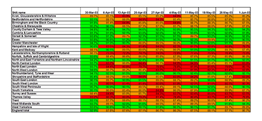
Figure 1: Where would you put your circles? Click here for larger image.3. For important data, a trend graph of the last 12 months (only) can be useful, as either a line or bar graph, with a trend line
Figure 2: What are you supposed to do with this? Click here for larger image.4. When displaying financial data, use rolling averages whenever possible
Figure 3: Yes, these are plotted using the exact same data5. The difference between this month’s and last month’s performance might need to be explained
6. The performances of this month, last month, and the same month a year ago may need a trend line
7. When at all possible, convert a table of numbers to its traffic-light equivalents
2. Set a standard. No more than (pick a number) months in a row can be non-green and will require a special report. Having (pick a number) reds in a row will require a face-to-face meeting with management to present a plan for better performance.8. Current month and year-to-date performances should be compared to goals and recorded as variances
9. All goals must end with a zero or a five
What about the tiresome annual ritual of the budget?
—David Kerridge
Our PROMISE: Quality Digest only displays static ads that never overlay or cover up content. They never get in your way. They are there for you to read, or not.
Quality Digest Discuss
About The Author
Davis Balestracci
© 2023 Quality Digest. Copyright on content held by Quality Digest or by individual authors. Contact Quality Digest for reprint information.
“Quality Digest" is a trademark owned by Quality Circle Institute, Inc.
Comments
Good article Davis.
Good article Davis.