Our PROMISE: Our ads will never cover up content.
Our children thank you.
Donald J. Wheeler
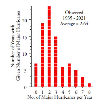
Published: Monday, December 13, 2021 - 13:03 Management requires prediction. However, when making predictions it is easy to torture the data until they surrender and tell you what you expect to hear. Even though this torture may be unintentional, it can keep you from hearing the story the data could tell. This column is about how to avoid torturing your data while making predictions. A few years ago a correspondent sent me the data for the number of major North Atlantic hurricanes for a 65-year period. Major hurricanes are those that make it up to category 3 or higher. I have updated this data set to include the number of major hurricanes through 2021. The counts of these major hurricanes are shown in a histogram in figure 1. In what follows we shall look at two approaches to using these data to make predictions. Approach one begins by finding a probability model to use in characterizing the data. Given that we have a skewed histogram of counts of events, the typical choice here would be a Poisson probability model. Since the Poisson model only has one parameter, we only need to compute the average number of hurricanes per year to fit a Poisson distribution to the histogram of figure 1. With 230 major hurricanes in 87 years we have an average of 2.64 major hurricanes per year. A Poisson model for 87 counts having an average of 2.64 is shown in figure 2. With no detectable lack of fit between the model and the histogram, we can proceed to use the model to characterize the number of major hurricanes and make predictions. Since the standard deviation for a Poisson model is equal to the square root of the mean, we can compute an approximate 95% confidence interval for the mean number of major hurricanes per year as: Prediction 1: Based on this confidence interval, in any reasonable multi-year period we would expect the average number of major hurricanes to fall between 2.3 and 3.0. Prediction 2. Summing up the probabilities for counts of 1, 2, and 3 in figure 2 we get a combined probability of 0.656. Based on this we might predict that, for any reasonable multi-year period, about two years out of three will have either 1, 2, or 3 major hurricanes. Prediction 3: At the same time, the probability of seven or more major hurricanes in one year is about 1.8 percent. Inverting this probability we get 55.2. This means that we would expect seven or more major hurricanes to occur once every 55 years on the average. Prediction 4: The probability of six or more major hurricanes in one year is about 5.2 percent. Inverting this probability we get 19.4. This means that we would expect six or more major hurricanes to occur once every 19 years on the average. When we compare the predictions with the actual histogram in figure 1 we find no problem with predictions 1 or 2. This is hardly surprising given that the model was made to fit the histogram. However we have problems with predictions 3 and 4. Prediction 3 said that extreme years with 7 or more major hurricanes should happen about once every 55 years. Figure 1 shows 4 out 87 years had seven or eight major hurricanes. This is one extreme year every 22 years on the average! Prediction 4 said that extreme years with 6 or more major hurricanes should happen about once every 19 years. Figure 1 shows 9 out of 87 years had six or more major hurricanes. This is an average of one extreme year every 10 years on the average! So what is happening? We fit the model to these data, so why are these data misbehaving? Oops! It is not the data that are wrong, but rather the model that is erroneous. The first clue as to why the model is wrong can be found by simply plotting the data in a running record. Figure 3 shows this running record for 1935 to 2012. As our eye follows the data from left to right we immediately see that there are two different patterns of hurricane activity. Before 1948 and from 1970 to 1994 there were low numbers of major hurricanes, while the periods from 1948 to 1969 and from 1995 to 2012 had higher numbers of major hurricanes. Thus, the histogram in figure 1 is a smash-up of data from two different systems. A better picture of these data would use two different histograms as in figure 4. So here we see that prediction 1 is also erroneous. No reasonable period of years has an average of 2.3 to 3.0 major hurricanes per year. The 95-percent confidence interval for the mean was completely bogus. Likewise, prediction 2 is wrong. In the years of low activity 33 out of 38 years (87%) have 1, 2, or 3 major hurricanes. In the years of high activity 25 out of 49 (51%) had 1, 2, or 3 major hurricanes. The fact that the erroneous histogram of figure 1 has 65 percent of the years with 1, 2, or 3 major hurricanes is meaningless. Approach one missed the time-order structure within the data simply because it assumed the data were homogeneous. When the data are not homogeneous the whole statistical house of cards comes tumbling down, your predictions will be incorrect, and decisions built on those predictions may be wrong. When we use an XmR chart for each of the four periods seen in figure 3 we get figure 5. We do not have to be meteorologists to examine the behavior of this time series. Here we find clear indications of each of the changes in behavior within the time series itself: the count for 1950 is above the earlier limit; the counts for 1970 through 1977 form a run below the previous central line; and the count for 1995 exceeds the previous limit. Thus, there can be no question that this time-series is oscillating between two different behaviors. The only question is what is the cause of these changes. To investigate these changes I went to the NOAA website and found the article: “NOAA Attributes Recent Increase in Hurricane Activity to Naturally Occurring Multi-Decadal Climate Variability” (Story 184). This article confirms the existence of the cycles seen above and attributes them in part to shifts in the latitude at which the storms form off the African coast So, how can we use the X-chart in figure 5 to make predictions? We can use the most recent portion of the chart (the part for 1995 to 2012) to describe what to expect in subsequent years In making these predictions it will be helpful to have an estimate of dispersion. Here we estimate sigma from the upper limit of 9.35 and the average of 3.72 to get: Prediction 1: If the high activity cycle continues, we should expect an average of about 3.7 major hurricanes per year. With a baseline of 18 years an approximate 95 percent interval estimate for the average will be: Prediction 2: The empirical rule tells us to expect roughly 60 percent to 75 percent within one sigma of the average. So, if the high activity cycle continues after 2012, we would expect about two thirds of the subsequent years to have 2 to 5 major hurricanes. Prediction 3: The empirical rule also tells us to expect 90 percent to 98 percent within two sigma on either side of the average. Thus, if the high activity cycle continues after 2012, we would expect almost all of the subsequent years to have between 0 and 7 major hurricanes. The data for 2013 to 2021 are shown in figure 6. With 30 major hurricanes in 9 years the most recent period averaged 3.33 per year. So prediction 1 was good. Six out of the last nine years had between 2 and 5 major hurricanes, so prediction 2 was good. Nine out of nine years had between zero and 7 major hurricanes, so prediction 3 was good. As seen in figure 6, the last nine years are consistent with the previous 18 years, and we continue to live in a period of high activity. By using the information contained in the time-order sequence of the data we not only avoid the tortured predictions of approach one, but also make predictions that are consistent with the process behavior and which, in this case, actually came true. So how many major hurricanes should we expect next year? Based on the past 27 years it is most likely that there will be between 2 to 5. However, there is about a 20-percent chance that there could be as many as 6, 7, or 8. And there is about a 10-percent chance that there could be as few as zero or 1 major hurricanes next year. How could we tell if there was a shift to an even higher level of activity? While meteorologists use a multiplicity of measures to make these determinations, we are limited to what we can learn from these counts. So for us, a signal of increased activity might be a single year with 10 or more major hurricanes, or two out of three successive years with 8 or more major hurricanes. How could we detect a shift back to a low-activity period using the counts alone? We would need to have four out of five successive years with no more than one major hurricane, or eight successive years with no more than 3 major hurricanes. So is figure 6 telling us anything about global warming? Not directly. Counts of major hurricanes are fairly blunt instruments. They do not take into account the length of time a hurricane spent as category 3 or higher. Neither do they take into account whether the storm hit land nor the amount of damage done by each storm. While these counts are sufficient to identify periods of high and low activity, they only tell part of the overall story. As always, these data have to be used in context with all of the other information that is available. When a histogram appears the least bit skewed there usually follows either an attempt to fit a probability model to the data or an attempt to transform the data to make them “more normal.” Both of these actions require the data to be homogeneous. When the data are not homogeneous fitting a model to the histogram, or transforming the data, has to be classified as torturing the data in order to satisfy your presuppositions. However, the most common cause of a skewed histogram is illustrated by these hurricane data. Figure 1 is made up of layers of data from different systems. Figure 7 shows these layers and what happens when they are laid on top of each other. Collectively the result is more skewed than any one portion thereof. So be careful to avoid being misled by a skewed histogram. It may be the result of a process that is going on walkabout. When you ignore the information contained in the time-order sequence of the data, your analysis loses contact with reality and the results are likely to be nonsense. Before the techniques taught in your statistics class will work as advertised you will need to have homogeneous data. And the simplest test for homogeneity is a process behavior chart. The primary question of all data analysis is whether or not the data are reasonably homogeneous. This trumps questions about what probability model to use. It trumps questions about how to estimate the parameters of a probability model. It trumps questions about whether to transform the data. Estimation and prediction have to wait until after we have characterized the process producing the data as behaving either predictably or unpredictably. When the data are not homogeneous, the whole statistical house of cards collapses. Hence, Shewhart’s second rule for the presentation of data: “Whenever an average, range, or histogram is used to summarize the data, the summary should not mislead the user into taking any action that the user would not take if the data were presented as a time series.” The primary technique for examining a collection of data for homogeneity is the process behavior chart. Any analysis of observational data that does not begin with a process behavior chart is fundamentally flawed. The best analysis is always the simplest analysis that provides the needed insight. And that is why you need to appreciate the difference in the two approaches to the analysis of observational data described in this article and outlined in figure 8. Quality Digest does not charge readers for its content. We believe that industry news is important for you to do your job, and Quality Digest supports businesses of all types. However, someone has to pay for this content. And that’s where advertising comes in. Most people consider ads a nuisance, but they do serve a useful function besides allowing media companies to stay afloat. They keep you aware of new products and services relevant to your industry. All ads in Quality Digest apply directly to products and services that most of our readers need. You won’t see automobile or health supplement ads. So please consider turning off your ad blocker for our site. Thanks, Dr. Wheeler is a fellow of both the American Statistical Association and the American Society for Quality who has taught more than 1,000 seminars in 17 countries on six continents. He welcomes your questions; you can contact him at djwheeler@spcpress.com. Torturing the Data
When is a prediction more than just wishful thinking?
Figure 1: Major North Atlantic hurricanes per year, 1935–2021Approach one
Figure 2: The Poisson probability model for 87 counts with mean of 2.64Evaluating approach one
Figure 3: The numbers of major North Atlantic hurricanes by year 1935–2012
Figure 4: Actual histograms for number of major hurricanes per yearApproach two
Figure 5: X-charts for the numbers of major North Atlantic hurricanes 1935–2012
Figure 6: X-chart for the numbers of major North Atlantic hurricanes 1995–2021Global warming
Much ado about skewness
Figure 7: How stratification of the data creates skewnessSummary
Figure 8: Two approaches to the analysis of observational data
Our PROMISE: Quality Digest only displays static ads that never overlay or cover up content. They never get in your way. They are there for you to read, or not.
Quality Digest Discuss
About The Author
Donald J. Wheeler
© 2023 Quality Digest. Copyright on content held by Quality Digest or by individual authors. Contact Quality Digest for reprint information.
“Quality Digest" is a trademark owned by Quality Circle Institute, Inc.
Comments
Non homogeneous
It is very difficult, if not impossible to get meaningful data in such an area over a long period. Detection has greatly improved, yet.https://www.drroyspencer.com/wp-content/uploads/tornadoes-1954-2018.jpg
If the Operational Definition in "what are we trying to achieve?", is to predict the future, the data is clearly non homogeneous. Predictions are not meaningful.
Control Limits Breakpoints
Dr Wheeler,
Excellent article. As a MBB, I always instruct problem solvers to gather all aspects of the data (who, what, where, when) in order to plot it many ways, and always get the temporal understanding of the data so it can be plotted on a time series plot.
My question is about determining the breakpoints to create new control limits as shown in Figure 5. Is there a certain rule to determine when to create new control limits or is just a trial and error method combined with observing natural breakpoints? On Figure 5, it looks obvious, but I can imagine a lot of cases where it is not so obvious.
Thanks.
Breakpoints
Dr. Wheeler will be able to address your question much better than I, but I have a few thoughts to consider.
- Plot without any breaks and the signals in the behavior chart will give clues about when breaks have happened (use Western Electric or other rules to find signals).
- Make sure signals are breakpoints of trends and not individual or tightly clustered extraordinary causes.
I have done this with many processes and found shifts in the behavior charts. After investigating the circumstances around the breakpoint timeline, I've often found that:
1) intentional changes were made to the process that were assumed to have no effect on this particular metric
2) unintentional changes were made to the process by new operators, maintenance, even the weather (seasonal changes)
Send it to the US President
An excellent article again! Given the recent storms across the States maybe send it to the new task force just announced by the President
Great article!
Great article! Thanks, Dr. Donald J. Wheeler