Cost for QD employees to rent an apartment in Chico, CA. $1,200/month. Please turn off your ad blocker in Quality Digest
Our landlords thank you.
Donald J. Wheeler
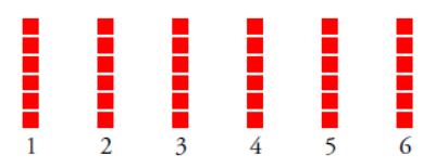
Published: Monday, January 3, 2022 - 13:03 On the face of it, it seems to be impossible for skewed variables to add up to a normally distributed result. Yet both common experience and mathematical theory combine to show us that this does indeed happen. In fact it is a fundamental property of probability theory which, in turn, explains the robustness of the process behavior chart. Consider a pair of dice used in games of chance. Each die has six faces with each face showing from one to six spots. If the die is a fair die, we expect each face will turn up approximately the same number of times in any series of repeated rolls. Here we say that each outcome between one and six is equally likely and expect any histogram to look something like figure 1. Now think about what happens when we roll a pair of dice. The sum of the spots showing will range from two to 12. But are all 11 of these outcomes equally likely? No. With an honest pair of dice we expect a histogram like that in figure 2. Notice what has happened as we go from figure 1 to figure 2. Fewer combinations result in the extreme values such as 2, 3, 11, or 12. This has the effect of making these outcomes less likely. At the same time more combinations result in values such as 6, 7, or 8, making these outcomes more likely. And our uniform distribution of figure 1 morphs into the pyramid of figure 2. This is the same sort of thing that happens in a more complex way with sums of continuous variables. To address the question posed by the title we shall use some chi-square random variables. Chi-square distributions are characterized by a single parameter known as the degrees of freedom (d.f.). Most statistics textbooks will contain a table of percentiles for the family of chi-square distributions. For convenience, figure 3 contains an abbreviated table of these percentiles. In order to easily compare these different distributions we will need to work with their standardized forms. We standardize the values of figure 3 by first subtracting the mean value and then dividing by the standard deviation for each distribution. (Chi-square distributions have a mean value that is equal to the degrees of freedom and a standard deviation that is equal to the square root of twice the number of degrees of freedom.) Figure 4 lists the standardized percentiles that correspond to the values in figure 3. These standardized values define the number of standard deviations between each percentile and the mean. To consider the question in the title of this paper we shall combine several chi-squares each having one degree of freedom. The chi-square distribution for one d.f. is shown in figure 5. Clearly, a one d.f. chi-square random variable has a very skewed distribution. Using the standardized percentiles from figure 4 we can see that the central 90 percent of this distribution spans a total of [2.008-(-0.704)] = 2.71 standard deviations, while the central 99.7 percent spans a total of [6.42-(-0.707)] = 7.13 standard deviations. When we add two independent chi-square random variables, each having one d.f., the sum will be a chi-square random variable with two degrees of freedom. Here the central 90 percent spreads out to span 2.94 standard deviations, which is more than in figure 5. This increased width of the central 90 percent reflects the increased uncertainty that comes from adding two random variables together. However, the central 99.7 percent shrinks to 6.50 standard deviations here. This reflects the reduced likelihood of two very extreme values combining. When we add two independent chi-square variables, each having two degrees of freedom, the sum will be a chi-square random variable with four degrees of freedom. The increased uncertainty continues to inflate the central 90-percent interval, which grows from 2.94 to 3.10 standard deviations in width. The decreased likelihood of very extreme values combining is seen in the shrinking central 99.7-percent interval, which drops from 6.50 to 6.18 standard deviations in width. When we add two independent chi-square random variables, each having four d.f., the sum will be a chi-square random variable with eight degrees of freedom. The increased uncertainty continues to inflate the central 90-percent interval, while the central 99.7-percent interval continues to shrink. Jumping ahead, when we add four independent chi-square random variables, each having eight d.f., the sum will be a chi-square random variable with 32 degrees of freedom. The increased uncertainty continues to inflate the central 90-percent interval, while the central 99.7-percent interval continues to slowly shrink. The mathematical limit for this sequence of standardized chi-square distributions is the standard normal distribution. No distribution can have a central 90-percent interval that is more spread out than that of the normal distribution. Therefore, as the uncertainty increases for our chi-squares, their central 90-percent intervals invariably grow toward the limiting normal value of 3.29 standard deviations. Moreover, while the central 99.7 percent of the chi-square distribution with one d.f. has a spread of 7.13 standard deviations, the central 99.7-percent interval of the sum of chi-squares will, as the number of degrees of freedom increase, contract down toward the normal value of 5.94 standard deviations. And so, as we add observations from skewed distributions together, the sum will have a distribution that approaches the normal distribution. There is even a theorem to this effect. “Any sum or mean will, if the number of terms is large, be approximately normally distributed.” This theorem was proven by Pierre Simon Laplace in 1810. Today it is known as the central limit theorem because it is one of the fundamental theorems of probability theory. The normal distribution is the distribution of maximum entropy. Any operation that increases uncertainty will push us toward the normal distribution. Think of any one product characteristic with which you are familiar. Next think of all of the cause-and-effect relationships that affect that one product characteristic. Typically a product characteristic will be subject to dozens if not hundreds of cause-and-effect relationships. Fortunately, there will usually be a Pareto effect: a critical few of these causes will have major effects upon the product characteristic, while the remainder will only have minor effects. Since we will never be able to spend the time or money to control all of the causes, we seek to control those critical few that have major effects. Once we have identified the causes to control during production, we leave the rest of the causes free to vary as they will. This leads to a crucial distinction: While the set of controlled factors will determine the average product characteristic, the sum of the effects of the uncontrolled causes will create virtually all of the variation in the stream of production. So, when we begin to study a production process, we are typically dealing with variation that is the sum of the effects of many different uncontrolled causes. This makes it important that we understand how the sum of the effects of many different causes might be expected to behave. And the process behavior chart allows us to characterize the variation in the product stream. Shewhart wrote about the routine variation of a predictable process as being “produced by a constant system of a large number of chance [common] causes in which no cause produces a predominating effect.” So if we have been successful in controlling all of those causes that have dominant effects, the resulting variation in the product stream should behave like the sum of a large number of variables where all of the variables have similar effects. And the central limit theorem tells us that this should result in an approximately normal histogram. (Unless a boundary condition intervenes to shorten one of the tails.) This is why the three-sigma limits of the process behavior chart are sufficient to filter out virtually all of the routine variation. However, if we fail to identify and control all of those causes having major effects upon the product characteristic, then some causes with dominant effects will remain in our set of uncontrolled causes. When these causes vary their dominant effects will show up as changes in the product stream. These changes will tend to result in points outside the three-sigma limits of the process behavior chart. Such points represent opportunities to identify the previously unknown, dominant cause-and-effect relationships. Once identified, these “assignable causes of exceptional variation” will need to be added to the set of controlled causes. This is why the three-sigma limits of the process behavior chart are not based on any specific probability model. It is not a matter of using a model and computing exact limits based on some probability. But it is rather about characterizing the variation in the product stream as being in one of two broad categories: either “predictable” or “unpredictable.” When a process is operated in a predictable manner the set of uncontrolled causes will consist of common causes of routine variation, the histogram will be fairly mound-shaped, the points will all fall within the three-sigma limits, and it will generally be uneconomical to seek to find new control factors for this process. When a process displays unpredictable operation the set of uncontrolled causes will contain assignable causes. Because of the dominant effects of these assignable causes the histogram may be skewed or irregular, some points will fall outside the three sigma limits, and it will generally be economical to identify and control these assignable causes. When we unwrap the above we discover why Shewhart found “empirical evidence” that his generic three-sigma limits work in practice. They provide an economic guide on when to take action and when to refrain from taking action. This is why skewed histograms present no problem for the process behavior chart. Process behavior charts have nothing to do with finding exact limits for a particular model based on some arbitrary probability. In fact, as demonstrated in last month’s column, “Torturing the Data,” skewed histograms are, most often, a smash up of data from an unpredictable process. So, should you be concerned about using a process behavior chart if your histogram doesn’t look “normal?” No, the objective is to take the right action. For more than 90 years we have found Shewhart’s generic, fixed-width, three-sigma limits to be sufficient to separate predictable processes from unpredictable processes so that appropriate action may be taken to improve quality, productivity, and competitive position. Just put the data on the chart, do what the chart tells you to do, and things will improve. Quality Digest does not charge readers for its content. We believe that industry news is important for you to do your job, and Quality Digest supports businesses of all types. However, someone has to pay for this content. And that’s where advertising comes in. Most people consider ads a nuisance, but they do serve a useful function besides allowing media companies to stay afloat. They keep you aware of new products and services relevant to your industry. All ads in Quality Digest apply directly to products and services that most of our readers need. You won’t see automobile or health supplement ads. So please consider turning off your ad blocker for our site. Thanks, Find out about Dr. Wheeler’s virtual seminars for 2022 at www.spcpress.com. Dr. Wheeler is a fellow of both the American Statistical Association and the American Society for Quality who has taught more than 1,000 seminars in 17 countries on six continents. He welcomes your questions; you can contact him at djwheeler@spcpress.com. How Can the Sum of Skewed Variables Be Normally Distributed?
One of the fundamental mysteries of probability theory
What happens when we add variables?
Figure 1: Outcomes for the roll of one die
Figure 2: Outcomes for the roll of two diceA skewed example
Figure 3: Percentiles for chi-square distributions
Figure 4: Standardized percentiles for chi-square distributions
Figure 5: The standardized chi-square distribution with one d.f.The sum of two chi-squares (with 1 d.f.)
Figure 6: The standardized chi-square distribution with two d.f.The sum of four chi-squares (with 1 d.f.)
Figure 7: The standardized chi-square distribution with four d.f.The sum of eight chi-squares (with 1 d.f.)
Figure 8: The standardized chi-square distribution with eight d.f.The sum of 32 chi-squares (with 1 d.f.)
Figure 9: The standardized chi-square distribution with 32 d.f.The mathematical limit
Figure 10: The standard normal distribution
Figure 11: One example of the central limit theoremAn application
Our PROMISE: Quality Digest only displays static ads that never overlay or cover up content. They never get in your way. They are there for you to read, or not.
Quality Digest Discuss
About The Author
Donald J. Wheeler
© 2022 Quality Digest. Copyright on content held by Quality Digest or by individual authors. Contact Quality Digest for reprint information.
“Quality Digest" is a trademark owned by Quality Circle Institute, Inc.
Comments
Dr Wheeler article
Another fabulous article full of precious knowledge and insight. Thank you Don!
Don Wheelers Article on non normal data
Don. This was an excellent article on how to handle skewness in your data. The law of averages using larger sample sizes really show the difference in Normality. Rhank You Don