Cost for QD employees to rent an apartment in Chico, CA. $1,200/month. Please turn off your ad blocker in Quality Digest
Our landlords thank you.
Donald J. Wheeler
Published: Monday, June 5, 2023 - 12:03 The keys to effective process behavior charts are rational sampling and rational subgrouping. As implied by the word rational, we must use our knowledge of the context to collect and organize data in a way that answers the interesting questions. This column will show the role that sample frequency plays in constructing an effective XmR chart. One of my clients had an online temperature gauge that could be sampled at different frequencies. The process engineer wanted to use these data to create a process behavior chart. He began by sampling the temperature once every 128 seconds, resulting in a sample frequency of 28 times per hour. The resulting XmR chart is shown in figure 1. This chart shows 50 consecutive readings that span almost two hours of production. The process is being operated predictably, with an average near 19°C. The observed temperatures varied from 16.5° to 21.6°, while the natural process limits range from 14.9° to 22.7°. Thus, unless something changes, these process temperatures can be expected to vary from 15° to 23° in the future. Next, the process engineer sampled the temperature every 64 seconds. The resulting XmR chart is shown in figure 2. These 50 consecutive readings represent about one hour of production. Once again, the chart shows a process that is being operated predictably, with an average near 19°. The observed temperatures vary from 16.2° to 22.3°. The natural process limits of 15.1° to 23.1° tell the same story as was told by figure 1. Unless something changes, this process can vary between 15° and 23° while averaging about 19°. For his next chart, the process engineer sampled the temperatures every 32 seconds. Fifty consecutive readings now cover a time span of about 27 minutes. This chart shows a process that is being operated predictably, with an average near 19°. The observed temperatures vary from 16.7° to 20.9°. The natural process limits of 16.1° to 22.0° are slightly tighter than before but are still consistent with the observed values in all three charts above. Changing the sample frequency to once every 16 seconds resulted in the chart in figure 4. Now, 50 consecutive readings cover about 13 minutes of process operation. As before, we see a process that is being operated predictably, with an average near 19°. The observed temperatures vary from 16.6° to 22.2°. The natural process limits are 15.8° to 22.3°. Up to this point all four XmR charts basically tell the same story, even though the computed values differ slightly. This process was operating predictably with an average near 19°C, while the temperatures varied from lows near 15° or 16° to highs near 22° or 23°. This is the voice of the process. It is what can be expected from this process unless or until it is changed in some fundamental way. Next, the process engineer changed the sample frequency to once every 8 seconds. The resulting chart is shown in figure 5. While the process still has an average near 19°, and while the observed temperatures vary from 16.6° to 21.0° as before, we now find eight points outside the computed limits of 17.6° to 20.4°. Having 16 percent of the points on an X chart beyond the limits is not what we expect to see from a predictable process. Continuing on, the sample frequency was set to once every four seconds, resulting in the chart in figure 6. Now our 50 data span less than four minutes elapsed time. The observed temperatures varied from 17.5° to 20.8° while averaging about 19°, yet 23 of the 50 values fall outside the computed limits of 18.3° to 19.8°. So what is happening? The shorter we make our window on the process, the more unpredictable the process appears to be! For an XmR chart, the requirements of rational sampling can be expressed in two statements. First, successive individual values must be logically comparable; and second, the differences between successive values must logically capture the routine process variation. The judgment involved in meeting both requirements is why we talk about rational sampling. It is rational sampling that allows the chart to reveal both the process potential and the process performance. Without rational sampling, our computations will have no fulcrum and the data will provide no leverage for gaining insight into the process. In the examples above, we are comparing successive temperatures at one point over time. So, successive values are logically comparable and the first requirement is satisfied. With regard to the second requirement, we see that the first two charts have average moving ranges of 1.45° and 1.50°. Both of these charts estimate the voice of the process to be about 19° ± 4°. The next two charts have average moving ranges of 1.11° and 1.22° and estimate the voice of the process to be about 19° ± 3.4°. Thus, the first four charts essentially tell the same story, and intervals of 16 seconds to 128 seconds between observations are sufficient to let the successive differences capture the routine variation inherent in this process. The similarity of these four charts reveals the robustness of the process behavior chart technique. We do not have to always get everything exactly right to characterize the process behavior. In the last two charts, with intervals of eight seconds and four seconds, the successive differences fail to capture the routine process variation. There is not enough time between successive readings. As a result, the moving ranges are constrained, the average moving ranges are deflated, and the limits for the X charts are too tight to describe the natural process variation. Thus, when sampling online readings for a process behavior chart, a sample frequency that is too high can result in limits that do not reflect either the process potential or the process performance. The truncated differences between successive readings will deflate the average moving range and artificially tighten the limits for the X-chart. This is one of the two known failure modes where the computations for an XmR chart will result in an excess number of false alarms. The first four sets of limits do a reasonable job of describing the data from all six charts. The last two sets of limits fail completely. So how can you avoid this problem? You have to think about your process and understand how rapidly it changes. In determining an appropriate sample frequency, you might do as the process engineer did here and try various frequencies to see how the story told by the chart changes. As shown by the first four charts, when the moving ranges capture the process variation, the limits will effectively stabilize and the charts will begin to tell the same story. But when the sample frequency is too high, the limits will begin to shrink. When sampling online readings from an unpredictable process, it is possible to make the process look more predictable with a sample frequency that is too low. Once again, judgment is required. Generally, in between frequencies that are too low and frequencies that are too high, there will be some region where different sample frequencies will result in similar limits. These will be the sample frequencies where the charts will describe both the process potential and the process performance. But what if 15° to 23° is too much variation for the process above? If 19° ± 4° is not satisfactory, then this predictable process will need to be changed in some fundamental way. Distorting things by artificially tightening the limits of the process behavior chart by increasing the sample frequency will not help. The objective of a process behavior chart is to characterize the process behavior so that appropriate actions can be taken as needed and when needed. And there are two fundamentally different courses of action that can be taken to reduce variation. For an unpredictable process, the appropriate action is to identify the assignable causes of exceptional variation so that they can be controlled in the future. As these assignable causes are found and controlled, the process variation will be substantially reduced. For a predictable process that still has too much variation, the appropriate action is to reengineer the process. Seeking nonexistent assignable causes will be a waste of time and effort. To know which type of action is appropriate, you will first need to create a process behavior chart that reflects both the process potential and the process performance. This requires rational sampling. SPC is a way of thinking with some tools attached. Learn the way of thinking, and the tools come to life. Quality Digest does not charge readers for its content. We believe that industry news is important for you to do your job, and Quality Digest supports businesses of all types. However, someone has to pay for this content. And that’s where advertising comes in. Most people consider ads a nuisance, but they do serve a useful function besides allowing media companies to stay afloat. They keep you aware of new products and services relevant to your industry. All ads in Quality Digest apply directly to products and services that most of our readers need. You won’t see automobile or health supplement ads. So please consider turning off your ad blocker for our site. Thanks, Dr. Wheeler is a fellow of both the American Statistical Association and the American Society for Quality who has taught more than 1,000 seminars in 17 countries on six continents. He welcomes your questions; you can contact him at djwheeler@spcpress.com. Are You Rational About Sample Frequency and Process Behavior Charts?
How you sample your process matters
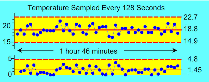
Figure 1: Temperature sampled 28 times per hour
Figure 2: Temperature sampled 56 times per hour
Figure 3: Temperature sampled 112 times per hour
Figure 4: Temperature sampled 225 times per hour
Figure 5: Temperature sampled 450 times per hour
Figure 6: Temperature sampled 900 times per hourRational sampling
Figure 7: The effect of sample frequency upon limitsUnpredictable processes
Two types of action
Our PROMISE: Quality Digest only displays static ads that never overlay or cover up content. They never get in your way. They are there for you to read, or not.
Quality Digest Discuss
About The Author
Donald J. Wheeler
© 2023 Quality Digest. Copyright on content held by Quality Digest or by individual authors. Contact Quality Digest for reprint information.
“Quality Digest" is a trademark owned by Quality Circle Institute, Inc.
Comments
Sampling too infrequently for high speed, unpredictable processe
Dr. Wheeler,
Thank you again for helping many of us setup and use process behavior charts effectively. While in this article you highlighted an example of the effects of too frequent sampling, you do mention the ills of too infrequent sampling of unprecitable processes -- specifically that such infrequent sampling can inadvertently cause the process behavior to look more predictable.
While you say "generally, in between frequencies that are too low and frequencies that are too high, there will be some region where different sampling frequencies will result in similar limits", do you really often see that when frequencies are too low to start with for an unpredictable process?
It seems logical and it has been my experience that unpredictable processes that run really fast but are sampled really infrequently (due to cost of labor) the limits will get narrower and narrower as the sampling frequency is increased over and over. And they are likely giving true, not false evidence of trouble in the process. Perhaps I just never got down to anything close to sampling every successive part, the fastest sampling possible.
It seems the concept of a process time constant would be worthy here. That and the degree of unpredictability in the process are factors in that judgement you mention? Faster more unpredictable processes can benefit from sampling more frequently and so on. But then, we have the problem you've written about elsewhere. If the current sampling frequency is already giving signals and if we aren't taking advantage of that information, why in the world would we need more signals from a faster frequency?
response for Blaine Kelly
Thanks for raising this question.
Rational sampling combines the context for the process and the purpose ofr the charts. It always requires judgment about what kind of process changes might occur and how fast they might show up in the data. Remember, we are not concerned with every little process change, but only those that are large enough to be of economic consequence.
I recommend starting with a higher sample frequency rather than a lower for exactly the reasons you note. However, when we reach a frequency that will allow the subgroup ranges, or the moving ranges, to capture the routine process variation the limits will stabilize. If the limits simply continue to shrink with increasing frequencies your initial frequency may have been too high.
When the limits stabilize you have empirical evidence that you have the right frequency. This empirical evidence should be used along with the context to get useful charts. When confronted with a process that produces data at a high frequency I tend to start with the running recod and look at the overall bandwidth of that record. Is it steady or does it meander around? This is just one more empirical trick to help with the judgment involved in rational sampling. As my colleague Richard Lyday used to say, we should always think first, then think statistically.
So keep asking questions.
Rational sampling
Always a pleasure to read !
Thank you so much!
As always, you explain complex things in simple language.
Thanks for the article dear Dr. Donald J. Wheeler.
As always, you explain complex things in simple language.
Thank you for sharing your knowledge with the world!
May God grant you long life!
Rational Sampling
The Process Engineer's project mentioned in this article reminded me of a 6-Sigma Black Belt project that I helped advise in a paper mill about 10 years ago. I came into the project after the data collection phase and was reviewing the Process Behavior Charts with the Process Engineer after he had collected about two weeks' worth of data. Initially, the charts appeared to be full of special causes; the charts had no semblance of stability. However, after asking a few questions, it turned out that the data points were only 5 seconds apart in their measurement! The data consisted of temperature readings of a pulp slurry exiting a 10,000 gallon tank at a rate of about 50 gallons per minute. The tank had a powerful agitator in it to keep the consistency of the slurry as even as possible. There was, indeed, a consistency meter in the pipeline exiting the tank. We charted the consistency data and found the consistency measurements to be wild as well. The problem was quickly recognized as "rational sampling". There was none! Upon reflection, it became obvious that a 10,000 gallon tank with a thoughput of 50 gpm, cannot possibly experience "real" or "practical" temperature or consistency changes in 5 seconds. An analysis to the autocorrelation of these two variables confirmed that the autocorrelation coefficient was greater than 85%. Thus, the sampling (every 5 seconds) was confirmed to be not rational. The problem was corrected by taking an average of 5 readings taken within a 1 minute span of time (randomly selected from the every 5 seconds data). The averages were taken every 15 minutes. Data collected in this manner showed a stable, predictable process with reasonable control limits, allowing for an 80% reduction in operator adjustments to the process.