Our PROMISE: Our ads will never cover up content.
Our children thank you.
Tim Mouw
Published: Thursday, July 21, 2016 - 11:34 When visually evaluating color, everyone accepts or rejects color matches based on their color-perception skills. In manufacturing, this subjectivity can lead to confusion and frustration between customers, suppliers, vendors, production, and management. This is why color-measurement devices are important in so many industries. By measuring colors using a spectrophotometer, you can communicate and compare spectral data for exact results. To aid in color decisions, color acceptability limits called tolerances can be set as guidelines for how much perceived color difference is acceptable. Tolerances are used to control color, ensure consistency within a production run, and to minimize lot-to-lot variability. But even when using spectral data and tolerances to quantify color, customers and suppliers still find themselves disagreeing. Why does this happen? Through the years, different numerical ordering systems have been developed. If customer and supplier are using different ones, the tolerance—and acceptable color—will be different. Today we’ll look at the most common tolerancing methods so you can be prepared, no matter which method you are expected to use. The human eye has limitations when distinguishing color differences. In addition to color memory loss, eye fatigue, color blindness, and viewing conditions, the eye can’t equally detect differences in hue (red, green, blue), chroma (saturation), or lightness and darkness. In fact, the average observer will see hue differences first, chroma or saturation differences second, and lightness/darkness differences last. As a result, a tolerance established for an acceptable color match has a three-dimensional boundary with varying limits for lightness/darkness, hue, and chroma. Over the years, tolerancing methods have evolved in an attempt to create a method that best correlates to the eye’s sensitivity. David MacAdam was one of the first to determine the human perceptibility limits for an entire population of colors. To do this, he produced a large assortment of master standards, then changed each color’s hue, chroma, and lightness until his observers noticed a difference from the color target. The resulting diagram, plotted on the chromaticity diagram, shows elliptical zones of visual acceptability. 1: CIELAB CIELAB, or L*a*b*, was the first internationally accepted color space. L*a*b* values are calculated from the tristimulus values (X,Y,Z), which are the backbone of all color mathematical models. The location of a color in the CIELAB color space is defined by a three-dimensional, rectangular coordinate system: Once the L*a*b* position of a color is determined, a rectangular tolerance box can be drawn around it to indicate the acceptable color difference. This color—a relatively dark (L* = 42.65, a* = -23.01, b* = 10.50) shade of greenish/blue—is defined by three numbers in the L*a*b* color model. Note that both a* and b* are negative, placing the measured dot in the green/blue quadrant. Because visual acceptability is the shape of an ellipse and not a rectangle, however, there are some places in L*a*b* color space where using a tolerance box may cause problems. Some colors may pass that shouldn’t, and some acceptable colors may fail. 2: L*C*h° L*C*h° color difference calculations are derived from L*a*b* values, but mathematics convert the rectangular coordinate system to a cylindrical polar coordinate system. • L* is the same as in L*a*b* and represents the lightness plane Using the L*C* h° polar coordinate system to set up tolerancing allows a tolerance box to be rotated in orientation to the hue angle. This more closely matches human perception of color, which reduces the chance of disagreement between human observer and instrumental readings or values. This image shows the same bluish-green point on the same color plane that was illustrated as L*a*b*, but using the L*C*h° system. The image below compares tolerancing in L*a*b* and L*C*h°. The black oval shows the range of colors that visually appear within tolerance, while the red rectangle around the perception ellipse will be recorded as “in tolerance” by color-measurement software. As you can see, the L*C*h° system more closely relates to human perception, but still is not as accurate as they could be. 3: CMC, CI94, and CIE2000 The most current and accepted tolerancing methods are elliptical—DECMC, CIE94, and CIE2000. These are not new color spaces, but rather are color difference calculations that are based on the color’s location in color space. This provides better agreement between visual assessment and instrumentally measured color difference. The image to the right shows a slice of these three-dimensional color models, bisected near the equator. At the center is gray, and chroma increases while moving out in any direction. Red, with a hue angle of zero, is at the right. Moving counter-clockwise, the hues shift into oranges, then yellows, then greens, etc. These tolerancing systems create tolerance ellipsoids in color space around the target color. The ellipsoid represents the volume of acceptance, and automatically varies in size depending on position of the color in color space to more closely represent visual color perception. As you can see, the ellipses in the orange area of color space are longer and narrower than the broad and rounder ones in the green area. The size and shape of the ellipses also change as the color increases in chroma. These equations allow the user to vary the overall size of the ellipse to better match what is considered acceptable. The eye generally has greater acceptance for shifts in the lightness (l) dimension than in the chromaticity (c) (hue and chroma) dimension. Although we have not yet devised the perfect color-tolerancing system, these elliptical tolerance methods best represents how we see color differences and are recognized standards in many industries. 1. The amount of acceptable tolerance varies by industry and application. For example, the tolerance for a plastic bubble container will be higher than the plastic dashboard for a $35,000 car. 2. When you’re discussing color difference, be sure you’re talking about the same tolerancing system. 3. When you’re setting the acceptable tolerance within your color measurement instruments and software, you must also select the tolerancing system to calculate accurate results. To learn more about color models and tolerancing, consider our traveling Fundamentals of Color and Appearance seminar. Check to see when we’ll be near you. Quality Digest does not charge readers for its content. We believe that industry news is important for you to do your job, and Quality Digest supports businesses of all types. However, someone has to pay for this content. And that’s where advertising comes in. Most people consider ads a nuisance, but they do serve a useful function besides allowing media companies to stay afloat. They keep you aware of new products and services relevant to your industry. All ads in Quality Digest apply directly to products and services that most of our readers need. You won’t see automobile or health supplement ads. So please consider turning off your ad blocker for our site. Thanks, Tim Mouw is the manager of applications engineering and technical support for X-Rite Pantone in the Americas. Mouw oversees a team of 20 technical support specialists who help customers manage and improve color quality control processes, and has taught more than 300 color science courses throughout North and South America, Europe, Asia, and Australia. X-Rite helps customers communicate and manage color standards for raw materials, paper-based products, ink, photography, video, metal, glass, textiles, plastics, and wood.Are You Using the Right Color-Tolerancing Method?
Unlike beauty, color matching isn’t in the eye of the beholder
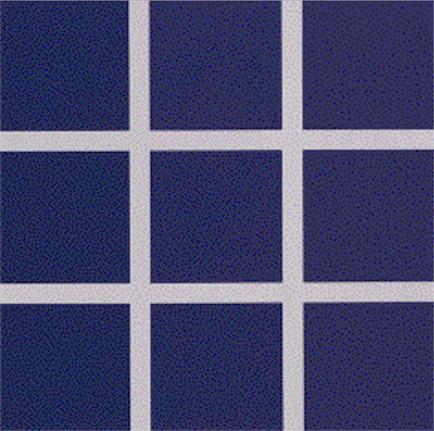
Image 1: Are these acceptable color differences?Why you can’t always count on your eyes
Image 2: Seeing color differences
Image 3: McAdam’s chromaticity diagramMethods that improve color interpretation
Image 4: The 3D aspect of the CIELAB color space
• L* indicates the color’s lightness or darkness
• a* is the color’s position on the red-green axis
• b* is the color’s position on the yellow-blue axis
Image 5: CIELAB acceptable color difference
Image 6: L*C*h° color difference schematic
• C* is calculated vector distance from the center of color space to the measured color. Larger C* values indicate higher chroma or saturation.
• ∆h° is the calculated hue difference between two colors.
Image 7: Bluish-green point on L*C*h° system
Image 8: Comparison of L*a*b* and L*C*h° systems
Image 9: CMC tolerancing modelWhat does this mean for manufacturers?
Our PROMISE: Quality Digest only displays static ads that never overlay or cover up content. They never get in your way. They are there for you to read, or not.
Quality Digest Discuss
About The Author
Tim Mouw
© 2023 Quality Digest. Copyright on content held by Quality Digest or by individual authors. Contact Quality Digest for reprint information.
“Quality Digest" is a trademark owned by Quality Circle Institute, Inc.
Comments
Color should be right the first time
I wasn't aware there are so many different ways of specifying colors. I hope more importers and factories can learn about all these methods so that there's less bickering about color tolerances on orders. It's absolutely an important detail for sure, but I think colors should be the least of someone's quality worries. Thanks for writing this article!