Social Sharing block
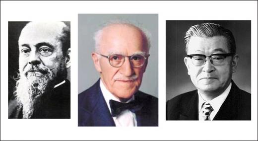
When I first learned quality improvement back in 1989 at Florida Power and Light, the consultants who trained us taught a very specific way to draw a Pareto chart. They’d been trained in Japan, the place where quality improvement first took root during the 1950s, so I took it for granted that the way they drew Pareto charts was the authentic and best way to do so.
|
ADVERTISEMENT |
A Pareto chart combines a bar graph with a cumulative line graph. Using the way we were taught to draw a Pareto chart (figure 1), the bars are touching, making it extremely easy to visually compare levels from one bar to the next. The bars span the entire available space along the x axis. The cumulative line graph springs from the bottom left corner of the first big bar, and each subsequent point is plotted from the corresponding top right corner of its bar.
…
Comments
Who Invented the Pareto Chart
The kernel of this idea has a rule of thumb application in many places, but it is commonly misused, according to one of the JUSE Counselors who worked with us called Dr. Shiba. He stated, for example, it is a misuse to state a solution to a problem "fits the 80/20 rule" just because it fits 80% of the cases; it must also be that the solution requires only 20% of the resources that would be needed to solve all cases. Additionally, it is a misuse of the 80/20 rule to interpret a small number of categories or observations.
According to Dr Shiba, this is a special case of the wider phenomenon of Pareto distributions. If the Pareto index α, which is one of the parameters characterizing a Pareto distribution, is chosen as α = log45 ≈ 1.16, then one has 80% of effects coming from 20% of causes. Using the Shiba Method, It follows that one also has 80% of that top 80% of effects coming from 20% of that top 20% of causes, and so on.
The bottom line is this: 80 percent of 80% is 64%; 20% of 20% is 4%, so in the Shiba Method, this implies a "64/4" law; and similarly implies a "51.2/0.8" law. Similarly for the bottom 80% of causes and bottom 20% of effects, the bottom 80% of the bottom 80% only cause 20% of the remaining 20%. This is broadly in line with the world population/wealth table discussed elsewhere, where the bottom 60% of the people own 5.5% of the wealth, approximating to a 64/4 connection.
Shiba's Law: the 64/4 correlation, also implies a 32% 'fair' area between the 4% and 64%, where the lower 80% of the top 20% (16%) and upper 20% of the bottom 80% (also 16%) relates to the corresponding lower top and upper bottom of effects (32%). This is also broadly in line with the world population table, where the second 20% control 12% of the wealth, and the bottom of the top 20% (presumably) control 16% of the wealth.
Confusing but amusing to some.
Joseph Juran and the Pareto Plot
Extremely interesting paper by Jay Arthur, but the third edition (1974) of Juran's Quality Control Handbook has on page 2-18 (Figure 2.5, 'Pareto analysis of weaving imperfects', a bar chart, cumulative line type Pareto chart that looks pretty much like the modern Pareto chart except that the line starts at the top of the first bar, and the y axis continues to 100%. This chart is clearly listed in the Subject Index on page 53, as 'Pareto diagram, 2-18, 2-19'. Interesting to see what is the seond (1962) edition as Leland Wilkinson, in Revising the Pareto Chart. The American Statistician, 60:4, 332-334, 2006, who pointed out that the chart did not appear in the first (1951) edition, but did in later editions. Wilkinson actually prefers the revised, cumulative barchart form, which Juran 1974 calls the 'Alternative Pareto diagram' on page 2-19, Figure 2-6.
So, the (Pareto) plot thickens?!
Add new comment