{domain:"www.qualitydigest.com",server:"169.47.211.87"} Skip to main content

User account menu
Main navigation
  • Topics
    • Customer Care
    • FDA Compliance
    • Healthcare
    • Innovation
    • Lean
    • Management
    • Metrology
    • Operations
    • Risk Management
    • Six Sigma
    • Standards
    • Statistics
    • Supply Chain
    • Sustainability
    • Training
  • Videos/Webinars
    • All videos
    • Product Demos
    • Webinars
  • Advertise
    • Advertise
    • Submit B2B Press Release
    • Write for us
  • Metrology Hub
  • Training
  • Subscribe
  • Log in
Mobile Menu
  • Home
  • Topics
    • 3D Metrology-CMSC
    • Customer Care
    • FDA Compliance
    • Healthcare
    • Innovation
    • Lean
    • Management
    • Metrology
    • Operations
    • Risk Management
    • Six Sigma
    • Standards
    • Statistics
    • Supply Chain
    • Sustainability
    • Training
  • Login / Subscribe
  • More...
    • All Features
    • All News
    • All Videos
    • Contact
    • Training

Examining Colorado’s Covid-19 Outbreak Using Control Charts

What helps us understand what’s going on, in a useful, actionable way?

Jay Arthur—The KnowWare Man
Wed, 05/06/2020 - 12:02
  • Comment
  • RSS

Social Sharing block

  • Print
  • Add new comment
Body

Story update 5/6/2020: The charts and some data have been updated to reflect the data available on the date this article was published.

During the Covid-19 stay-at-home order in Colorado, I've become increasingly frustrated by Covid-19 charts. Most of what I see are cumulative column charts, which don't give any real insight into what's going on. Are we really flattening the curve?

ADVERTISEMENT

So I decided to use the state's Covid-19 statistics for Colorado and Denver county, and see what I could learn using control charts. Control charts have been around for almost 100 years. They use formulas to calculate control limits that encompass 99.7 percent of the data points. This makes it easy to monitor any process and detect process shifts and "out of control" conditions.


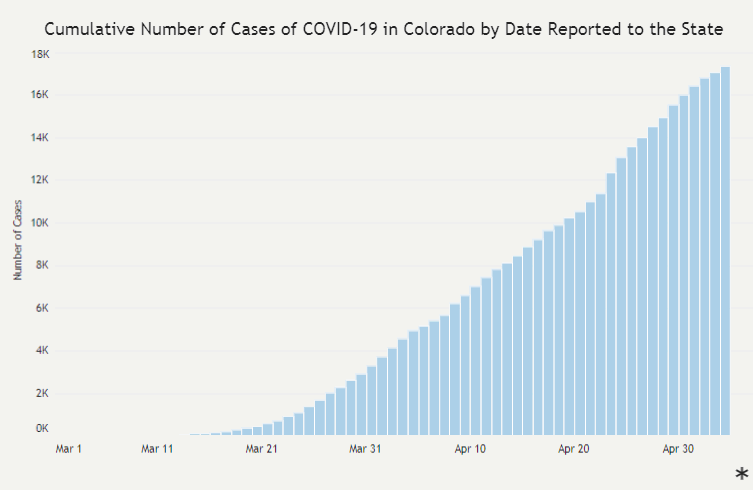
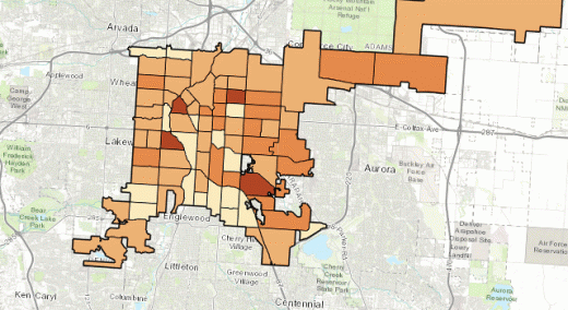
Source: https://covid19.colorado.gov/case-data Click image for larger view.

 …

Want to continue?
Log in or create a FREE account.
Enter your username or email address
Enter the password that accompanies your username.
By logging in you agree to receive communication from Quality Digest. Privacy Policy.
Create a FREE account
Forgot My Password

Comments

Submitted by mgraban on Fri, 06/05/2020 - 08:40

XmR charts are better than the alternatives

I've also been creating and using XmR ("Process Behavior Charts") with Covid cases and deaths in certain locations that matter to me.

I see Dr. Wheeler's point, but I'd also suggest that XmR Charts are far more helpful than any alternatives, such as two-data-point comparisons or other limited views of data.

The XmR charts I've made show periods of predictability... then there are shifts. The system has changed. But why? I agree that's what really matters.

  • Reply

Add new comment

Image CAPTCHA
Enter the characters shown in the image.
Please login to comment.
      

© 2025 Quality Digest. Copyright on content held by Quality Digest or by individual authors. Contact Quality Digest for reprint information.
“Quality Digest" is a trademark owned by Quality Circle Institute Inc.

footer
  • Home
  • Print QD: 1995-2008
  • Print QD: 2008-2009
  • Videos
  • Privacy Policy
  • Write for us
footer second menu
  • Subscribe to Quality Digest
  • About Us
  • Contact Us