Some authors recommend that you have to wait until you have the range chart “in control” before you can compute the limits for the average chart or the X chart. Why this is not true will be the subject of this column.
To illustrate the issues we will once again use the NB10 data. The 100 values are given in the table below.
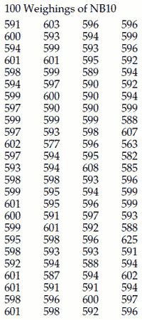
These data are the values obtained during the weekly weighings of standard NB10 at the National Bureau of Standards during 1963 and 1964. The values express the weights as the number of micrograms in excess of 9.999000 grams. Figure 1 shows the XmR chart for these data with three sets of limits.
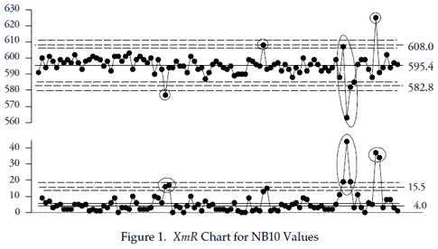
The widest set of limits is based on the average moving range of 5.73. Dividing by 1.128 gives a Sigma(X) value of 5.08, and limits that are 15.2 units on either side of the average. With these limits we can identify three occasions when there were problems with weighing this standard.
The middle set of limits were based upon the median moving range of 4.0. Dividing by 0.954 gives a Sigma(X) value of 4.2, and limits that are 12.6 units on either side of the average. With these limits we find one additional possible signal. When should we consider using these limits? One guideline is to consider using the median moving range whenever two-thirds or more of the moving ranges fall below the average moving range. Here there are 68 of the 99 moving ranges that are five or smaller—only 31 are six or larger.
The narrowest set of limits are those that result from deleting the ranges above the upper range limit, recomputing the average moving range, and revising the limits accordingly. After two cycles this gives an average moving range of 4.02, which results in limits that are 10.7 units on either side of the average.
While the details change, you end up telling the same story about this process with all three sets of limits. With the initial limits we found three signals of exceptional variation. Polishing the limits by using either the median moving range or by deleting and revising the average moving range only added one more potential signal. Thus, regardless of which of the correct approaches to computing limits that we exercise, we end up telling the same story about our data. As the name implies, process behavior charts are focused on characterizing the process behavior rather than estimating parameters for some probability model. To this end we do not need high precision, or even perfect data. With the correct computations we can get good limits from bad data. We do not have to wait until we have an “in control” range chart prior to computing our limits for the X chart or the average chart. In fact, it would be a mistake to wait.
Add new comment