The Heat Is On
Michael J. Cleary, Ph.D.
mcleary@qualitydigest.com
Hy Sedrate, a quality assurance
specialist for St. Recover in the Long Run Hospital, has
noticed that the accuracy of his lab readings is higher
in cool weather than it is on hot days, even though the
lab is air-conditioned and doesn’t have an appreciable
difference in temperature from the rest of the hospital.
Nonetheless, the data are dramatic, and Sedrate wants to
demonstrate the pattern he’s observed so his boss
and the entire quality team can analyze the situation.
Sedrate collects data relating to defective lab readings
while tracking the daily high temperatures recorded by the
National Weather Service for his area. Without complex analysis,
he can see even from the raw data that the higher the temperature,
the greater the number of errors. In order to illustrate
the pattern that he’s observed, he decides to create
an individual moving range chart from the data.
After he’s produced the charts and examined them
for patterns, another quality specialist, Hap N. Stance,
insists that Sedrate has used the wrong statistical method.
Nevertheless, Stance can’t suggest an approach that
might be better. Is Sedrate correct in using an individual
moving range chart, or is there a better way to analyze
this data?
a. Sedrate should abandon his chart and take an Alka Seltzer.
It’s too hot outside to think.
b. An individual moving range chart provides insights about
the data that no other method can give.
c. Stance is on the right track but the wrong train. He
should advise Sedrate to use a scatter diagram to get the
best analysis of the data.
d. Because he already knows that there’s a relationship
between defects and temperature, Sedrate should select the
chart that will be most dramatic so he can impress the quality
team with his statistical prowess.
Answer c is the correct response.
A scatter diagram will indicate whether two variables--in
this case, temperature and inaccurate lab reports--are related
to each other, or whether there’s a correlation between
the two. If one of the variables appears to have an effect
on the other, then regression analysis will be appropriate.
Because Sedrate wants to establish whether there’s
a correlation, an individual moving range chart won’t
be of any help. (See Practical Tools for Continuous Improvement
Vol. I, Statistical Tools, by Jacqueline D. Graham, Ph.D.,
and Michael J. Cleary, Ph.D., pp. 298–311).
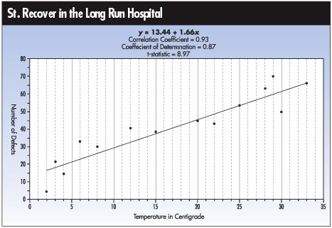
The same data is shown within the chart on page 20.
Because Sedrate assumes that temperature affects the number
of defects (rather than the other way around), temperature
becomes the independent variable, represented on the horizontal
axis. The number of defects becomes the dependent variable,
on the vertical axis. The line of best fit shows the relationship:
y = 13.44 + 1.66x
This means that as the temperature goes up, so does the
number of defects. A correlation coefficient of 0.93 suggests
a rather strong relationship between the two variables.
In addition, the t value of 8.969 suggests that there’s
indeed a statistical relationship between the number of
defects and temperature. But Sedrate should be encouraged
to study a little more statistics before approaching his
next challenge.
Michael J. Cleary, Ph.D., founder and president of
PQ Systems Inc., is a professor emeritus of management science
at Wright State University in Dayton, Ohio. A 29-year professorship
in management science has enabled him to conduct extensive
research in expanding quality management methods. He’s
the author of several articles on quality management and
statistical process control. Letters to the editor regarding
this column can be sent to letters@qualitydigest.com.
|