Images of jet aircraft, exploding bombs and busy freeways flash on the screen. Then music announces an event of
historic importance. A young journalist stares into the camera with steely eyed grace. "The Secretary of Labor announced today a dramatic reduction in the nation's unemployment
rate," he reports. "The number of jobless is down sharply following other good economic news. This sparked fears on Wall Street that the economy might be overheating. As a result, the Dow Jones
industrial average plummeted almost 90 points in heavy trading." Sound familiar? Someone once said that news is the process of making not very much out of practically nothing.
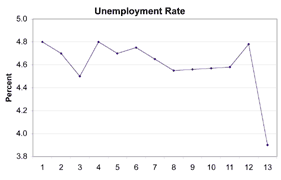
In this simulated news story, did the unemployment rate drop? Was the drop significant? Did the Dow even change? Look closely at the unemployment rate graph (Figure 1). Do you see anything wrong
with it?
Figure 1: Unemployment Rate
Appears to Nose-Dive |
|
Reporters like to make things dramatic. As Harry White said in "Superman," "A good reporter doesn't write good stories. A good reporter makes them great!"
One of the favorite ways our reporter likes to enhance his story is to use the "gee whiz, look at that!" graph. The graph presented in Figure 1 is a good example.
The unemployment rate dropped from 4.8 percent to 3.9 percent. When you say it like that, it doesn't sound quite so exciting, does it? But if you put it on a
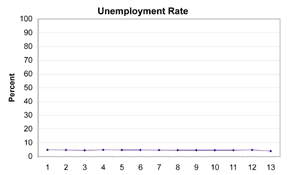
gee-whiz graph, it can be made to look spectacular. This is done by playing with the vertical scale. Figure 2 shows the same information,
Figure 2: Unemployment Rate
Appears Steady |
|
but the scale now shows from zero to 100 percent. That doesn't look quite so dramatic, does it? And as far as the Dow goes, it has been running around 11,000 for the last
year or so. As a percentage, a 90-point change is even smaller than the change in unemployment. This reporter isn't trying to inform you. He doesn't care
about your education, or even reality. He's trying to get your attention so you'll watch his television program.
The real danger here is not that some reporter is going to fool you with a graph; the danger is that you are going to fool yourself with one of your own
graphs. Edward R. Tufte's excellent book, The Visual Display of Quantitative Information, covers this topic in detail. Chapter 5, "Chartjunk:
Vibrations, Grids, and Ducks," discusses misleading and poorly designed graphs. Tufte also includes examples of well-designed graphs, including my all-time
favorite graph showing Napoleon's invasion of Russia (see Figure 3).
It's a line graph, although there's really more of a ribbon than a line. Superimposed over a map of Europe, the line starts on the left, on the
Polish-Russian border. The lighter ribbon moving from left to right represents the position of Napoleon's army. The width of the ribbon represents the size of
his army. On the left it has 422,000 men. As the army approached Moscow on the right, the number dropped to 100,000. The path of Napoleon's retreat
from Moscow in the bitterly cold winter is depicted by the darker, lower band, which is linked to a temperature scale and dates at the bottom of the chart. Only 10,000 men made it home. The graphic, drawn by Charles Minard, tells a rich story with its multivariate data. Many variables are plotted: the size of the army, its location on a
two-dimensional surface, direction of the army's movement and the temperature on various dates during the retreat from Moscow. I like to call this
an intelligent use of graphics to depict an unintelligent use of military force. The scale and format you use in a graph can create very different perceptions.
If you change the cell width of a histogram, you can make normal data look non-normal. If you use a 3-D pie chart, you can make small differences seem
large. And in my October 1999 column, I showed how the different ways of computing the standard deviation yield different results.
Newspaper and television reporters often present very misleading data (or gossip) in their reports. Watch out for this. Whether it results from an overt
intention to mislead (in efforts to sensationalize the news and increase ratings) or sheer ignorance about what the numbers really show and what they don't,
such deception is only dangerous if consumers neglect their responsibility to think critically. About the author
Gregory P. Ferguson is quality manager of Parker Hannifin's Tucson, Arizona, facility. E-mail him at gferguson@qualitydigest.com . |