I
once heard a military strategist say that when you begin an attack, you need to confuse your enemies. You want to be in front of them, on their left, on their right and behind them. A process control study is like that. You have to make charts and graphs and compute statistics. You have to go out and watch the process and talk to the production operators. You have to eat, drink and think the process until you understand everything about it. In my Kwai Chang Caine mode, I refer to this as "becoming one with the process."
I've noticed that few people understand what I'm talking about when I'm in this mode, so here's an example. At Global Solar we make thin-film photovoltaic (PV) material, which
is coated on a stainless steel roll using a vapor deposition process. One of our concerns is how well the PV material sticks to the stainless steel. Standard adhesion tests (such as ASTM 3359-97)
don't work very well for us, so we "invented" our own. We use a small wheeled cart, approximately 10 inches wide by 18 inches long, to drag an Xacto knife over the
surface of the coating. The cart has a hinged arm to hold the knife and exert a constant pressure on the coating. When the adhesion is good, the knife makes a clean scratch on the surface. When
the adhesion is bad, the material is brittle, and the knife blade makes it flake off in rather large pieces, creating a wider scratch. By measuring the width of this cut, we can quantify adhesion.
One of the process variables we thought might affect adhesion is the operating pressure of the deposition chamber during the production run. I did a correlation of adhesion
and pressure, and the correlation coefficient was 0.46. In other words, there was no correlation. But I had been working with this data for weeks, and as I kept staring at it, I thought I could
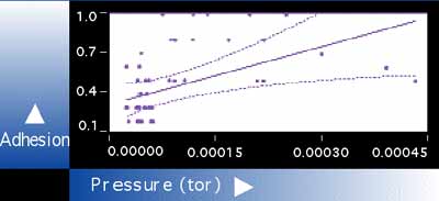
see a pattern. Figure 1: Scatter Plot of Adhesion vs. Pressure
Figure 1 is a scatter plot of that data. The horizontal axis shows pressure and the
vertical axis shows the width of the scratch made during testing. When the pressure is below 0.00007 tor, the adhesion values range between 0.1 and 0.7. We generally regard
any value greater than 0.3 as an indication of poor adhesion. As the adhesion gets worse, the number gets larger. But look at the adhesion values when the pressure is
greater than 0.00007. There are no good adhesion values in that entire region. All of the adhesion values are 0.5 or above, and this is terrible adhesion.
If you study the graph further, there appear to be two groups of data points. One group is centered around a pressure of 0.00004 to 0.00005. The other group extends
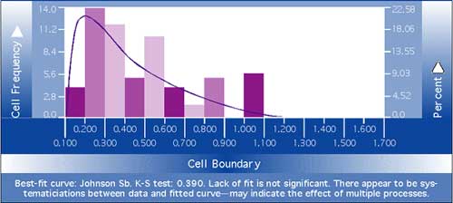
beyond a pressure of 0.00007 and up to an adhesion value of 1.0. If there are indeed two groups in this data set, that should show up on a histogram (Figure 2). Figure 2: Histogram of Adhesion Data
This analysis might not stand up to a rigorous statistical examination, but I think I can
see a bimodal distribution here. The data to the left of 0.4 seems different than the rest. If that's the case, there could be two or more special causes of variation affecting this
process. We'll continue to investigate our process, but we'll move beyond standard analytical methods.
Statistics will only get you so far. After that you need some insight, a little luck and a long talk with Master Po. About the author Gregory P. Ferguson is senior quality engineer at Global Solar Energy in Tucson, Arizona. E-mail him at gferguson@qualitydigest.com . |