In Search of the Median Ground
Quality Manager Polly Yurrathain is in deep trouble.
Her boss, Hammond Eggs, has been ranting for days about
the diminishing quality of the company’s products.
Their firm, which manufactures a variety of toy products,
has undergone scrutiny by a major consumer journal; in addition,
stores are complaining about high rates of return for the
toys that Play With Us Inc. manufactures.
Eggs orders Yurrathain to hire “as many inspectors
as needed” to keep defective products from leaving
the assembly line and landing in stores. Yurrathain, who
rarely responds to her boss with anything but a meek, “Yes,
sir,” summons the courage to point out that a system
of prevention is always preferable to one of detection.
“I hired you to prevent mistakes,” her boss
shouts. “And that hasn’t worked, so we’ll
inspect every blasted toy that we make.” He orders
Yurrathain to hire 10 inspectors immediately, at minimum
wage.
Under pressure to get results, Yurrathain goes to the
local employment office and pleads with people in line,
finally attracting 10 who say they’ll show up Monday.
Although only eight workers actually appear on schedule,
Yurrathain is undaunted and decides to teach them about
X-bar and R charts on the first day. The training room is
set with calculators at each station, and she begins to
lecture. These new students do well with the concept of
range:

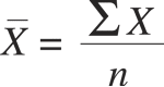
However, they have a hard time calculating averages despite
Yurrathain’s use of batting averages as a model. They
seem to be totally puzzled by the statistical symbols:
She suddenly recalls the use of median charts, popularized
by Paul Clifford after World War II, where only the median
is recorded rather than the mean. Common practice called
for sample sizes of three or five, so no math was necessary.
For example:
Data: 14, 12, 17, 19, 15
To calculate the median, the data must be ordered from
the smallest to the largest number; the middle number is
the median. In this example, it would be 15.
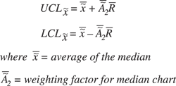
Excited by this approach, Yurrathain teaches her motley
crew how to do median charts, beginning with the following
formula:
Unfortunately for her, one of the new recruits had been
employed previously as an inspector. Just as Yurrathain
finishes her brilliant lesson, this inspector asks why the
A2 factor is different for median charts than for X-bar
and R charts. He used his calculator to figure that the
A2 factor for median charts, called A2 tilde (~), is about
25 percent larger than the A2 for X-bar and R charts.
Not wanting to embarrass herself by admitting that she
doesn’t know, Yurrathain points out that the square
root of 0.0625 is equal to 0.25. The former inspector accepts
this answer because he isn’t adept at math. Is Yurrathain’s
response appropriate?
The answer is no. Although she didn’t get caught
by the unsuspecting inspector, Yurrathain was wrong. Median
charts offer a good alternative to X-bar and R charts for
two reasons:
 They can be done by hand, so for those with limited math
skills, creating the charts isn’t an overwhelming
task.
They can be done by hand, so for those with limited math
skills, creating the charts isn’t an overwhelming
task.
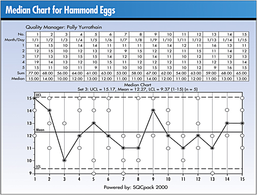
By convention, a median chart shows not only the median
value but also the values of the observations.
The real reason that control limits are about 25 percent
wider than for X-bar and R charts deals with the difference
in the way medians and averages are calculated.
The mean uses all the data in a sample to estimate the
central location of the population.
The median orders the samples from smallest to largest
and picks the middle number (assuming an odd sample size)
as an estimate of the central location of the population.
With a sample size of five, all data values are used in
calculating the mean, but only one number is used to determine
the median’s value. It’s as if the calculation
of the median throws away the information in four of the
five pieces of data. One would expect that the mean would
be a more efficient estimator of central location of a population
than would a median. (Note: An “efficient” estimator
is one that is more precise in its ability to estimate a
population parameter.)
Statistician Walter Shewhart was aware of the phenomenon
and noted that the sampling distribution of sample medians
will be about 25 percent more variable than the distribution
of sample means. (Source: Shewhart, W.A. Economic Control
of Quality of Manufactured Product [D. Van Nostrand, 1931])
Poor Yurrathain. She started out well, but because she
was unwilling to take time to investigate, she was wrong.
Michael J. Cleary, Ph.D., founder and president of
PQ Systems Inc., is a noted authority in the field of quality
management and a professor emeritus of management science
at Wright State University in Dayton, Ohio.
A 29-year professorship in management science has
enabled Cleary to conduct extensive research and garner
valuable experience in expanding quality management methods.
He has published articles on quality management and statistical
process control in a variety of academic and professional
journals.
|