Using Excel for Data Analysis
by William W. Dorner Microsoft Excel's capabilities for analyzing
data are limited only by your creativity. Professional statisticians typically have powerful software at their disposal to perform advanced analyses and create slick graphs. But many professionals in the quality field don't enjoy that luxury. Faced with a limited budget, they must be resourceful with the software they already have. Besides, not everyone needs the capability to perform nonlinear regression with custom loss functions for maximum likelihood! Fortunately, many occasional data analysts already own a versatile software capable of providing most basic quality analyses -- Microsoft Excel. Skeptical? I don't blame you. The following examples show how to apply Excel for the graphical analysis of quality data. The examples range from somewhat obvious to downright clever. As it turns out, Excel's capabilities are limited only by your creativity. Shewhart control charts Although most Excel users can create and format simple charts, many don't exploit Excel's capabilities for more advanced graphical applications. For example, with minimal knowledge of statistical process control, you can turn a basic line chart into a Shewhart control chart in a flash. The trick is to supplement your data series with additional columns representing upper and lower control limits and a center line. Figure 1 depicts some hypothetical data from a machining operation. The characteristic of interest is the diameter of a brass stud. The sample averages (n=5) appear in column F, and the sample ranges appear in column G. To obtain the control limits and center line for an x-bar chart, first compute the grand average of the data. Enter the following formula into cell F27: =AVERAGE(F2:F26). Then compute the average range by copying the formula from F27 to G27. 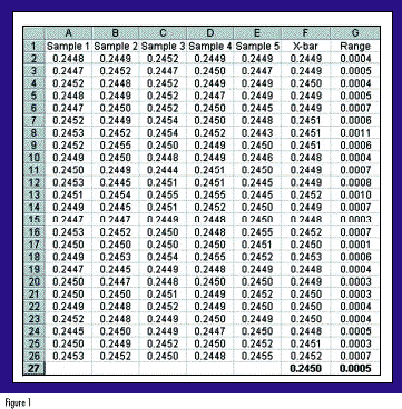
With the groundwork laid, you're ready to compute the control limits and center line. First, put the following in cell I2: =$F$27. Note that this formula uses an absolute reference, as denoted by the dollar signs. Recall that the formula for the upper control limit of an x-bar chart is UCL = x + A2R. In this example, the sample size is 5 so, consulting my handy table of control chart constants, I find that A2 is 0.577. In cell H2, type: =I2+0.577*$G$27. Similarly, the lower control limit will be LCL = x - A2R; so in cell J2, type: =I2-0.577*$G$27. You've now entered all of the formulas and can proceed to copy cells H2:J2 to cells H3:J26. Voilà, you have control limits and a center line! (See Figure 2.) 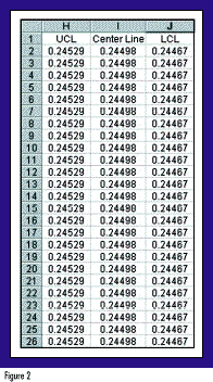
To obtain the x-bar chart, first highlight cells F1:F26. Because the control limits are not in contiguous columns, you will have to hold down the Control key as you also highlight cells H1:J26. Next use the ChartWizard as you normally would to create a line chart of the four data series. You'll find that columns H, I and J will provide horizontal lines on your chart representing the UCL, center line and LCL, respectively. All that's left now is to format your chart as you like it. For example, I prefer to make the following changes:  Eliminate the grey background and border around the chart. Eliminate the grey background and border around the chart.
Change the UCL and LCL lines to bold dashed lines with no markers. Change the center line to a lighter solid line with no markers. Change the x-bar data series to a bold solid line with large visible markers. Tweak the fonts, axes, titles, headers, footers and margins, as desired. The resulting control chart is shown in Figure 3. 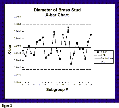
Similar steps would be followed to generate the accompanying R chart to monitor variability. This method isn't elegant. Nor is it intended to be used on a grand scale to implement plantwide online SPC. Instead, it is a nifty way to create a quick control chart. And thanks to Excel's versatile formatting options, you can make it look as if it were generated using a specialized SPC software package. 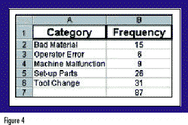
Pareto charts Another popular quality tool that's a snap to produce using Excel is a Pareto chart. If you already have your data summarized, as in Figure 4, you can obtain a Pareto chart by following these steps: Sort your data in descending order by frequency of occurrence. Create Percentage (e.g., in cell C2, type: =B2/$B$7) and Cumulative Percentage (e.g., in cell D2, type: =C2. In cell D3, type: =D2+C3) columns, as shown in Figure 5. 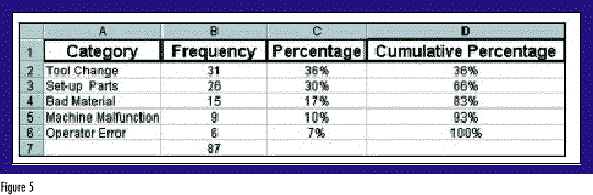
Once again using the Control key to select noncontiguous columns, highlight the Category, Percentage and Cumulative Percentage columns. In the example, this corresponds to cells A1:A6 and C1:D6. Use the ChartWizard to generate a Combination Bar Chart with both left and right axes. After adding some titles and customizing the formats, you get a chart like the one in Figure 6. Note that the height of each bar references the left axis, whereas the cumulative percentage line references the right axis. 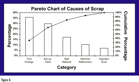
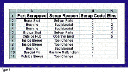
Perhaps your data are not summarized but are instead in a list where each category has a numerical code (see Figure 7). Fear not! Excel has an even easier way to create a histogram using its Data Analysis ToolPak. Not all Excel users are familiar with the Data Analysis ToolPak because it is an Add-In, meaning that it does not appear in your Tools menu by default -- you must put it there. It contains a wealth of statistical tools that will come in handy for any data analyst, such as: descriptive statistics, regression analysis, analysis of variance (ANOVA) and random number generation. To load the Data Analysis ToolPak, select Tools and then Add-Ins. Click on the appropriate box and select OK. After a few seconds, the Add-In will be loaded. To activate the Data Analysis ToolPak, select Tools and then Data Analysis. A pop-up window will appear listing all of the data analysis functions. Scroll down, highlight Histogram, then click OK. A pop-up window will appear. In the field titled Input Range, enter the cell range containing the numerical category codes of your data (select M2 through M11). In the Bin Range field, enter the cell range containing the list of all category codes, or "bins," you want to be tabulated and charted (select N2 through N6). Next, select where you would like Excel to deposit the finished output. Finally, check all three boxes at the bottom of the pop-up window: Pareto, Cumulative Percentage and Chart Output. When you click OK, Excel will generate a tabular summary and a Pareto chart. Simple box-and-whisker plots One statistical tool notably absent from Excel is the box-and-whisker plot. As designed by Mary Eleanor Spear, the box-and-whisker plot was originally called a range bar1. Renowned statistician John Tukey later modified the display and coined the name box-and-whisker2, which some shorten to boxplot. The simple box-and-whisker plot provides a vivid snapshot of a data set using just five statistics: the minimum, 25th percentile, median, 75th percentile and maximum. Tukey refers to the 25th and 75th percentiles as the hinges of the data set and the minimum and maximum as the extremes. A simple box-and-whisker plot appears in Figure 8. The plot consists of a box drawn with its left and right edges at the hinges. A third vertical line spans the box at the median. Finally, whiskers extend from each hinge to its respective extreme. 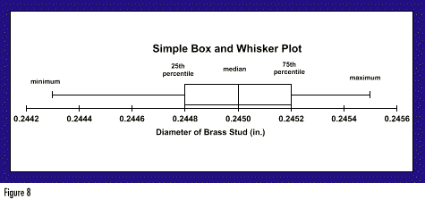
When interpreting a box-and-whisker plot, you can obtain a lot of information quickly. The plot depicts two common measures of variation -- the range and the interquartile range (IQR). The box contains the middle 50 percent of the data, so it is easy to see where the middle of the distribution lies. The box-and-whisker plot depicts one common measure of central tendency -- the median. The plot also illuminates the shape of the distribution. The location of the median line and the relative length of the whiskers help indicate how symmetrical the data are. When the median lies far from the center of the box or if one whisker is much longer than the other, you know that the distribution is skewed to some extent. It wouldn't take much for Microsoft to add the box-and-whisker plot to Excel. Until they do, there is a simple way for Excel users to create professional-looking box-and-whisker plots. The trick is to use Excel's charting capabilities in a way that they were never intended to be used. But first, you must obtain the five statistics necessary to construct the box-and-whisker plot. Suppose the data set resides in cells A1:A50. The Excel functions you'll need to use are: =MIN(A1:A50), to obtain the minimum =PERCENTILE(A1:A50,0.25), to obtain the 25th percentile =MEDIAN(A1:A50), to obtain the median =PERCENTILE(A1:A50,0.75), to obtain the 75th percentile =MAX(A1:A50), to obtain the maximum Next, enter these numbers into the center column (X) of a spreadsheet template like the one in Figure 9. The rightmost column (Y) contains constants that will also be used to construct the plot. You should not shuffle the rows for convenience -- the order of the data entries does matter. 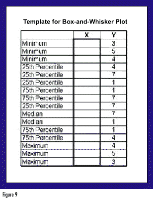
Having entered the data, use Excel's XY (Scatter) plot with connecting lines and no point markers. Excel plots the XY coordinates, then "connects the dots" in sequential order as they appear in the spreadsheet. With some customization, you can create a professional-looking box-and-whisker plot. In fact, Figure 8 was created using Excel. Variations on a theme The value of box-and-whisker plots increases when used to compare multiple data sets. By adding additional series to the Excel XY plot, you can easily obtain multiple box-and-whisker plots, as in Figure 10. The multiple plots allow easy comparisons between distributions of data. Furthermore, Figure 10 illustrates the notched box-and-whisker plot, a more advanced statistical tool first proposed by McGill, Tukey and Larsen3. Here the notches are constructed about the median so that notches which don't overlap represent significant differences between medians (with about 95% confidence). For example, in Figure 10, Design A clearly exhibits a significantly lower median yield strength than designs B or C. With minor modifications to the scheme presented in Figure 9, you can use Excel to obtain such plots. 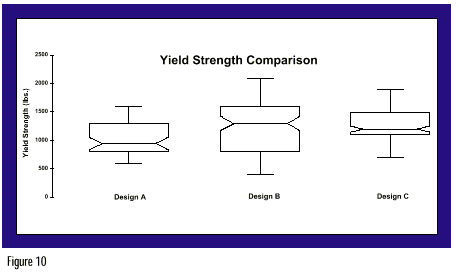
Virtually endless possibilities If you are already an Excel user, think twice before investing in expensive statistical software. With some creativity, you can usually expand Excel's capabilities to meet special needs. Excel's statistical capabilities are impressive, and its graphical possibilities are virtually unlimited. With a little effort, you can create useful control charts, Pareto charts, histograms and box-and-whisker plots. Granted, you could eventually reach a point of diminishing marginal returns, beyond which you may wish to purchase more powerful statistical software. But for the occasional number cruncher, Excel is likely to fulfill all of your graphical needs, and then some References
1. Spear, M.E. 1952. Charting Statistics. New York: McGraw-Hill. 2. Tukey, J.W. 1977. Exploratory Data Analysis (First Edition). Reading, MA: Addison-Wesley Publishing Co. 3. McGill, R.; J.W. Tukey; and W.A. Larsen. 1978. "Variations of Box Plots." The American Statistician. 32. 12-16. For the interested reader, McGill et al. recommend constructing notches as follows: Median ± 1.7 x [(1.25 x IQR)/(1.35 x sample size)]
About the author
William W. Dorner is a senior quality/process engineer at Best Lock Corp. in Indianapolis. He is a member of ASQ and ASA.
For more information, you may e-mail Dorner at wdorner@qualitydigest.com. |