I Hate Bar Graphs--Part 2 (Cont.)
Last month, I demonstrated that under appropriate conditions a seasonality analysis can be accomplished by applying the analysis of variance (ANOVA), as long as the diagnostics are satisfied. I even gave you two numbers typically taught and calculated to interpret the ANOVA. I also showed the analysis of means (ANOM) for a yearly comparison and a monthly, or seasonal, comparison, the latter shown in the top of figure 1.
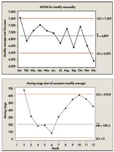
Figure 1: ANOM and Moving-Range Charts
Let's take advantage of the months being in chronological order to present a standard moving-range chart (bottom of figure 1) of the 12 monthly averages, based on the averages of five observations, yielding a standard deviation for each of 375.5/ √5.
This chart seems to confirm our previous conclusion that January is definitely different from February. The moving ranges for the next six monthly differences seem relatively unremarkable; however, the last four moving ranges look extremely odd--hardly random, and somewhat large in value. It's almost as if, in looking at the monthly ANOM, September drops quite a bit from August, then October recovers to the previous system, and then there's another significant drop to November-December.
A possible explanation could be that there are three systems: January (high); September, November and December (low); and the other eight months (average).
Two helpful numbers for determining differences are:
• The least significant difference (LSD) between two averages, in this case 479, which is less conservative than the upper limit of 619 on the moving-range chart
• A more conservative difference based on the desire to compare two arbitrarily chosen averages out of 12 (based on the Studentized range), in this case 819
The LSD could be used in this case to further test the month-to-month difference, although only between consecutive monthly averages, because the choices aren't arbitrary. The chart in figure 2 has been reproduced from last month and a new row added to show the differences; any greater than 479 are indicated in red.
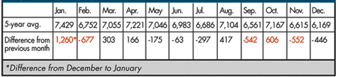
Figure 2: Monthly Differences
It seems obvious that January is in a class by itself. Using the difference of 819, do any other differences pop out at you?
Perhaps we might test the clusters of our preliminary conclusions using the appropriate Studentized ranges (for n = 8 and n = 3) to determine a significant difference:
• Cluster 1 (February-August and October): 4.50 × 375.5/ √5 = 756. Maximum
observed difference: 7,221-6,686 = 535.
• Cluster 2 (September, November and December): 3.43 × 375.5/ √5 = 576. Maximum observed difference: 6,615-6,169 = 446. The clusters now seem reasonable.
This demonstrates one way of determining seasonality and shows how the fundamental SPC concept of considering any data set by looking at the underlying time sequence leads to an appropriate use of standard methods.
The control chart in figure 3 integrates all this knowledge into a final, preliminary graphical summary. It now must be discussed with administrators' master knowledge of the process while asking the questions, "What action do you want to take, and what do you want to predict?"
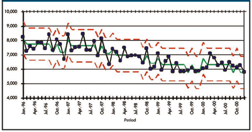
Figure 3: Monthly Patient Counts
Davis Balestracci is a member of the American Society for Quality and past chair of its statistics division. Visit his Web site at www.dbharmony.com.
|