| by William Peters and Beth Savage
If one were to lead a child into the New York City Public Library and plop him or her down in the grand entrance with the directive, "Everything you need to know is here; all you have to do is find it," the outcome would be predictable. The child, overwhelmed with the sheer volume of information, would be able to focus only on a small part--or none--of the resources available.
This situation is similar to that facing any health care organization pursuing Six Sigma or other established approaches to improvement. The most compelling motivations for using Six Sigma are enhancing process performance, improving the bottom line and ensuring customer satisfaction. These aspirations aren't limited to manufacturing companies and in fact may be more critical to health care organizations, where lives are at stake. A health care organization can be overwhelmed by the knowledge that its database contains information that will be useful to Six Sigma improvement efforts and frustrated that it doesn't have the tools or the resources to make sense of that information.
So how do health care providers participate in the Six Sigma methodology? In this industry, there's no shortage of data, but accessing that data for the purposes of an improvement project is challenging. One innovative software product facilitates data mining and can ease the burden of improvement efforts in virtually any organization by gathering relevant information from data in commonly used programs such as Excel, Access and Oracle, as well as sources such as legacy databases. In the past, real-time access to such data was hindered by the inability of statistical analysis software to access data directly from the various data sources. Typically data had to be exported from one application and then imported into the analysis software, resulting in a lag from when the data was generated to the time it was available for analysis.
Today, that problem is almost eliminated through the use of software that can directly access data sources. Because data are accessed from the original source in real time, steps such as importing and data entry are eliminated. Charts are generated to reflect processes in real time and facilitate accurate data analysis. The software generates process performance charts from data that are collected, stored and managed by other applications, making these charts available for e-mailing, posting to a Web site or pasting into another program, such as PowerPoint.
The Children's Medical Center, a 155-bed pediatric acute-care facility in Dayton, Ohio, has improved its patient-satisfaction scores through an educational intervention strategy facilitated by CHARTrunner, a statistical analysis software program from Miamisburg, Ohio-based PQ Systems Inc.
"Most patients and their parents don't mind a slight delay in waiting for a physician or ancillary service staff member, but they feel more in control when they're given the courtesy of having someone touch base with them periodically in the waiting room," says Carol Wise, director of quality resource management for Children's. As a follow-up to the patient-satisfaction data analysis, hospital staff members put together a video and conducted a number of educational interventions. By using process behavior charts, Wise's department has been able to identify the effect that such interventions have had on patient satisfaction.
More improvements were also generated in patient-
satisfaction scores for specialty clinics, cardiology, radiology and laboratory services. Children's has an active quality steering committee that oversees performance-improvement endeavors at the organization. Ultimately, the hospital's trustees review all
performance-improvement reports through its performance improvement oversight committee (PIOC). Wise's department looks at data from a variety of sources, including Microsoft Excel and Access, in an ongoing effort to improve patient care. Among areas that have benefited from this analysis are patient satisfaction,
hospital-acquired infection rates, responses of resistant bacteria to antibiotics, patient complaints, medication errors, safety issues and mortality rates.
In the case of denials by third-party payers, Children's restructured the hospital's quality department so that nurses were more aligned in a disease management structure, a change made based on an improvement opportunity identified through the use of control charts. This allowed a nurse to follow patients with respiratory illnesses, for example. The process has evolved to a modified case management approach that makes nurses far more familiar with each patient's case and better positioned to address concerns with insurance companies. Results, demonstrated in control charts from data that reside in the hospital's Access database, include a significant decrease in the number of denials from insurance companies.
Children's recently showcased its control charts and discussed ensuing improvements in a performance-improvement overview at a visit from the Joint Commission on Accreditation of Healthcare Organizations. JCAHO is the regulatory body that provides oversight to hospitals, home cares and many long-term care facilities in the United States. One complaint that JCAHO often has with health care organizations, Wise says, is that they tend to be "data-rich and information-poor." The surveyors who visited Children's, on the other hand, complimented the organization for its ability to demonstrate the effect of data collection, analysis and action to make changes.
At another hospital, Delnor-Community in Geneva, Illinois, analysis software was used to help improve pneumonia care. The 130-bed community acute-care hospital in the western suburbs of Chicago has been using the software since the late 1990s on many improvement efforts, as well as in creating the organization's clinical quality dashboard.
With the release of publicly reported quality data in late 2004 on JCAHO Quality Check Web sites, hospitals across the nation have been motivated to examine how they're performing on sets of varied indicators. One such set is the pneumonia group, composed of a series of indicators purporting to measure the quality of pneumonia care. In late 2004, Delnor's board of directors challenged the hospital to perform better at the specific pneumonia indicator "initial antibiotic received within four hours of hospital arrival." The board chose this indicator because research demonstrated a significant decrease in mortality, both during the in-patient stay and 30 days post-discharge, for patients who received their first dose of antibiotics within four hours of arrival. At the initial release of the JCAHO Quality Check report, Delnor was reporting 77 percent of pneumonia patients receiving antibiotics within four hours. An improvement effort was chartered in early 2005, and a team was formed shortly after to address this concern.
Following the Model for Improvement tool developed by management consulting firm Associates in Process Improvement, the team's first task was to answer the question, "What are we trying to accomplish?" They stated their answer simply as "dramatically reduce the time to first-dose antibiotics for pneumonia patients regardless of admission source."
Delnor was similar to many health care organizations struggling to answer the second key question from the API model: "How will we know that a change is an improvement?" Without an accurate way to answer this question, Six Sigma and efforts to improve can be futile and frustrating. To respond, Delnor turned to control charts. The team selected "the average time to first-dose antibiotics" and "the percent of patients receiving antibiotics within four hours" as its two measurements. To provide meaningful pictures of these measurements, the team chose an X-bar chart for the average time and a p-chart for the percent within four hours, as seen in figures 1 and 2 below.
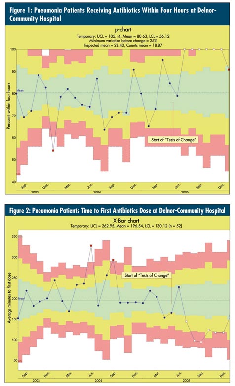
Delnor wasn't short on data, but like many organizations, the data were stored in a variety of sources. Individual pneumonia cases, for example, were kept in the hospital's Microsoft SQL server data repository. CHARTrunner was able to connect to the hospital's multiple data sources, which included Excel, Access tables, Access queries, and SQL, and generate real-time control charts directly from these sources. Once the charts were defined and linked to the data, team members could push a key to see an up-to-date chart at any time, with no additional setup work. With the majority of team members being nontechnical, this ability was not only welcomed but required for efficient analysis and monitoring of these processes on an ongoing basis.
From the charts, the team learned that the average time to first dose was nearly 222 minutes, and the percent receiving antibiotics within four hours of arrival was about 77 percent. But before moving on, the team had to address an out-of-control point on the p-chart. In January 2004 the chart displayed an unusually low percentage of patients receiving antibiotics within four hours of arrival. "Any improvement would be thwarted unless this special cause was identified and eliminated," explains Dr. Carlos Duarte, a Delnor emergency room physician. Upon investigation, the team discovered reluctance by the physicians to use the newly modified pneumonia protocol. This led to delays in treatment because certain antibiotics weren't readily available in the automated pharmacy system at the point of treatment. Through a re-
education campaign, physicians were urged to follow the protocol to avoid unnecessary delays in treatment.
With the special cause addressed, the team progressed to the third question of the API model, "What changes can we make that will result in improvement?" The team created a detailed flowchart mapping out the two sides of the process--patients entering through the emergency room and direct-admit patients. Both flows were used to generate ideas for change. Each of the changes suggested by the subject matter experts was tested on a small scale using multiple iterative cycles of the plan, do, study, act cycle. Some of the changes that proved successful were:
• Reordering several steps followed at the time of diagnosis
• Eliminating an unnecessary step at the time of chest X-ray reading
• Ordering chest X-rays and labs as urgent
• Redesigning the direct-admit process
As is common in Six Sigma and other improvement efforts, none of the changes alone created the desired effect. Instead, it was the combination of multiple, small changes over time that led to the significant changes in the two indicators. Starting with the fourth consecutive month at 100 percent in October 2005, the p-chart began displaying out-of-control data points on the high side (which was good in this case). This was a clear indication that the changes had resulted in real improvement. Additionally, the average time to first dose demonstrated real improvement starting in August 2005, with several points marked as special causes. The new average time to first dose antibiotics was now close to 116 minutes. The new percentage of those receiving antibiotics within four hours of arrival was 100 percent, a significant improvement from the initial starting point. Additionally, the average length of hospital stay for pneumonia patients dropped by two days compared to initial levels. This led to gains in bed capacity, cost-avoidance per treated case and a decrease in overall risks to patients associated with longer hospital stays (e.g., those being treated for pressure ulcers, falls and hospital-acquired infections).
"The power of control charts is the ability to let your data speak for itself, to remove human subjectiveness and bias," notes Duarte. He adds that using statistical software has aided in improving patient care. Improvement efforts are paying off. Delnor-Community Hospital is a recognized national leader in patient, physician and employee satisfaction and is one of the few hospitals in Illinois to receive Magnet Nursing designation. The hospital is currently undergoing massive growth in all areas and is expecting to add another 20 patient beds within the next several years.
As with Children's and Delnor, quality practitioners in health care organizations should be encouraged to establish specific, habitual patterns of data collection and analysis so that their quality improvement efforts become automatic parts of the work life. Ideally, systematic process improvement will be embedded in the organization's approach to Six Sigma and become as much a part of daily work life as e-mail and coffee breaks.
As an IHI-trained improvement adviser, William Peters provides support in all areas involving quality improvement for Delnor-Community Hospital. He's a specialist in statistical process control, quality data analysis, and the creating and measuring of quality indicators. Peters facilitates teams using the API model for improvement. Visit online at www.delnor.com.
Beth Savage has served as marketing director for PQ Systems Inc. (www.pqsystems.com) for the past 10 years. She has led several product launch teams, including the CHARTrunner team. Savage is a member of the American Society for Quality.
|