I Hate Bar Graphs*** --Part 1
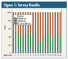
Almost 10 years ago, I picked up my morning paper and saw an article, with an accompanying graph (as seen in figure 1), rating the 20 health systems in my metropolitan community on the question: "Would you recommend your clinic to adult friends or family members?" I happened to work at Clinic 19.
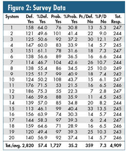
When I got to work that morning, I was greeted with (surprise): "Davis, we'd like you to take a look at those data." After a couple of phone calls, I was able to obtain them. (See figure 2.)
It's a classic customer satisfaction survey on a 1-4 scale, where 1 = definitely no, 2 = probably no, 3 = probably yes and 4 = definitely yes. Note that the graph in figure 1 combines the "definitely no" and "probably no" responses.
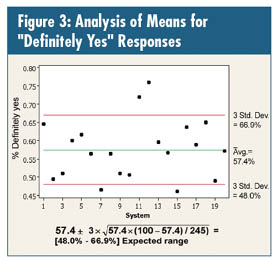
Rather than calculate a weighted score, re-ranking and using a Ouija board to interpret the 20 numbers, I decided to do two analyses via a p-chart analysis of means: the first for the "definitely yes" data, and the second for the combined "definitely no" and "probably no" data.
Because the sample sizes for the 20 systems are so close, I also decided to use the average sample size in the calculation, in this case 245. Rule of thumb for a p-chart: As long as an individual clinic's sample size is within 25 percent of this number (~185-305), it's a good approximation to start with.
The overall average of the 20 systems is 57.4 percent of the people answering "definitely yes." Given that and using 245 responses per clinic, the analysis is shown in the chart and the equation in figure 3.
Similarly, the system average is 7.3 percent of the people answering "definitely no" and "probably no," resulting in the analysis shown in the chart and the equation in figure 4.
Another obsession with data like these is to rank the 20 systems via quartiles. For the best and worst possible responses, this results in:
• Definitely yes:
Quartile 1 (i.e., best): 1, 11*, 12*, 16, 18 Quartile 2: 4, 5, 13, 17, 20
Quartile 3: 3, 6, 8, 9, 14 Quartile 4 (i.e., worst): 2, 7**, 10, 15**, 19
• Probably/definitely not:
Quartile 1 (i.e., worst): 3, 7, 8, 15*, 19 Quartile 2: 2, 5, 6, 9, 14,
Quartile 3: 4, 10, 11, 16, 18 Quartile 4 (i.e., best): 1, 12, 13, 17, 20
*Statistically above average
**Statistically below average
Clinic 19 appeared in the absolute worst quartile of both responses. We sure lost the lottery in this survey (and systems 1, 16 and 18 were quick to design new marketing materials). But maybe we'll win next year --or maybe another survey done by someone else will exonerate us.
Oh, by the way, I hate most surveys, too!
***Except in the specific cases of a Pareto analysis or stratified histogram comparison.
Davis Balestracci is a member of the American Society for Quality and past chair of its statistics division. Visit his Web site at www.dbharmony.com.
|