His Kingdom for a t Value
Michael J. Cleary, Ph.D.
Cal Lesterol is a technician in the quality department
of Fourlegs Furniture Manufacturing. He does his job without
complaint and rarely talks to those around him, preferring
instead to create his own little data analysis kingdom.
He’s also somewhat diffident about his statistical
skills, so his kingdom might be a little shaky, as kingdoms
go.
His boss, Les Casteroyl, wants Lesterol to take greater
initiative in presenting data to management. Thus, when
Lesterol brings Casteroyl a scatter diagram, his interest
is piqued. Lesterol had prepared a chart to show that when
the outside temperature went up,
the number of defects in the chair leg assembly went down.
His first thought was that Fourlegs might want to relocate
its plant to a climate with more hot days, but because
he knew this suggestion was impractical, he’d gone
to Casteroyl to ask what he should do with the data that
he’d charted. The scatter diagram appears below.
“I think it’s time for you to present it
to the management team,” his boss responded.
Lesterol prepared his presentation, using elaborate color
schemes to identify the dependent and independent variables
and to label the X and Y axes. It was a beautiful visual
aide, he thought. Unfortunately, someone asked him to explain
what the implications were for the portion of the graphic
labeled as the “t value.” Panicked as well as
clueless, Lesterol responded vaguely that the t value represents
the number of defects for each unit of temperature (t).
Was his explanation correct?
No, Lesterol missed the mark. The t statistic is used
to test the hypothesis that there’s no relationship
between X and Y.
In rejecting that hypothesis, one assumes that X is a
valid predictor of Y. The formula to derive the t statistic
is:
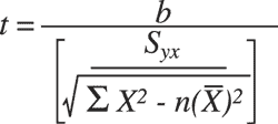
In this case, the t value on Lesterol’s printout
is -18.664. Because there are 24 data points, the degrees
of freedom are 22:
df = n – 2
= 24 – 2
= 22
Using an alpha value of 0.05 (the probability of rejecting
the null when the null is true), the tabular t is 2.074.
Because the calculated t is higher than the tabular t,
the null is rejected, and one can assume that
X is a predictor of Y.
Lesterol’s logical, linguistic response has nothing
to do with statistics. Fortunately, his audience paid no
attention to the t value but simply let Lesterol take his
chart back to his own little kingdom in the quality department
for further study.
Michael J. Cleary, Ph.D., founder and president of
PQ Systems Inc. is a noted authority in the field of
quality
management and a professor emeritus of management science
at Wright State University in Dayton, Ohio. He’s
published articles on quality management and statistical
process control in a variety of academic and professional
journals.
|