by Matthew J. Savage and M. Stephen Daum
Although control charts are often associated with manufacturing industries, there is perhaps no environment in which they play a more critical role than that of health care, where data collected by medical professionals may indeed reflect life-saving improvements to a process. Physicians and other health care professionals know what to look for as they diagnose a patient's condition, and they realize that data analysis demands the same scrutiny. Evaluating the quality and reliability of data reflected on a control chart, like diagnosing medical conditions, means knowing what to look for.
Control charts are valuable tools to help health care teams implement fundamental process changes to improve patient care. But before it's possible to effectively use the information from the chart, one must first be confident that the chart being reviewed is healthy. Just as you wouldn't perform elective surgery on a patient with an infection, you shouldn't analyze a process improvement chart without first considering seven key attributes.
Software is an invaluable tool for creating control charts; however, great diversity among software programs exists. When choosing control-chart software, use the following traits as a guide:
• Lloyd Nelson limits for computing control charts
• Clear, extensive and accurate titles
• Underlying data visible on the chart
• Control limits reflecting process change
• Out-of-control conditions clearly identified
• Assignable causes shown but not used in overall calculations
• Annotations used to increase understanding
An important part of interpreting control charts is identifying special causes. A sudden change in the data may render the moving range out of control, for example. This spike in the moving range artificially widens the control limits on the individuals chart, making it more difficult to identify special causes. By not catching a sample that is out of control, you can miss an opportunity for improvement, as seen in figure 1.
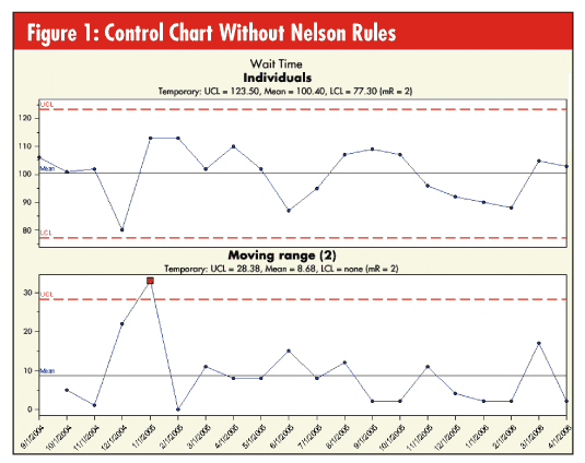
The Lloyd Nelson limits (often referred to as the "Nelson rules") render individuals charts more effective in identifying special causes by removing any moving range values that are above the upper control limit (UCL). This can be a better option than marking the sample as a special cause. When a sample is marked with a special cause, it is eliminated from both the moving range and the individuals chart calculations. The Lloyd Nelson option removes the sample from only the moving range and keeps the sample on the individuals chart. To ensure this kind of precision, make sure that your software provides the Lloyd Nelson limits option so that you don't miss any opportunities for improvement.
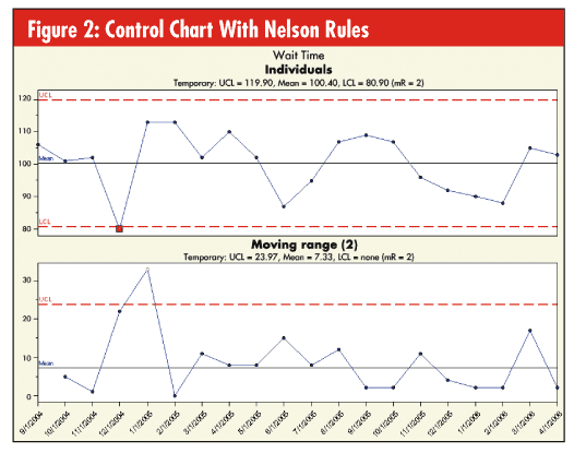
Figure 2 shows the same two charts as shown in figure 1 using the Lloyd Nelson control limits option. There is clearly an out-of-control condition on the individuals chart that was missed using traditional techniques.
On any control chart, the metric being evaluated should be obvious at a glance. The chart may require additional explanatory titles, but one title, probably at the top in a large font, should stand out and clearly name the metric being considered. An important quality to be found in control charts—if they are to be useful in analyzing processes—is clarity. Visible titles, clear annotation and readable labels contribute to this clarity.
Because the name of some metrics may be obscure, additional titles may be necessary to help the viewer understand where the data come from, how they were gathered, and what time frame is represented in the chart. Although the chart should not be cluttered, several appropriate titles both above and below the control chart can make it much easier for a viewer of the chart to understand what is being presented.
If any part of the title information is inaccurate or out of date, the viewer will question the entire chart. Choose software that can ensure that your chart titles are current. For ex- ample, when a date is used as one of the titles, rather than changing the date each time the chart is generated, use software that em- ploys a title code (such as @D) to automatically read the date from the computer and up- date the title. This ensures that titles are current and useful every time the chart is generated.
To evaluate a control chart, one generally looks for exceptional cases. Points beyond the control limits are the best example, but other data points might raise questions as well. These exceptional points elicit a need for more information. What is the actual data value? When was the data value gathered? Who recorded the data? Answering these questions may involve some detective work unless the software provides clear information.
To be useful in providing this information, the software should offer the option to make additional identifying information visible on the chart, so that when you look at an exceptional point, it is possible to glean additional information to under- stand what has happened. Displaying the data value near the plotted point can help in understanding the exceptional points. This allows the viewer to see the number immediately, rather than looking over to the y-axis and trying to guess what the value is.
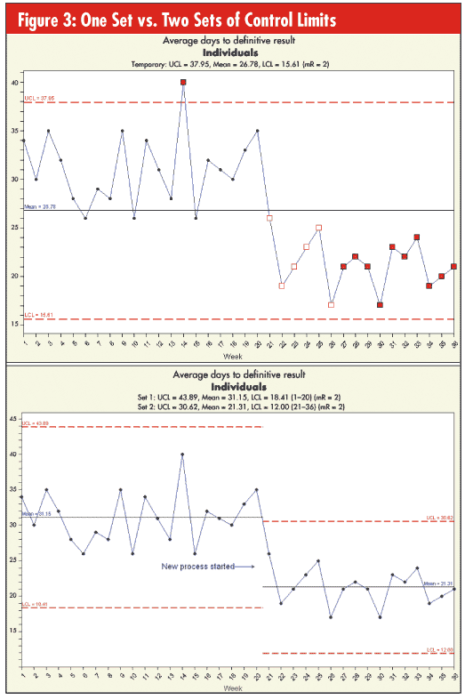
When using control charts for process improvement, one can expect to see changes in the process over time. As a process improves, control charts must be able to reflect the new reality. If the data on a chart show a significant improvement or change, the chart should communicate this with multiple sets of control limits. For example, it might be useful to see one set of limits before the improvement has been made, and another set of limits after the improvement. This visualization of an improving process can be a powerful way to communicate feedback to workers in the process as well as to management, board members and other stakeholders. (See figure 3.)
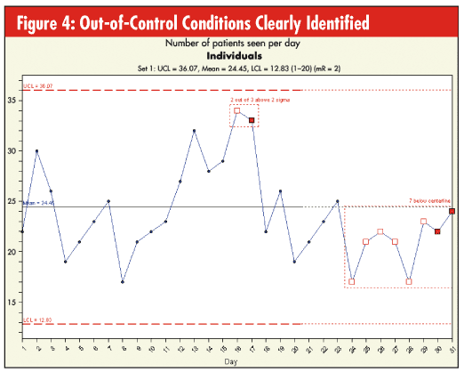
Some out-of-control conditions are easy to spot. A point above the upper control limit or below the lower control limit is usually obvious. However, other conditions can be more difficult to see. For example, the run rules, such as seven points increasing or decreasing, and the zone rules, such as two points beyond two sigma, can be hard to pick up at a glance. In these cases, the software should help by visually showing a difference and by labeling the out-of- control conditions on the chart, as seen in figure 4.
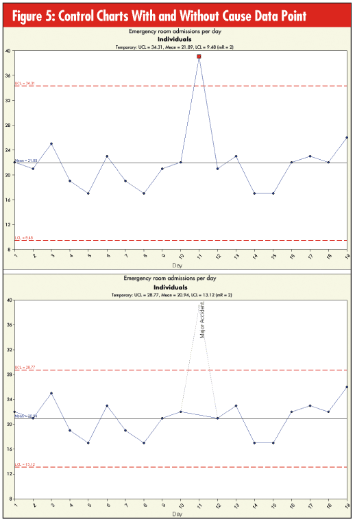
When data are being collected on a key metric for use in a control chart, one is likely to encounter unusual data values. These values can be significantly different from the typical values—different enough to distort the control limits and change the scale of the control chart. Usually, some reason or special cause can be found for these values.
One needs to re- cord these data points for historical study, but without affecting the control limit calculations. Control-chart software should have a mechanism for handling assignable causes. When a point is marked with an assignable cause, it should show up on the control chart, but it should not be included in the calculations, and it should be visually different from the other data points. (See figure 5.)
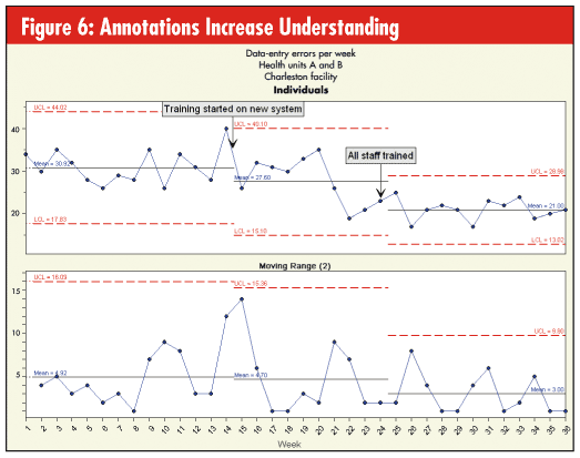
Sometimes, a word is worth a thousand pictures. A control chart can be rendered more useful with the addition of some well-placed text, lines and arrows. These chart annotations can document process changes or note important events that affect the chart. As long as one is careful not to overuse them, annotations can be an important addition to most control charts, saving time during analysis. (See figure 6.)
Software is an outstanding tool for creating control charts, but software by itself cannot improve a process any more than a pencil alone can write a poem. Improvement will come from the data-based decisions that are made after interpreting the charts. That's why the software tool that's used should have the features and flexibility to make the charts easy to interpret. Following the guidelines presented in this article will put you well on your way to selecting the best software for creating healthy control charts.
Matthew J. Savage is an experienced consultant to organizations that want to utilize the power of data analysis to improve processes and enhance profitability. He has been a presenter at the National Association for Healthcare Quality and other quality conferences in the United Kingdom and the United States, and has published articles in a variety of trade publications.
M. Stephen Daum is director of development for PQ Systems Inc. He has more than 20 years of experience with control charts and control-chart software, and has shared that experience through presentations, training, and educational sessions for organizations throughout the United States, the United Kingdom and South Africa.
|