It's Time to Ignore the Traffic Lights
The United Kingdom is in the middle of a significant quality improvement effort regarding its health care system. In 2003, the government set a target (one of 50!) that patients visiting a hospital's accident and emergency (A&E) department must wait no longer than four hours at least 90 percent of the time. (The current target is 98%.) Performances were reported to the government weekly for each of 28 U.K. regions. If the performance was greater than 90 percent, it was reported as "green," while a performance between 85 percent and 90 percent was reported as "yellow" and a performance less than 85 percent was reported as "red." Notice the nice, neat cutoff points ending in "0" and "5."
Any result's deviation from the target is treated as a special cause, i.e., assigned a color. When government monitoring agencies deem a particular hospital's performance unacceptable, an action plan must be
submitted.
Individual hospitals record their results daily. These figures cause hours of meetings during which administrators react to their hospitals' latest daily result, especially if it's red. It isn't uncommon on red days for managers to descend on the A&E department to expedite things, then hold meetings to go over every individual breach to determine what should be done differently. In other words, every individual target breach (i.e., variation) is treated as a special cause.
I hope my recent columns show the futility in doing this until the true process behavior and/or variation has been assessed by "plotting the dots." The run chart for one of the 28 regions is shown below (median = 90.75).
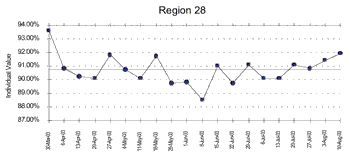
No trends of seven and no individual runs of eight or more all above or below the median: It's common cause! To further confirm, a control chart could also be generated, and the common cause limits are [87.6–93.8], between which all data fall (and none of the classic nine tests for special causes are triggered). Thus, any number in that range cannot be given a traffic light interpretation--in fact, given a process-oriented definition of "meeting target," it was meeting it all along.
From another routine control chart calculation, consecutive weeks can differ by as much as 3.9. You'll notice that no weekly difference even comes close to this value; the largest difference is 2.8. Of course, one can almost predict the weekly "Why are we up?" and "Why are we down?" questions and people subsequently looking for reasons… and finding them.
Despite all the efforts, time and energy being spent to improve this process, there's been no change from April through August. Special cause strategies were being applied to a situation whose variation was common cause, which just adds complexity and, as can be seen in this case, no value.
So… does this mean that the process can't be improved? Absolutely not. This is one of the biggest misinterpretations of the Deming philosophy and why a great many man-agers were turned off by well-meaning Deming proponents who repeatedly blamed management by say-ing, "See… it's common cause and only management can do something about it." Nothing could be further from the truth. The situation needs a common cause strategy to improve it, and my experience has shown that this concept is neither widely known, nor are these strategies routinely taught in this context--talk about a trump card for quality professionals!
So, what are these common cause strategies? My next columns will deal
with them.
Meanwhile, what do we about the "red… yellow… green" epidemic? Is it bigger than all of us? I was once trying to sell the idea of plotting key organizational indicators over time, and one executive patronized me by saying, "We're very busy and don't have time to look at complicated graphs. Just give me red, yellow and green!" I guess they just wanted to look at colors and, another current epidemic, their "smiley face" interpretations (skills taught in kindergarten!) when I was trying to get them to more "advanced" skills (taught in, say, third grade): counting to eight, subtracting two numbers (to get a moving range), simple addition and multiplication. I guess with the salaries we pay them, that's asking too much.
Davis Balestracci is a member of the American Society for Quality and the Association for Quality and Participation. He previously served as chair of the statistics division of ASQ. His
book, Quality Improvement: Practical Applications for Medical Group Practice (Center for Research in Ambulatory
Health Care Administration, 1994), is in its second edition. Visit his Web site at www.dbharmony.com.
|