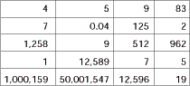
Sometimes data in the real world is uncooperative. At other times, it can be downright dangerous. Consider the
data in Table 1. It's a hypothetical record of how many lies were told per day in a presidential election.
Table 1: Number of Lies Per Day
|
|
I first encountered data like this in college. We were writing a simulation of part of a guided missile factory. With my head full of equations and an ivory-tower gleam in my
eyes, I met with several overworked factory managers who thought I was crazy. They kept saying things like: "Our data isn't like
that. Sometimes it just doesn't make any sense." Convinced I could analyze any kind of data, I challenged them to show me what they had. They came back with
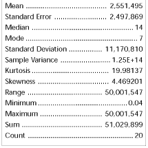
such crazy numbers, I had to change the whole nature of my project or flunk the course. With this kind of data, descriptive statistics are no help at all. Look at Table 2.
Table 2: Descriptive Statistics
for Table 1 data
|
|
The mean is 2.5 million, the median is 14, and the mode represents only two occurrences. What do you make of that? And look at the standard deviation. What's a
three-sigma confidence interval when the standard deviation is 11 million? Faced with such highly variable data, it's easy to get discouraged. If you had a lot of
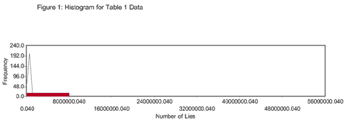
data, you could try dropping the outlying points. But with only 20 data points, you can't really afford to drop anything. And besides, in this data set, almost everything is outlying. Of course, one picture is worth a thousand lawyers, so let's try a histogram. Not much help here, either. It just looks like a very wide bar, and the best-fit curve is a
spike, as you can see in Figure 1. Figure 1: Histogram for Table 1 Data
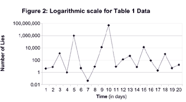
What's a person to do? I have a fairly standard response to that question: When in
doubt, ask a Ph.D. And in the case of this kind of a data set, a friend of mine with a doctorate had a great idea: Change the vertical scale. He suggested I use a
logarithmic scale. What a difference! You can see in Figure 2 how much of an improvement this is.
Now the graph looks more like something used to convey facts. It's compact, pleasing to the eye and retains all the original information. Sometimes an unusual
vertical axis can be misleading. (See my March column, "The Smoke and Mirrors of Charts, Graphs and Figures.") But in a case like this, it can be the only way to fit the data on a page. Most people know that out here in Arizona we have hostile fauna, such as rattlesnakes, Gila monsters and javelina. Some people also know of the area's
hostile flora. (Try making a graph of the number of needles in a Teddy Bear cholla cactus.) Nevertheless, it's a rare person indeed who realizes how virulent our data can get.
About the author Gregory P. Ferguson is senior quality engineer at Global Solar Energy in
Tucson, Arizona. He has published technical articles and assisted in the publication of two books. Comments can be e-mailed to him at gferguson@qualitydigest.com . |