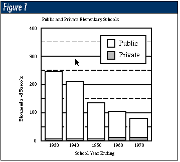
You have 30 seconds to communicate the content of your data to your audience&emdash;after 30 seconds, their eyes glaze over and you have lost their attention. So, how do you beat the 30-second rule? The only reliable way is with a graph. But not all graphs are created equal. Howard Wainer offers an interesting example of this in the Summer 1996 issue of Chance when he uses a graphic from the Bureau of the Census' Social Indicators III. Figure 1 shows a facsimile of this graph.
This bar graph attempts to show two things at once&emdash;that the total number of elementary schools has gone down over the period shown, while the number of private elementary schools has grown slightly. Figure 1 is not a particularly bad graphic. It is legible, even if the vertical scale is a bit larger than it needs to be.
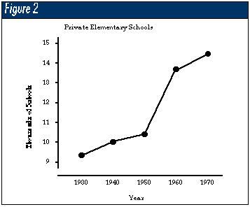
However, by placing both measures on the same graph, Figure 1 compresses the time series for the private schools excessively. One of the principles of good graphics requires that when the data changes, the graphic should also change. By placing both public and private schools on the same graph, the difference in magnitude between the two time series makes it impossible to fully comprehend the private school time series. Figure 2 shows what Figure 1 obscures: a jump in the number of private schools between 1950 and 1960. Of course, the connected nature of the plot in Figure 2 also helps because it draws the eye the way the mind wants to go. The bars of Figure 1 do not do this.
Adding data to Figure 2 will increase insight. By using more points over the same period, the nature of the changes will be better understood.
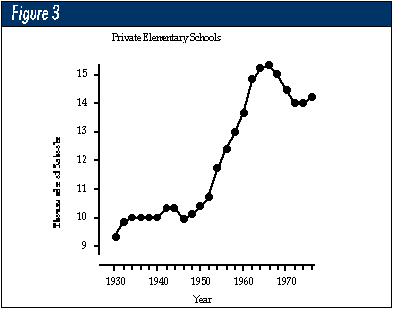
Once you have plotted the data in an effective graph, you can see the need to explain certain data characteristics. While a graph cannot distinguish between an accidental relationship and a cause-and-effect relationship, it can be the springboard for asking interesting questions. For example, the baby boom hit elementary schools in 1952. Thus, the trend in Figure 3 lags behind the increases in the sizes of the elementary school cohorts. So, the baby boom as a possible explanation is not convincing.
Another possible explanation is the 1954 Supreme Court decision Brown vs. Topeka School Board, which declared segregated public schools to be illegal. During the following decade, many private schools were started. This trend continued until the mid-1960s, when two things happened&emdash;the baby boomers were moving on to secondary schools, and the 1964 Civil Rights Act was passed. Figure 3 does not prove anything, but it certainly does support some interesting speculation.
Better graphics communicate the interesting parts of the data more directly. That means that when the data changes, the graph shows that change. When the data is presented as a time series, it is better to use connected points than to use a bar chart. The connected points draw the eye the way the mind wants to go, while the bar chart doesn't do this. The scale should be sufficient to avoid excessive compression of the graphic. The graphic should "fill up" the graph. Only rarely will multiple measures be appropriate on a single graph.
Decoration should be avoided. If you denote the points and lines needed to show the data as "data ink" and denote all other lines, tick-marks, labels and decoration as "nondata ink," better graphics will always have a high ratio of data ink to nondata ink.
Nowadays, people can easily obtain highly decorated graphs at the push of a button. Yet only when they understand that the purpose of a graph is to inform rather than to decorate will they begin to produce better graphics. Experience, practice and good guidance will all help. To this end, I recommend Edward Tufte's book, The Visual Display of Quantitative Information (Graphics Press, Cheshire, Connecticut).
About the author
Donald J. Wheeler is an internationally known consulting statistician and the author of Understanding Variation: The Key to Managing Chaos and Understanding Statistical Process Control, Second Edition. © 1996 SPC Press Inc. Telephone (423) 584-5005.