A Colorful Solution, But Is It Correct?
Michael J. Cleary, Ph.D.
mcleary@qualitydigest.com
Walker Runn is quality manager
for Color In A Can, a paint processing company with facilities
in three states. He’s pleased to be assigned to the
plant located farthest from company headquarters, hoping
that an “out of sight, out of mind” sensibility
will keep the home office from pestering him about things
like using statistical process control, getting more training
to do his work or a host of other things that are pebbles
in his shoe.
The company sends a vice president to audit his quality
system each year, but Runn has been able to sustain a façade
of competence because the vice presidents that the home
office sends have generally known little about statistical
process control. In the past, he simply threw around a few
impressive terms and charts to satisfy them. This time,
however, the company has chosen to send Dan Druff, a highly
competent (though somewhat flaky) statistician.
Thumbing through an old statistics textbook, Runn decides
that the only way to convince Druff that the plant is producing
consistently high-quality paint is to wow him with hypothesis
testing. Because Runn has never done hypothesis testing
himself, he finds that he must actually review the chapter
to learn some terminology. A section entitled “Differences
Between Means” draws his interest. In the associated
case study, a plant has two identical production lines that
produce identical products--not unlike the way Color In
A Can is set up, with two lines that produce the same product.
As part of the corporate quality effort, each production
line is rated on a quality index each day. Data for the
two lines
follows:
Quality Index
Line 1 |
Line 2 |
14 |
10 |
17 |
7 |
9 |
11 |
16 |
9 |
15 |
5 |
11 |
12 |
Line 1 Line 2
Runn collects the data and asks one of his employees to
enter the data into a statistical software program so it
can be presented to Druff in a major PowerPoint presentation
that he has planned.
As he shares the presentation, he points to the high t
value of 2.83.
“Aha,” he says. This demonstrates how different
the lines are from each other, he points out to Druff, who
nods and then asks Runn what alpha value might be used.
Oh-oh. “Selecting the Alpha” was in the part
of the chapter that Runn hadn’t skimmed. The only
connection with “alpha” that came to his mind
derived from the sports car his neighbor just bought, an
Alfa Romeo GTV6. Fishing for a response, he blurts out,
“12,” because the sum of n1 and n2 is 12. Not
fancy, but a fast calculation, he thinks to himself.
Was Druff impressed? Should he have been?
Runn was flat-out wrong. He had confused the sum of the
two sample sizes with a type 1 error.
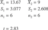
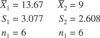
Data from the production lines were as follows:
Line 1 Line 2
The production on line 2 is clearly less than that of
line 1. The question remains whether the difference is due
to natural variation or whether it can be ascribed to the
two lines actually operating differently. Using traditional
hypothesis testing, one can apply the “t-test”:
Step 1:
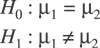
Interpretation: The null hypothesis (H0) is that line
1 and line 2 are not significantly different.
Step 2:
Alpha value (a) = 0.01
Interpretation: An alpha value of 1 percent suggests a
willingness to accept a 1 percent chance of rejecting the
null when it’s actually true. This is known as a type
1 error.
Step 3: Calculate statistical t value:
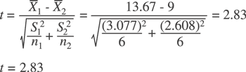
Step 4: Make a decision:
a) Look up tabular t value in a statistics textbook. In
this case, it’s equal to 2.2281. (Note: You have
10 degrees of freedom.)
b) Compare this to the value from step 3 of 2.83. If it’s
greater, reject; if not, accept.
Interpretation: In this case, the mean values are different
enough from each other that one would conclude that lines
1 and 2 are indeed different from one another.
How would X-MR charts created for each line compare?
If this exercise brings back dark memories of a statistics
course and its innumerable calculations, welcome to the
new technology.
Michael J. Cleary, Ph.D. is founder and president
of PQ Systems Inc.
|