Think You Know Balanced Scorecards?
In my travels, I have yet to come across a decent attempt at a balanced scorecard. I'm not saying that they don't exist, but good ones are truly rare. Most executives seem to be satisfied with an "unbalanced rubbish heap" heavy on financial and operational measures. I once worked with a team that, when told that good scorecards should have no more than 10 to 15 measures, said to me, "We know… but we're going to have 60." They wanted them in red-yellow-green format because they were so busy. Sigh….
What constitutes a good balanced scorecard is a whole other article. I highly recommend Mark Graham Brown's work, especially his new book, Beyond the Balanced Scorecard (Productivity Press, 2007), which treats measures in an intriguing concept known as "analytics."
In this column, I'm going to deal with the need to have measures cascade in a cause-and-effect fashion. A good analogy is your car's dashboard: A light goes on and the mechanic knows exactly where to connect the computer to get more diagnostic data (and only then is it needed).
Many executive teams look at heavily aggregated measures. What they don't realize is that aggregation can hide a multitude of sins and muddle a situation. However, unlike a car, balanced scorecards are inherently self-repairing--even if a "light" doesn't go on at the executive level, because they've deemed the measure important, it is being proactively monitored rather than passively collected.
Consider one hospital's data. The board was concerned with the overall "incident rate" (an aggregation of a multitude of various metrics) at the hospital, as seen in figure 1.
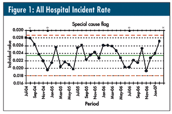
Relatively unremarkable, eh?
Figure 2 is a layout of three of several component graphs that disaggregates the data down to the next management level.
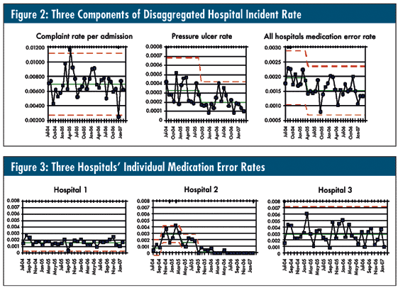
Now let's look specifically at the disaggregated medication error rates for three of the six hospitals that make up the aggregated "all hospitals medication error rate" from figure 2, in the format that I described in my two previous columns. These are shown in figure 3.
So, despite not triggering a signal at the board level, progress is being made in several areas that have been deemed important to the organization… as well as exposing opportunities for ongoing improvement. If the board is frustrated by the lack of progress shown in their chart, because of the common language, they can request the sub-scorecards and get a pleasant surprise, or appropriately request resources for areas that seem stuck.
Sure beats drawing circles around tables of numbers or reacting to red-yellow-green reports, wouldn't you say?
Davis Balestracci is a member of the American Society for Quality and past chair of its statistics division. He would love to wake up your conferences with his dynamic style and unique, entertaining insights into the places where process, statistics, and quality meet. Visit his Web site at www.dbharmony.com .
|