A Handy Technique
 Often, when people are trying to make comparisons, they rank groups on several factors and then use the sum of their respective ranks to come to a conclusion--after presenting the bar graph, of course. Often, when people are trying to make comparisons, they rank groups on several factors and then use the sum of their respective ranks to come to a conclusion--after presenting the bar graph, of course.
The data seen in figure 1 are the sum of rankings for 10 aspects of 21 counties' health care systems. (Lower sums are better: minimum = 10, maximum = 210, average = 10 × 11 = 110.)
There's a statistical technique known as the Friedman test, for which it's legitimate to perform an analysis of variance (ANOVA) using the combined individual sets of rankings (not shown) as responses. The results for these data are shown in figure 2: 10 "items," 21 "counties." Note that, because of the nature of rankings, "item" always results in a sum of squares (SS)of zero.
For statistical interpretation, W. J. Conover uses the actual F-test for "county" (i.e., F = 2.56, p = 0.001). See his reference, Practical Nonparametric Statistics, Third Edition (John Wiley & Sons Inc., 1998). Conover claims that this technique is superior to the more commonly used Chi-square statistic given in most computer packages, which can be approximated from the ANOVA by multiplying SS by the factor 12 / (T×(T + 1)
), with (T - 1) degrees of freedom (DF), where T is equal to the number of items being compared--in this case, counties (21). For this example, the result is a Chi-square of (12 /
( 21 × 22) ) × 1702.8 = 44.23 with 20 degrees of freedom (p = 0.0014).
Technicalities such as this aside, there's little doubt that a difference exists amongst counties. The question is, which ones?
As mentioned in my April and May columns ("I Hate Bar Graphs--Part 2" and "I Hate Bar Graphs--Part 2 [cont.]"), one could calculate the least significant difference (LSD) between two summed scores or the more conservative difference based on the interquartile range (~51 and 91, respectively) and "discuss" it (with lots of human variation).

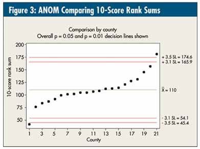
One can also use analysis of means (ANOM), resulting in the graph in figure 3, and get overall p = 0.05 and p = 0.01 (reference lines drawn in). See Process Quality Control: Troubleshooting and Interpretation of Data, Fourth Edition, by Ellis R. Ott, Edward G. Schilling and Dean V. Neubauer (ASQ Quality Press, 2005).
All these calculations are based on the standard deviation of the sum of the 10 rankings, which derives from the mean square error (MS error) term from the ANOVA and equals, given the "k" items summed: square root (k × MS error) = square root (10 × 33.32) = 18.25.
Given this graph, the statistical interpretation would be that there's one outstanding county (No. 1) and one county "below" average in performance (No. 21). The other 19 counties are, based on these data, indistinguishable.
Previous discussions involving these data involved a lot of talk about quartiles; however, when I presented this analysis to the involved executives as an alternative, it was met with a stunned silence and defensiveness, which I'll address next month in a more philosophical column.
Davis Balestracci is a member of the American Society for Quality and past chair of its statistics division. Visit his Web site at www.dbharmony.com.
|